Nicole O’Connor | Design
I’m Nicole. My love of design grew out of creating theatrical posters and self crafted social media campaigns, as a drama student. Later I moved into online media, gathering experience designing social media content and working as a brand ambassador. In 2018 I began studying design and I haven’t looked back since. Since then I’ve found joy in illustration, motion and graphic design. I currently divide my time between Dublin and Berlin. I am delighted to be a part of Upstarts 2022!
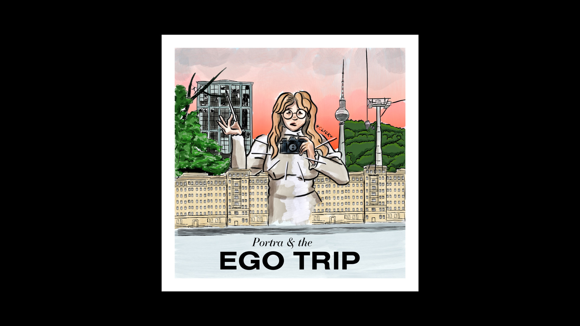
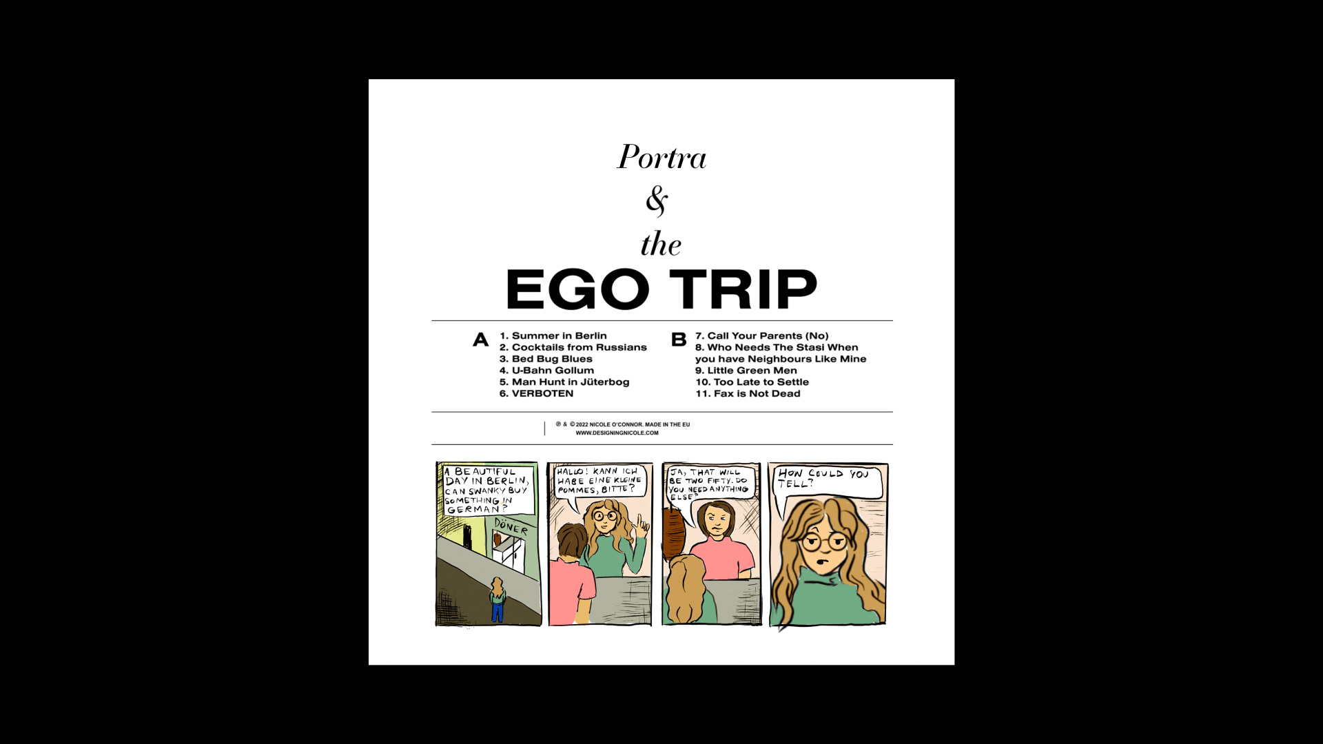
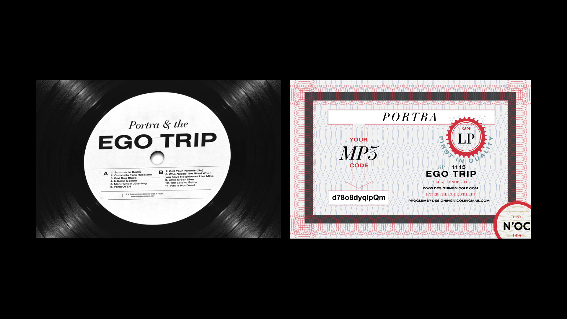
Project 1 | Portra & The Ego Trip
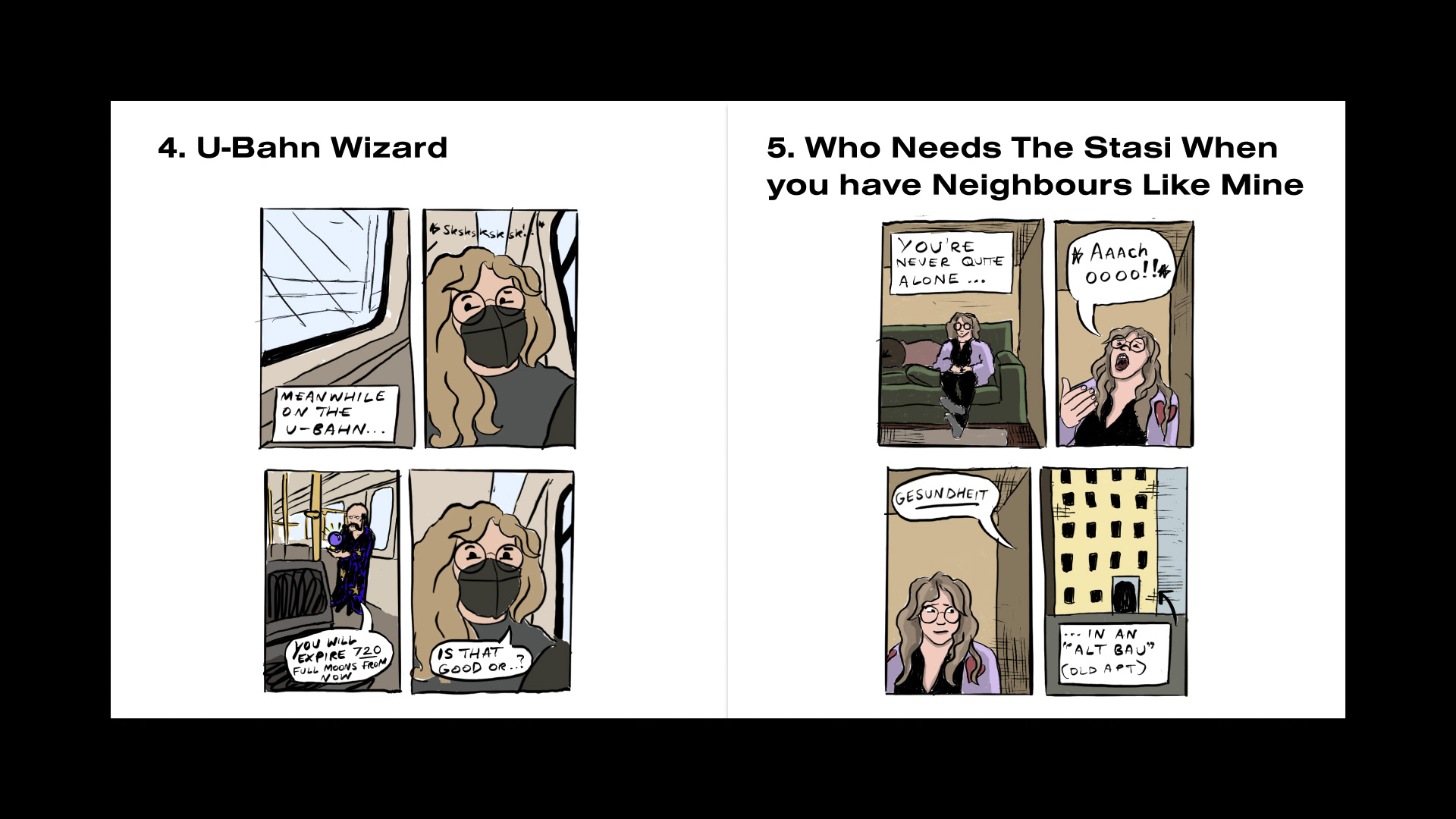
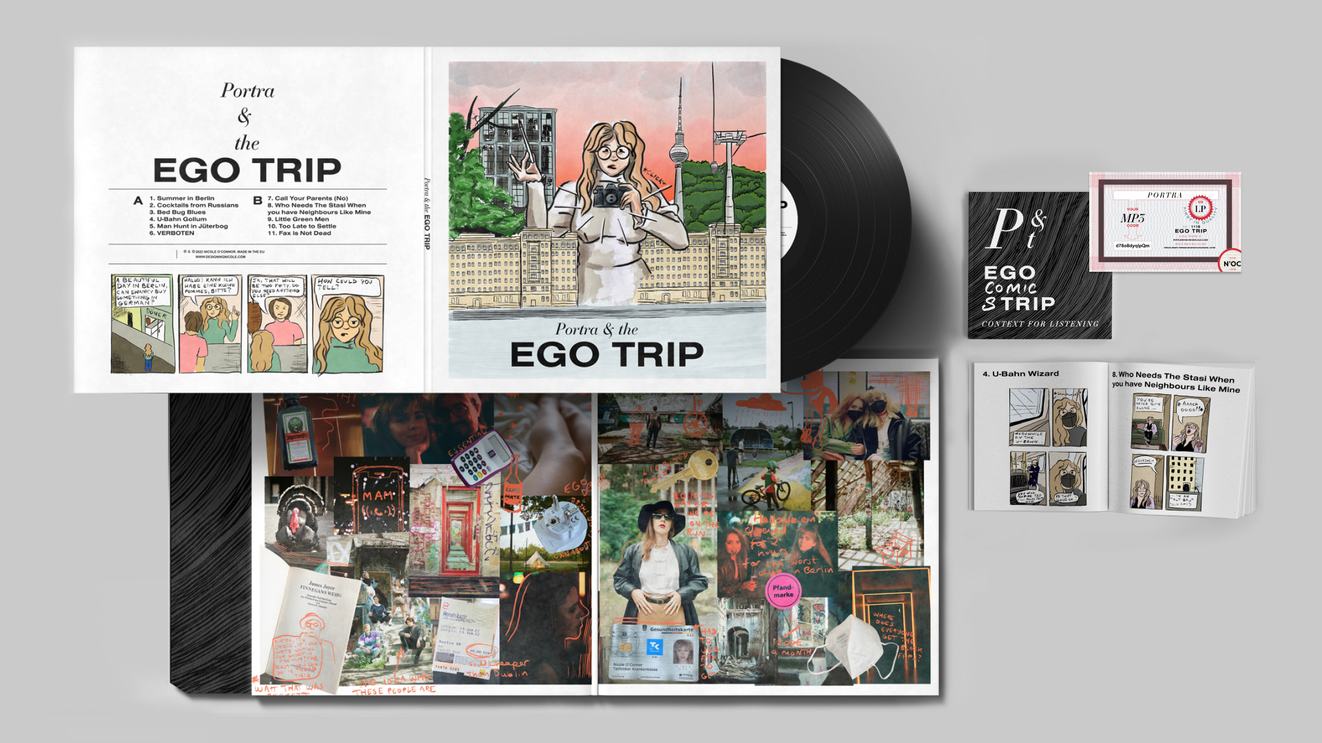
A response to a brief set by Red&Grey: We were asked to create a project that showcases our individual personalities, without employing the internet for research or inspiration. I based my work on my vinyl and graphic novel collections, and developed a concept album themed around my first year of living in Berlin. I created a rockstar alter ego “Portra” created a series of comic strips of her antics in Deutschland, which illustrated a deluxe vinyl set.
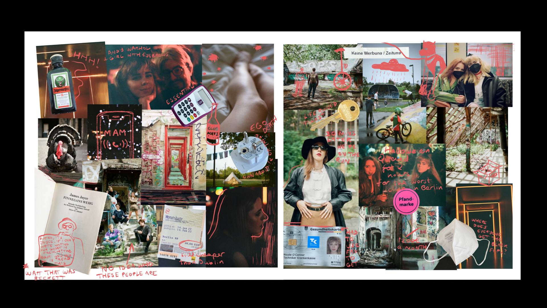
The cover is a self portrait of Portra nestling between the East Berlin communist era apartment buildings where I currently live. The tracklist and corresponding comic strips allude to various semi-autobiographical events. It is only in the inside sleeve that we get a peek of real experiences. Here I’ve made a collage of 35mm pictures I’d taken over a year of living in Berlin, and personal items that became essential when I moved to another country.
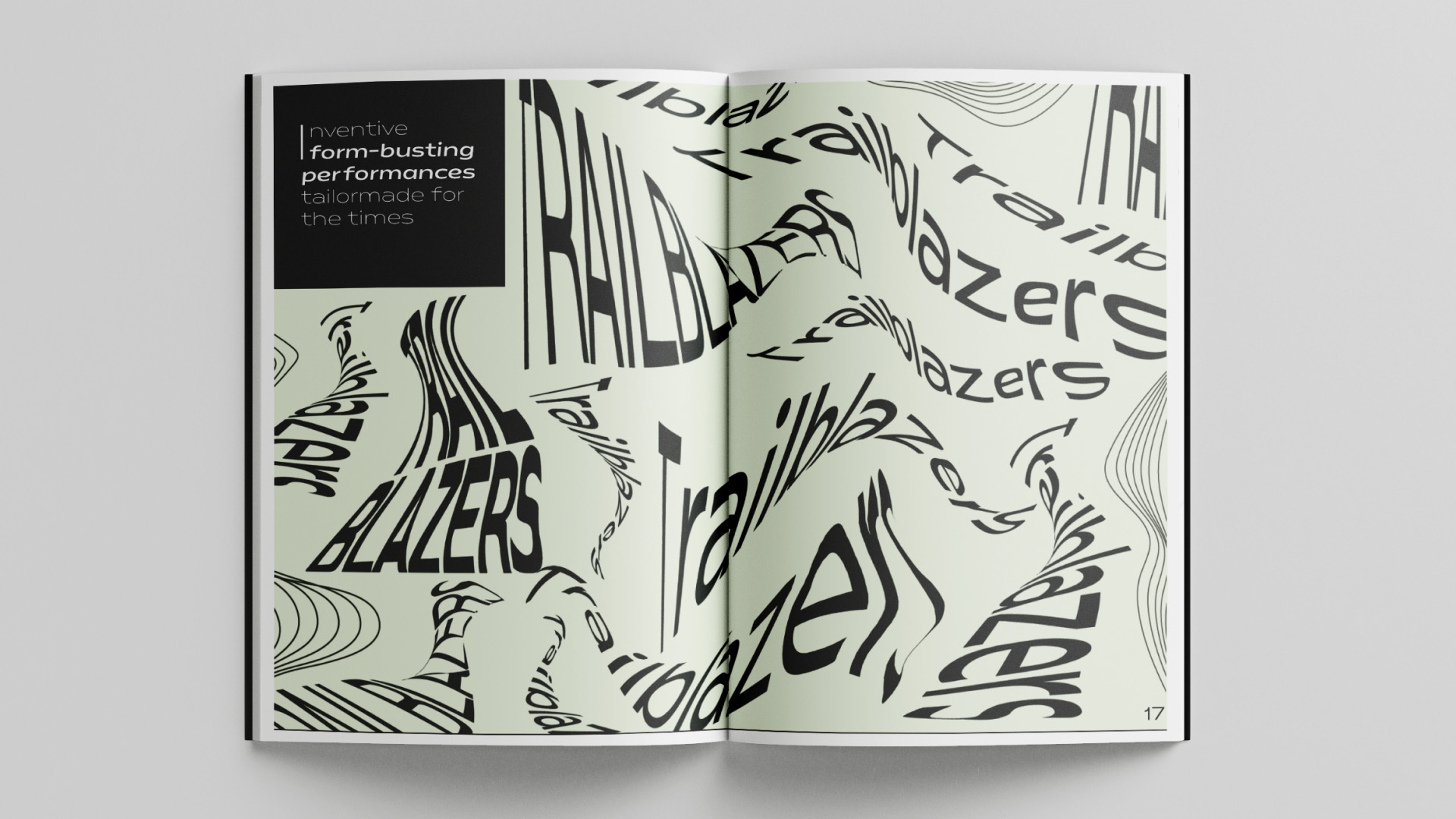
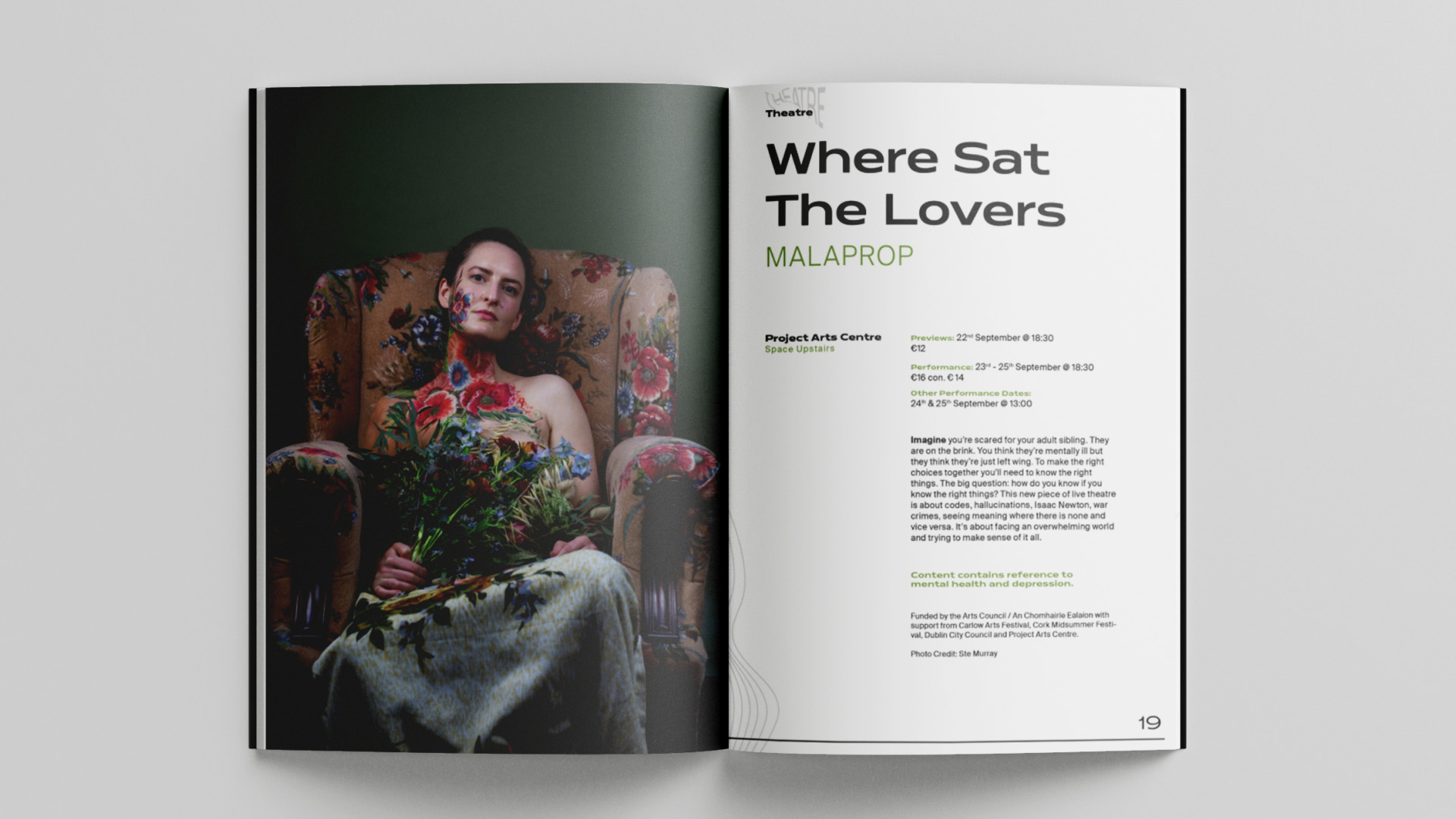
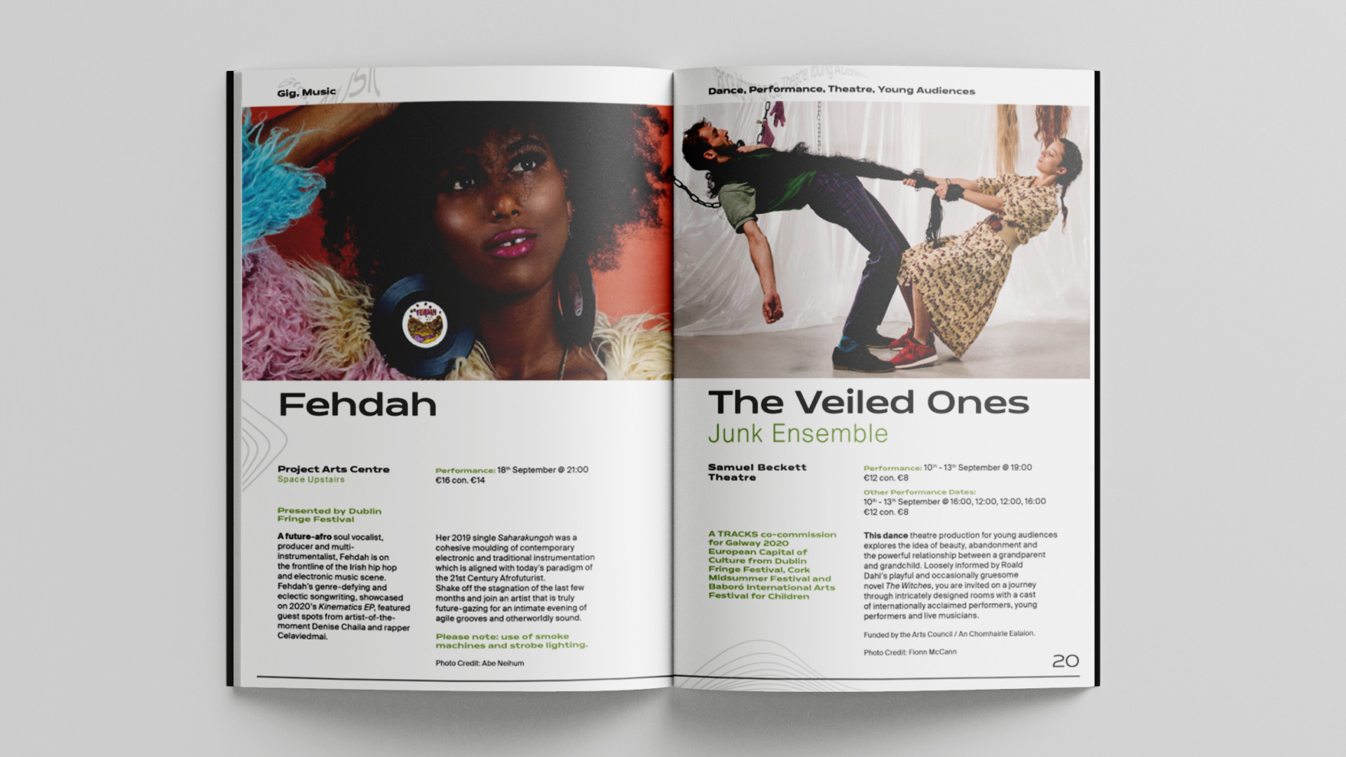
In a brief set by BigO, we were tasked with creating a coherent visual style to present six sample pages of a Dublin Fringe Festival Booklet. The aim of this project was to create an experimental text treatment in line with the overall visual identity, while maintaining the utility and readability of the show listings. The phrase ‘form busting’ was employed in the copy of the festival, so I took this as a prompt to distort and twist the letterforms, serving as a visual metaphor for the clash of diverse performances. Each ‘Trailblazer’ is unique, but their work is unified by the curatorial approach of the festival organisers.
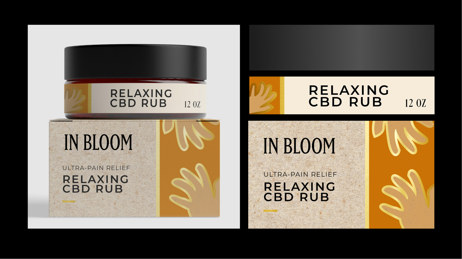
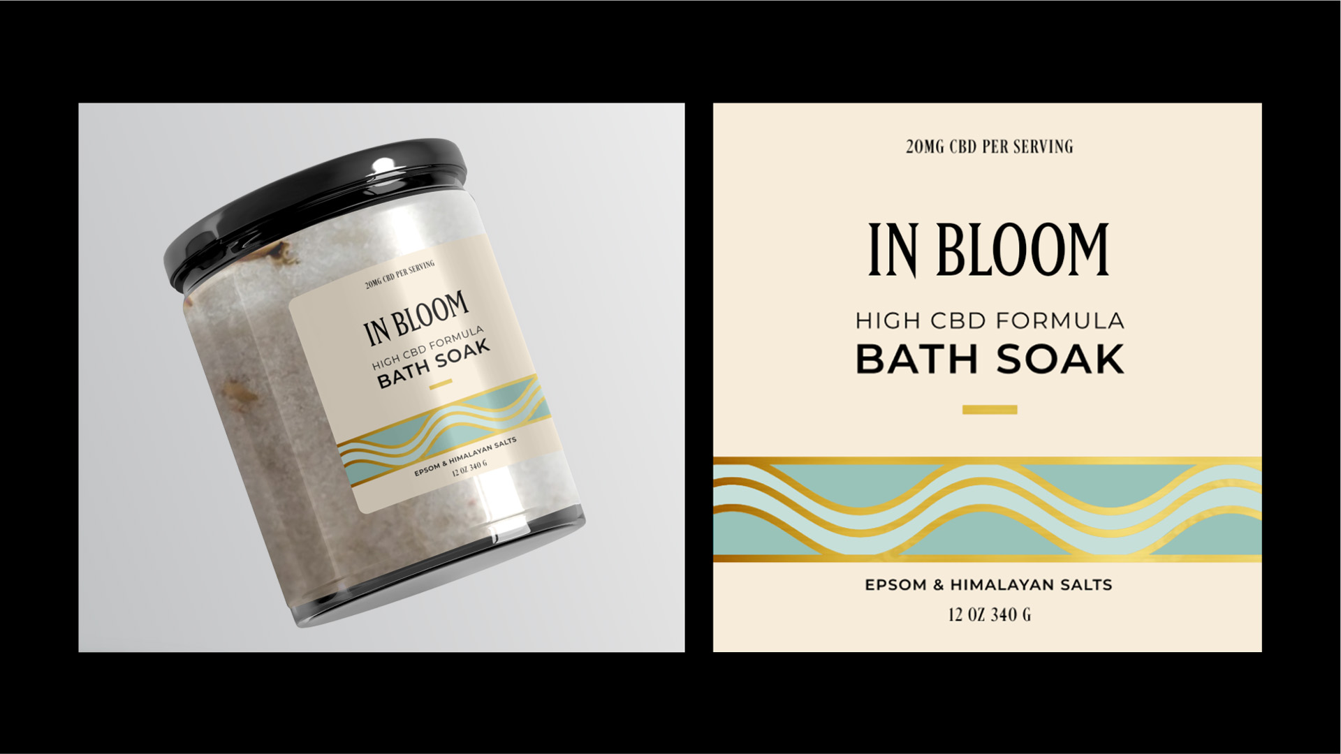
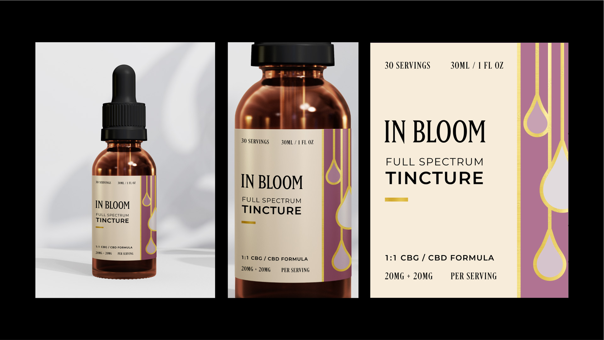
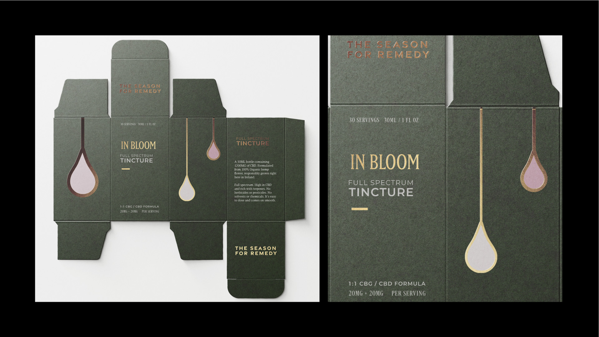
In this project Slater tasked us with developing a brand for an imagined Cannabis personal care company. The aim was to create something that avoided stereotypes, had an emphasis on sustainability, creating an identity that remains consistent across a range of products and packaging.
I wanted the brand to feel luxurious, so I added gold foil and rich jewel tones to the labels. The illustrations are abstract but allude to how the products should be used. I chose the word “Bloom ” to suggest a flower cultivated for its beauty, fertility, and to confer the openness of the concept. The phrase “In bloom” suggests flowering, and in referencing the Nirvana song of the same name, adds a slight edge and familiarity to the brand.