Marc Comiskey
Marc Comiskey | Design
My name is Marc Comiskey and I am a Graphic Designer based in Dublin. I am obsessed with branding, I bring a unique point of view to every project and create compelling designs that tell a story. I believe great design should be engaging, accessible, and above all inspiring.
I have experience with brand identity design, logo design, designing marketing materials, print production and working with a team over multiple projects and campaigns. I love anything adventurous and always jump at the chance to do something outdoors.
I love to travel and have lived in Spain, Australia, and Thailand.
Favourite Food: Burgers ( Bunsen is king )
Favourite Place: Melbourne
Inspired by: Chris do
Hobbies: Hiking, GAA, GAA Coaching, Running, Reading, Art and Films
Podcasts: Blindboy, Tony Cantwell and The Future
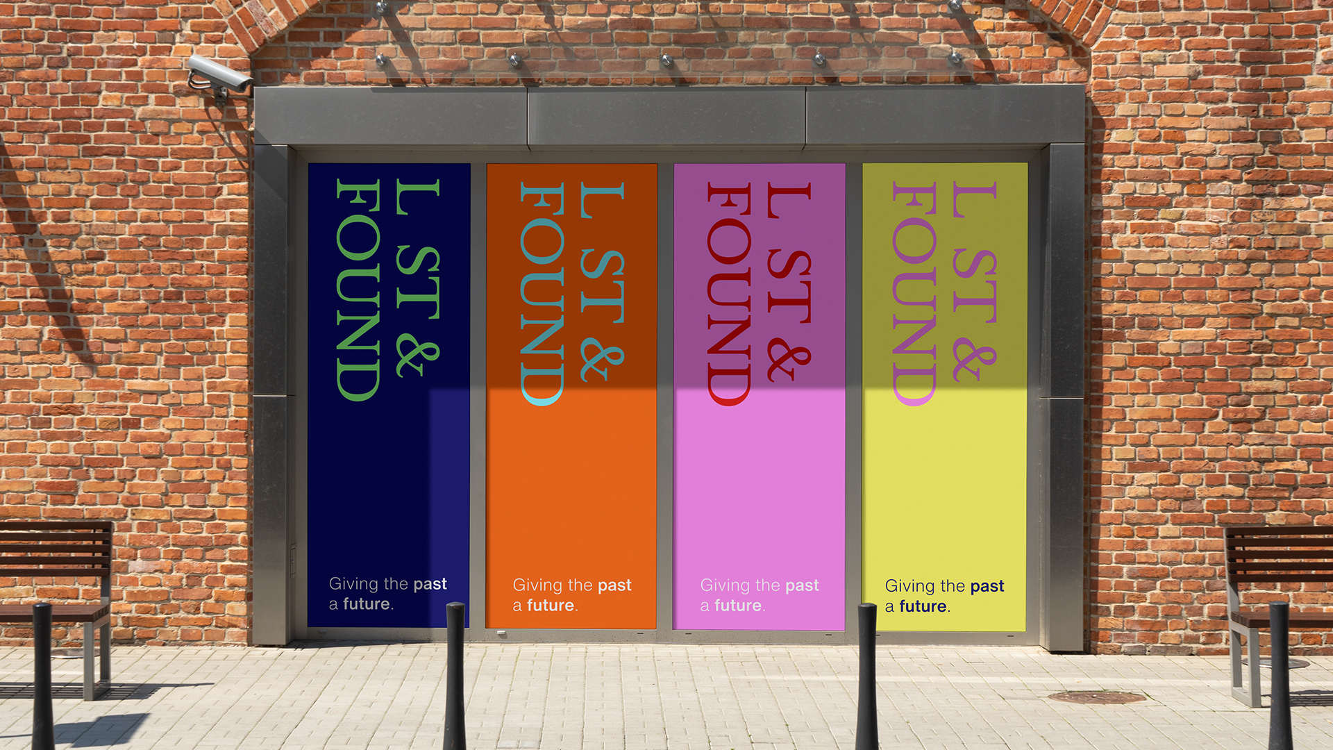
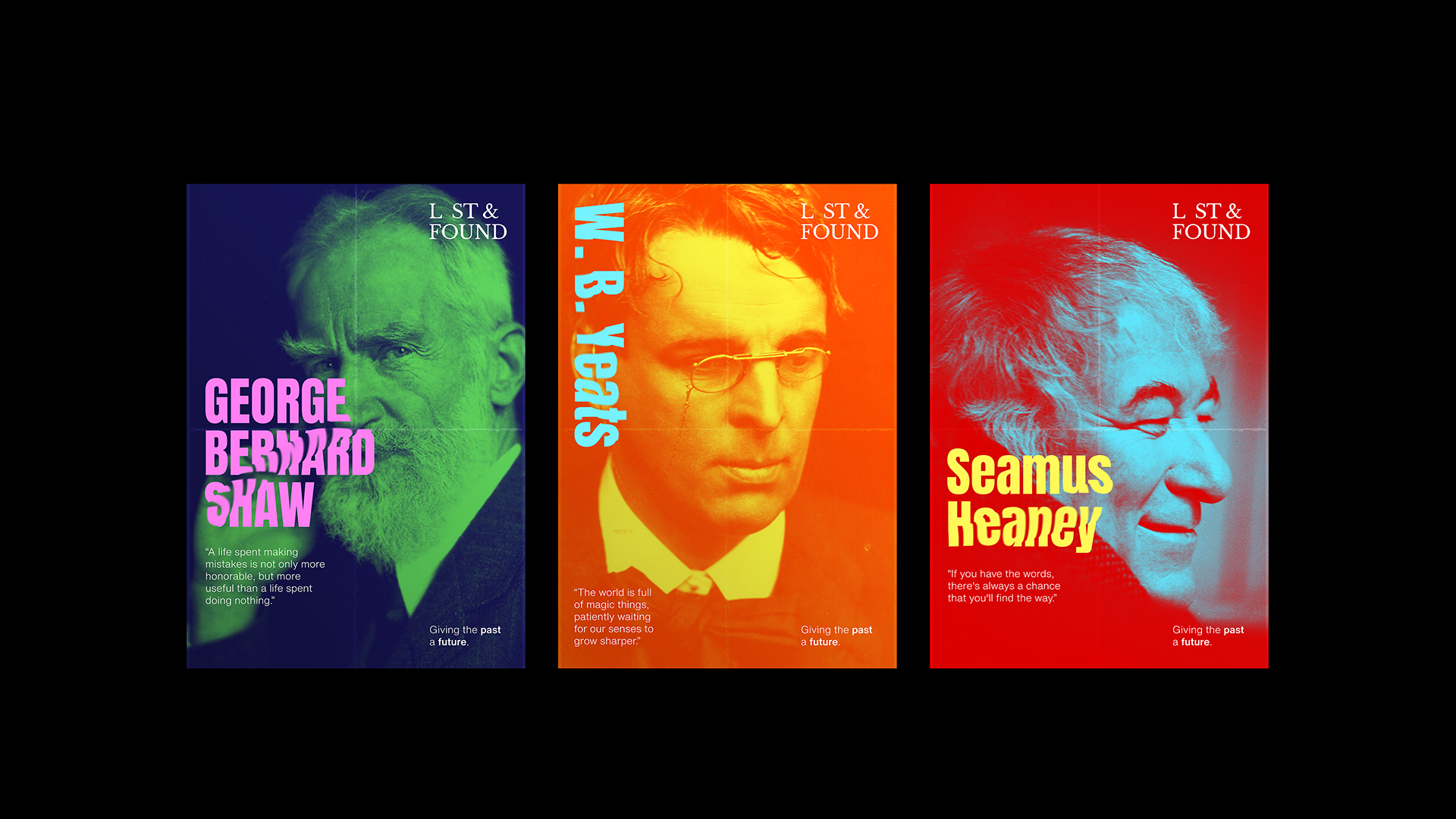
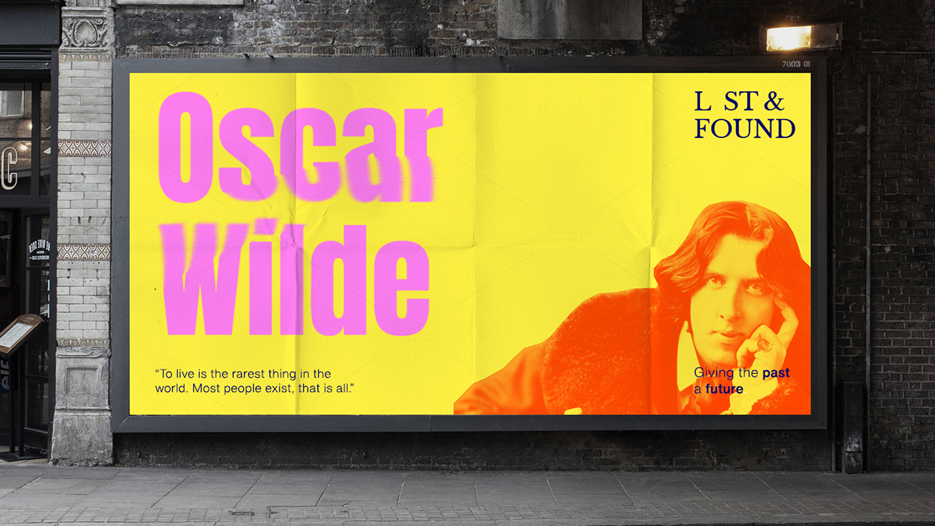
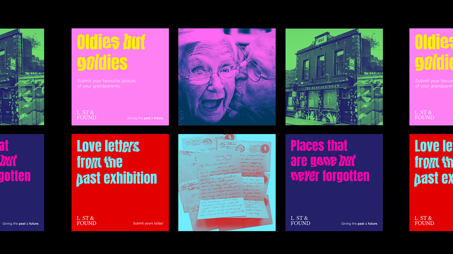
Project 1 | Lost and Found
In response to the Upstarts 2022 design brief, I was tasked with developing a new concept/identity for a cultural space located in Dublin. I chose to use The Bernard Shaw as the location for the new cultural space.
I picked The Bernard Shaw because it was a place that always seemed on the cusp of the latest trend whether that was the latest music or the newest street art talent. It was a cultural melting pot from street art to music to food from different cultures.
Concept:
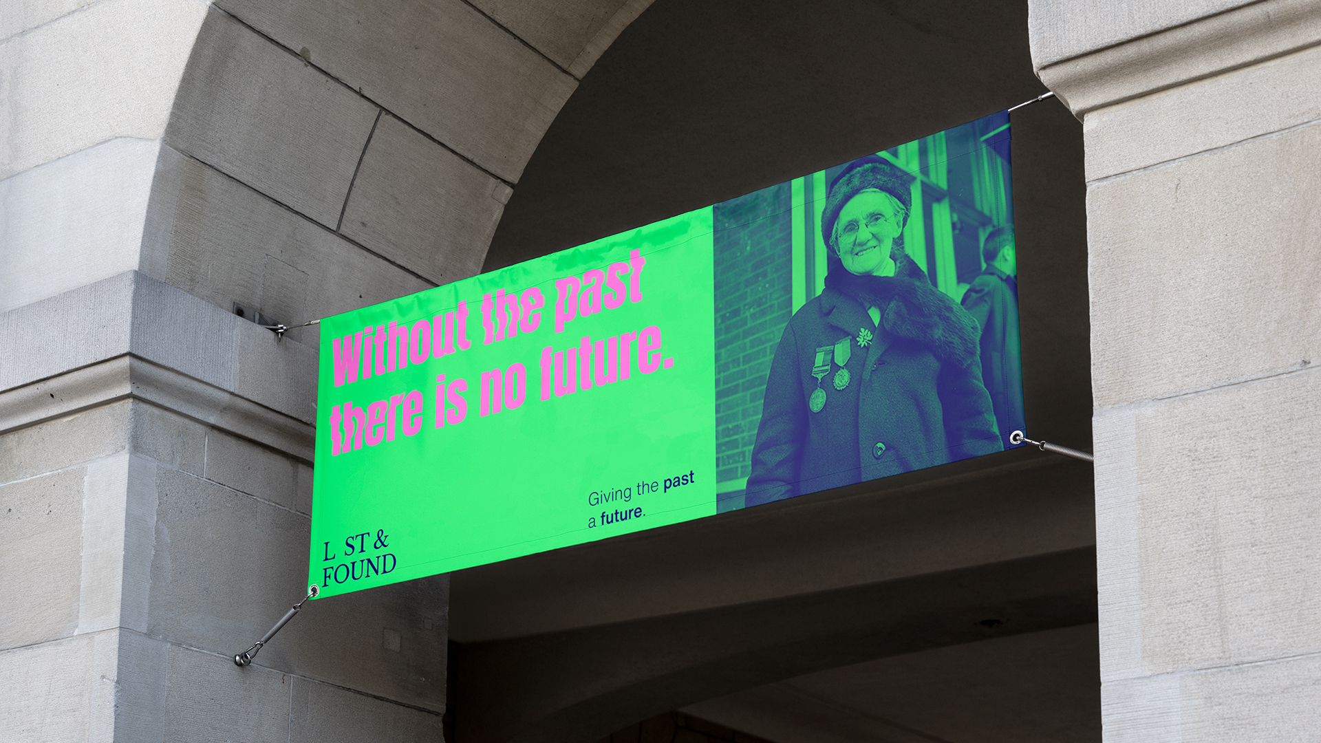
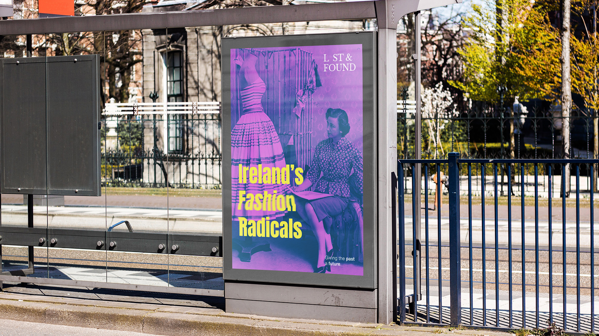
My concept for the new cultural space that would replace The Bernard Shaw is called “ Lost & Found “. A space where we can give the past a future. Using the space to put on reinterpretations of historic plays, putting on an exhibition showing old love letters from the past or images of the places that use to be so dear to us such as the Bernard Shaw, and most of all a space where we can honor our heritage and the people that made our culture what it is today.
The idea is to use our history and show it to people in a new way. A cultural space that would help connect people through the past. Sharing memories of places, people, and our history. At a time where so many cultural spaces are being taken away and forgotten about this would be a space where these things could live on.
The Design
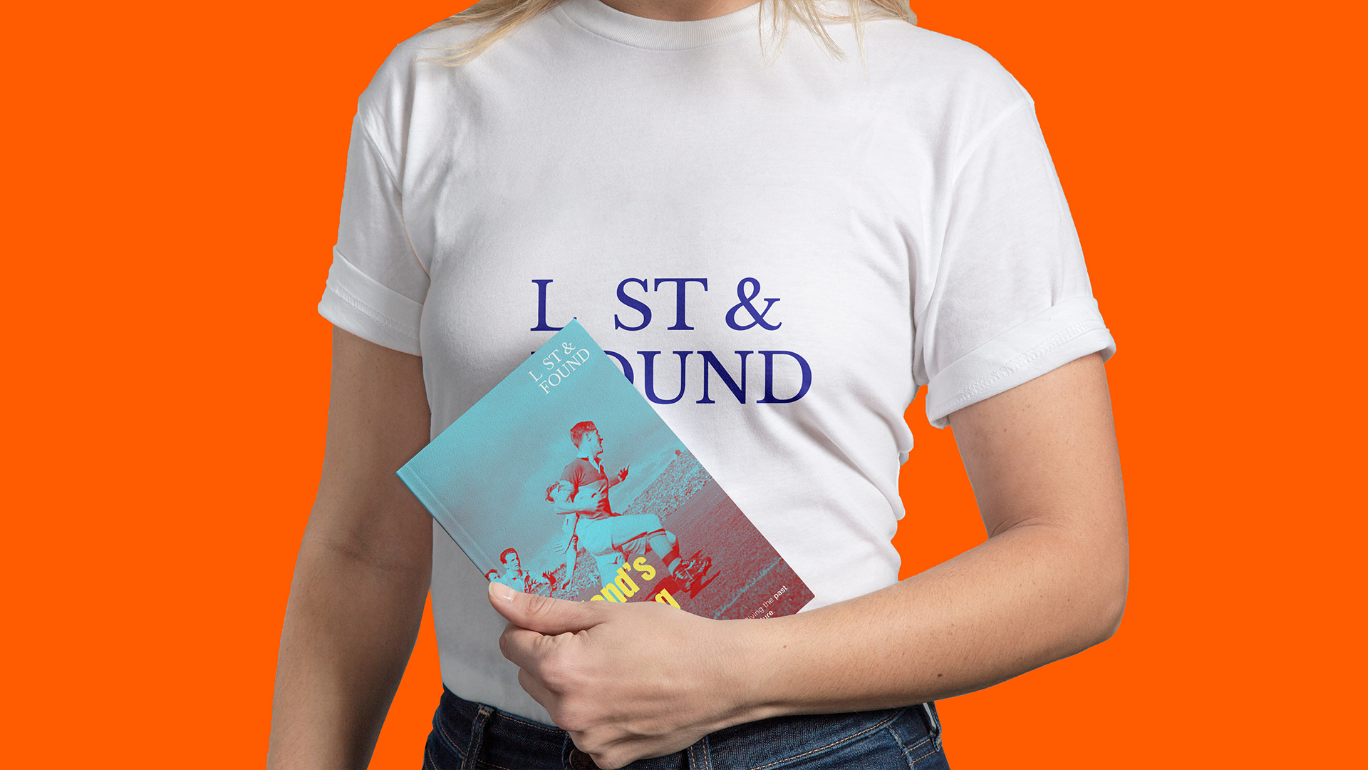
When designing the identity for Lost and Found I took inspiration from The Bernard Shaw. I love how it had such a contrast between Traditional and Modern/bold design for instance the signage for the Bernard Shaw being a serif classic traditional font but then the aesthetic being full of bright and bold street art.
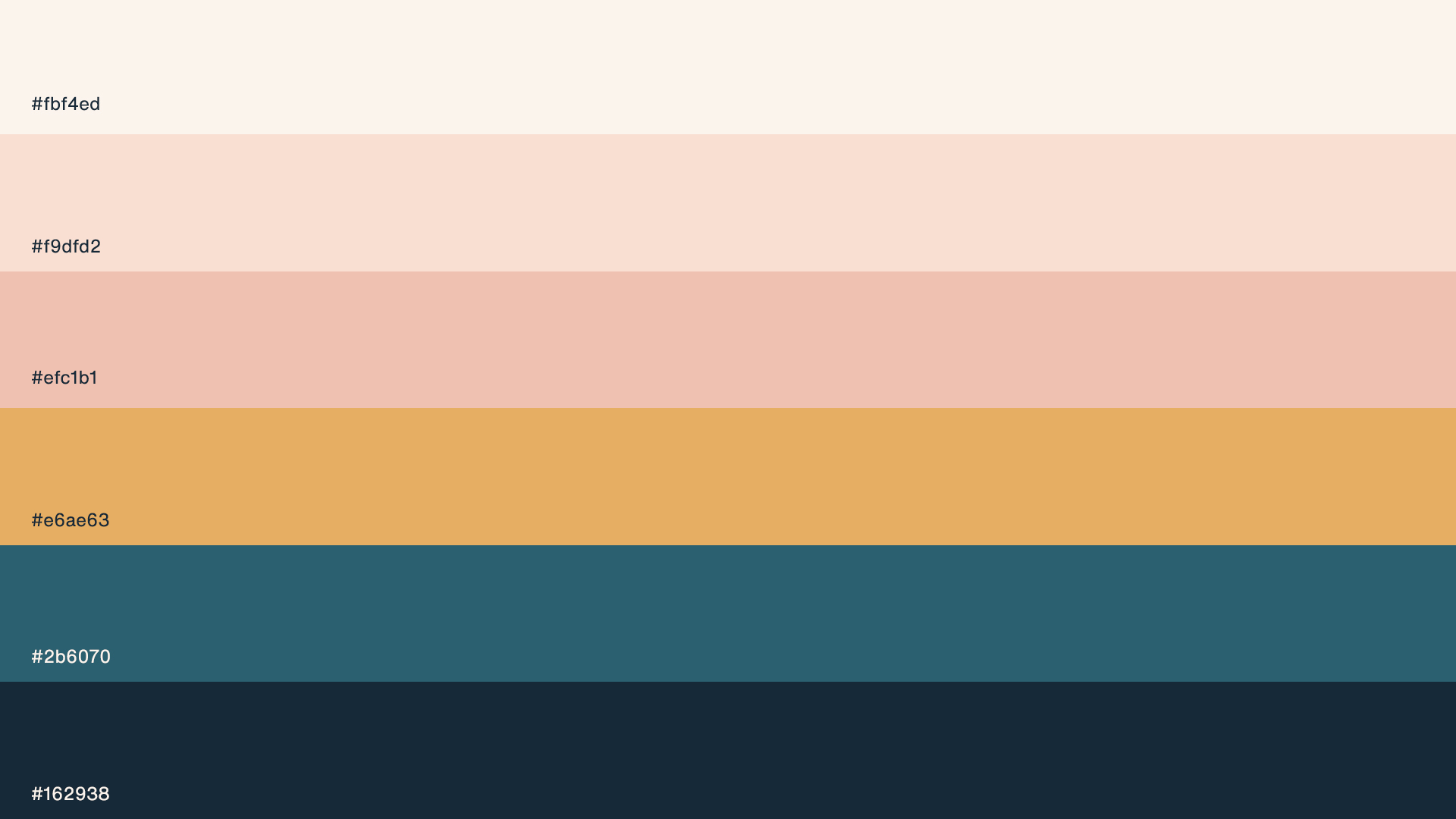
This contrast is something that drove the design for the identity using old photography and redesigning it with vibrant colours. For the logo, I used a san serif paying homage to The Bernard Shaw. For the headlines, I used a bold font to further create this tension and chose to warp the text to create the feeling that it was being lost in time.
Unthink challenged us to create an experience which encourages people to reduce their social media usage, and engage with the world around them.
Concept
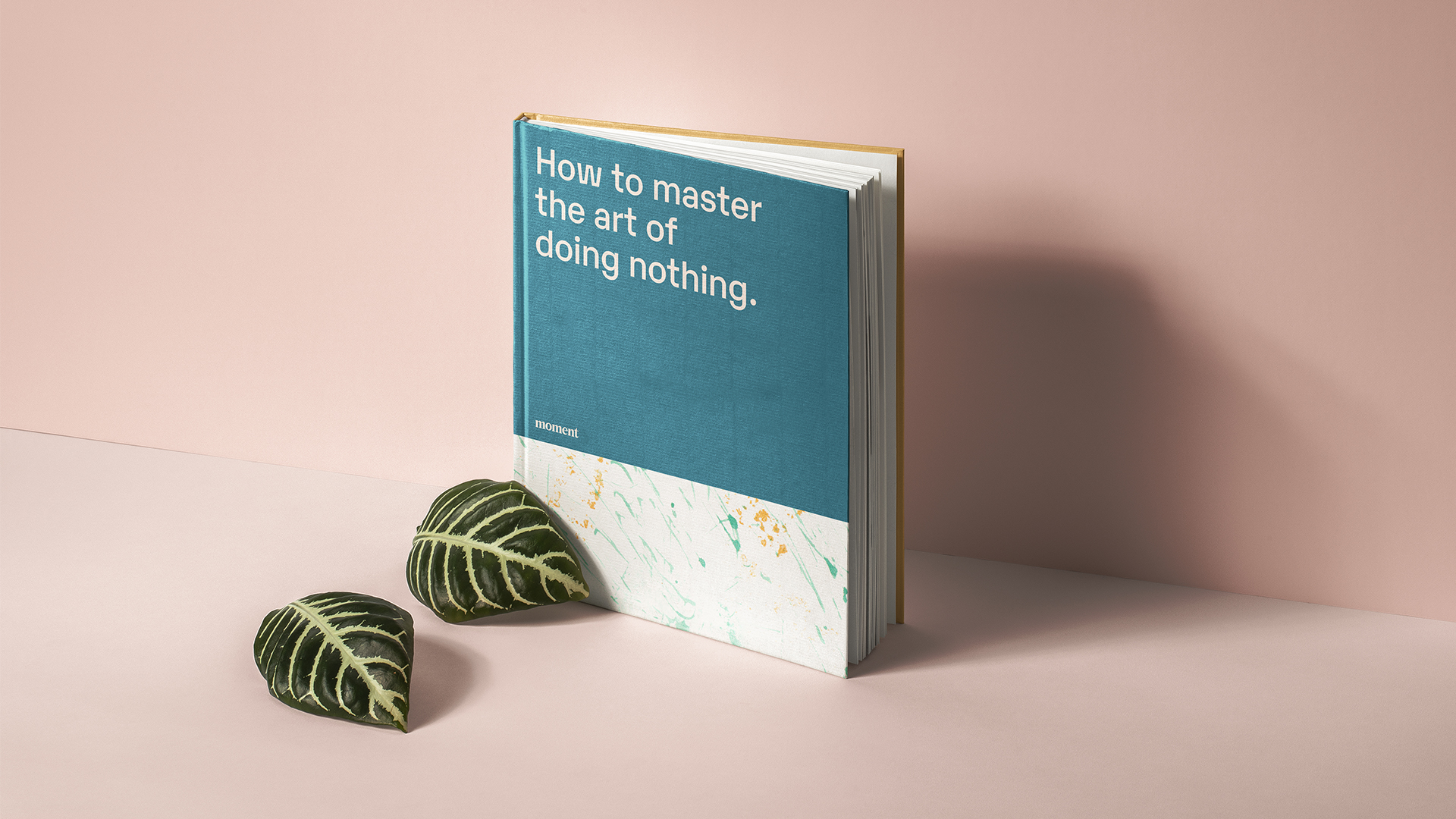
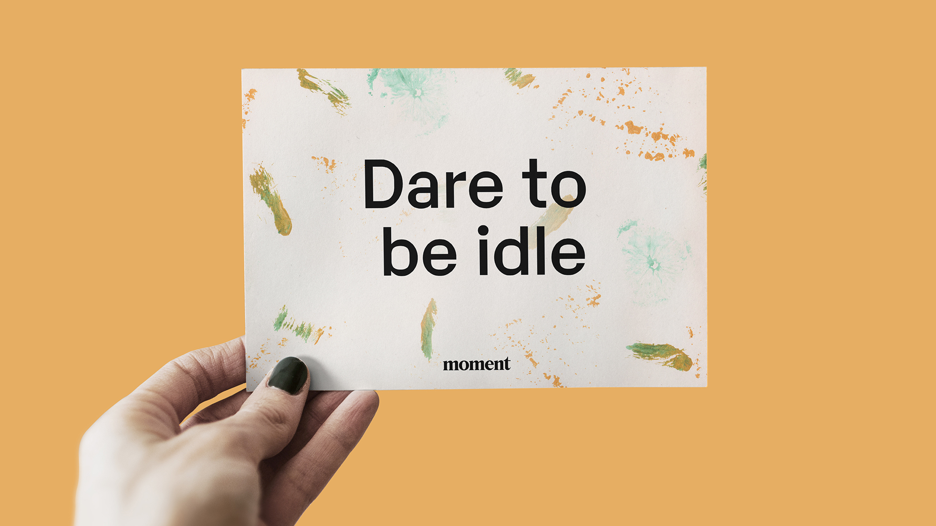
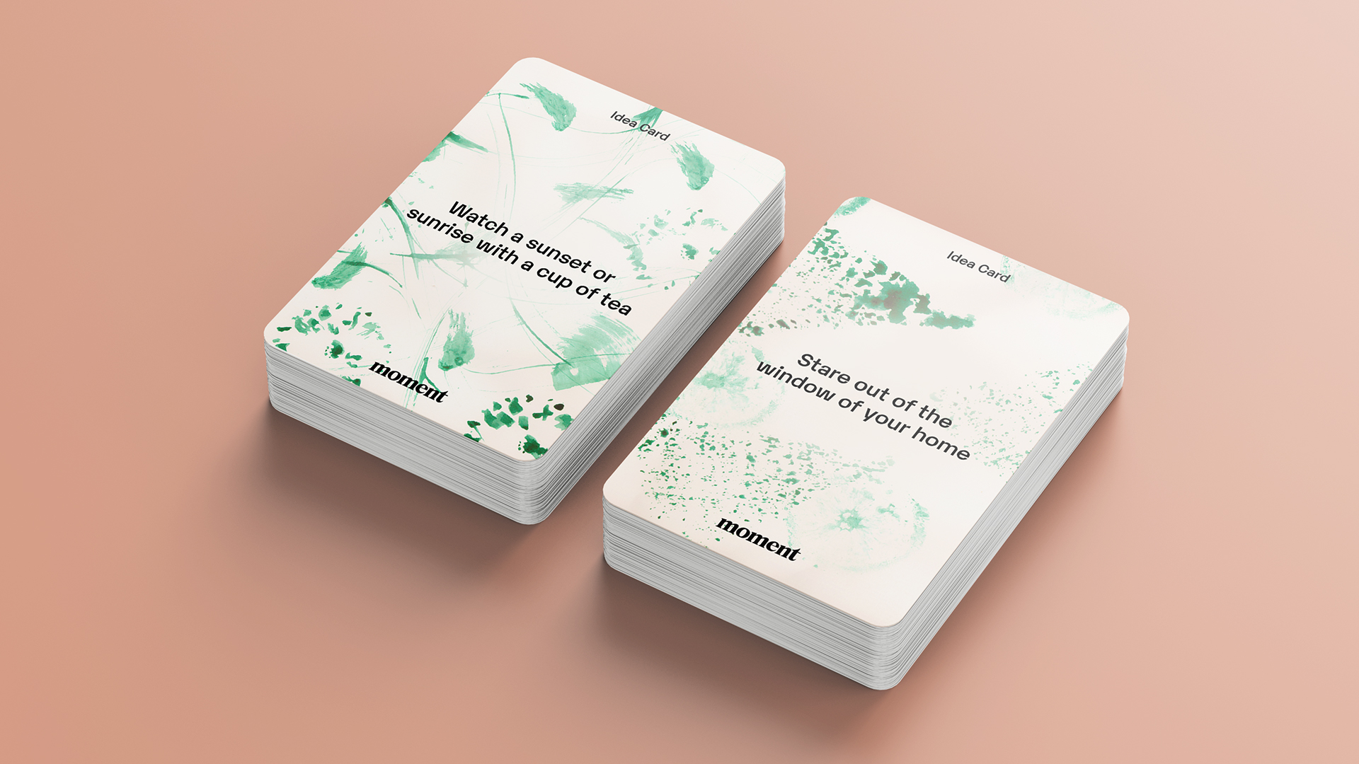
While researching I came across a philosophy which other countries such as Italy, Denmark and China follow called the “The art of doing nothing”. It is all about the essence of doing nothing and enjoying it.
Idea:
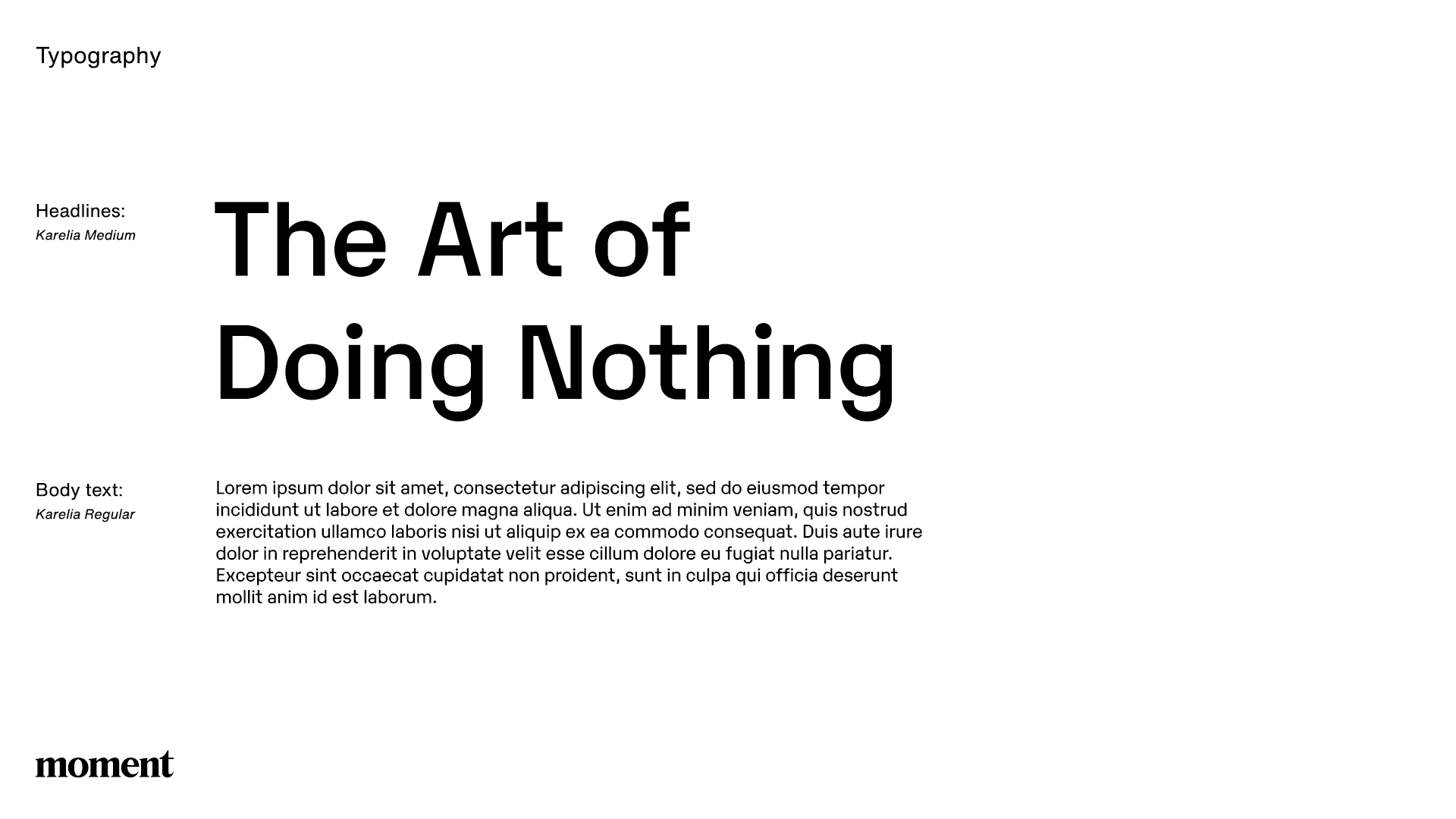
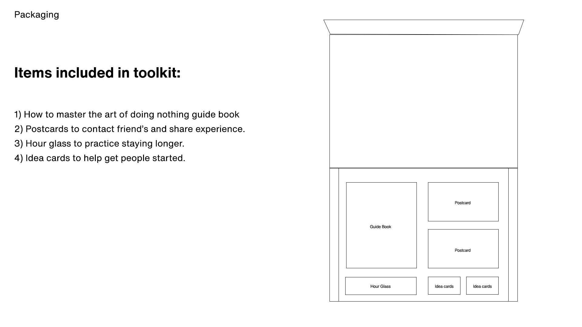
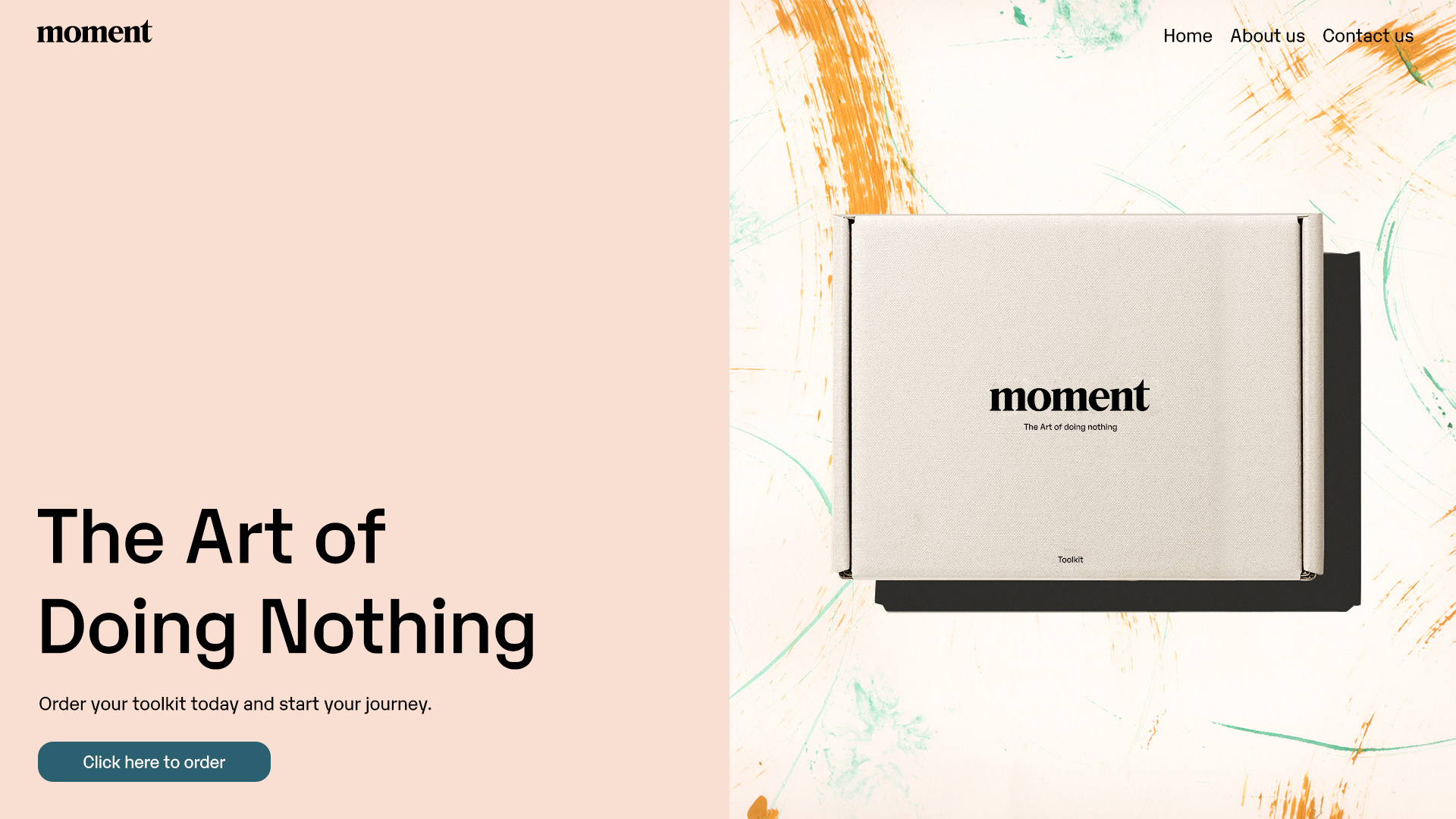
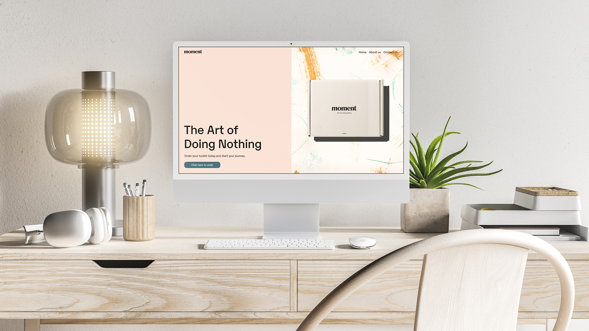
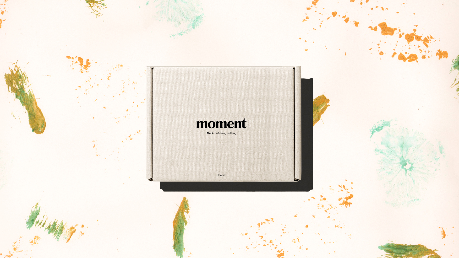
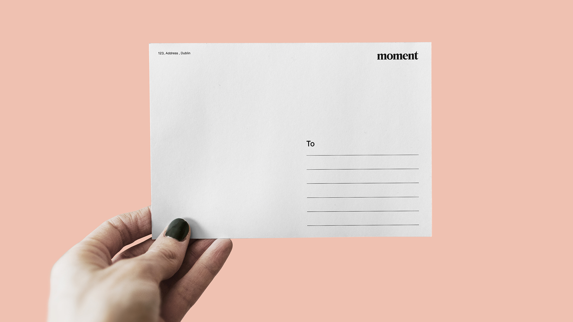
I created the brand Moment around the concept “The art of doing nothing” which helps people learn about disconnecting from life and practice this philosophy to help overcome technology addiction and everyday burnout. Moment will offer a web service where people can order “The art of doing nothing” toolkit which shows people how to use this practice and implement it in their life.
Design
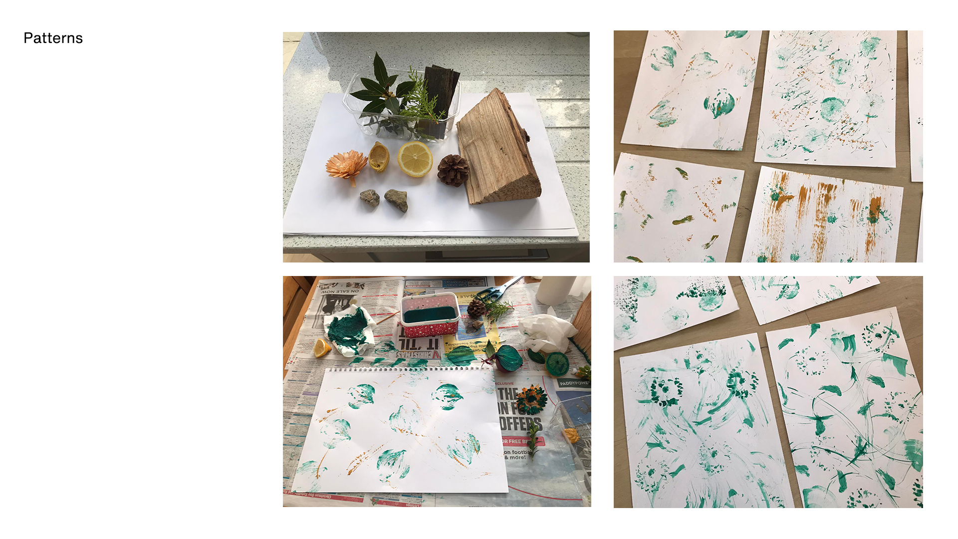
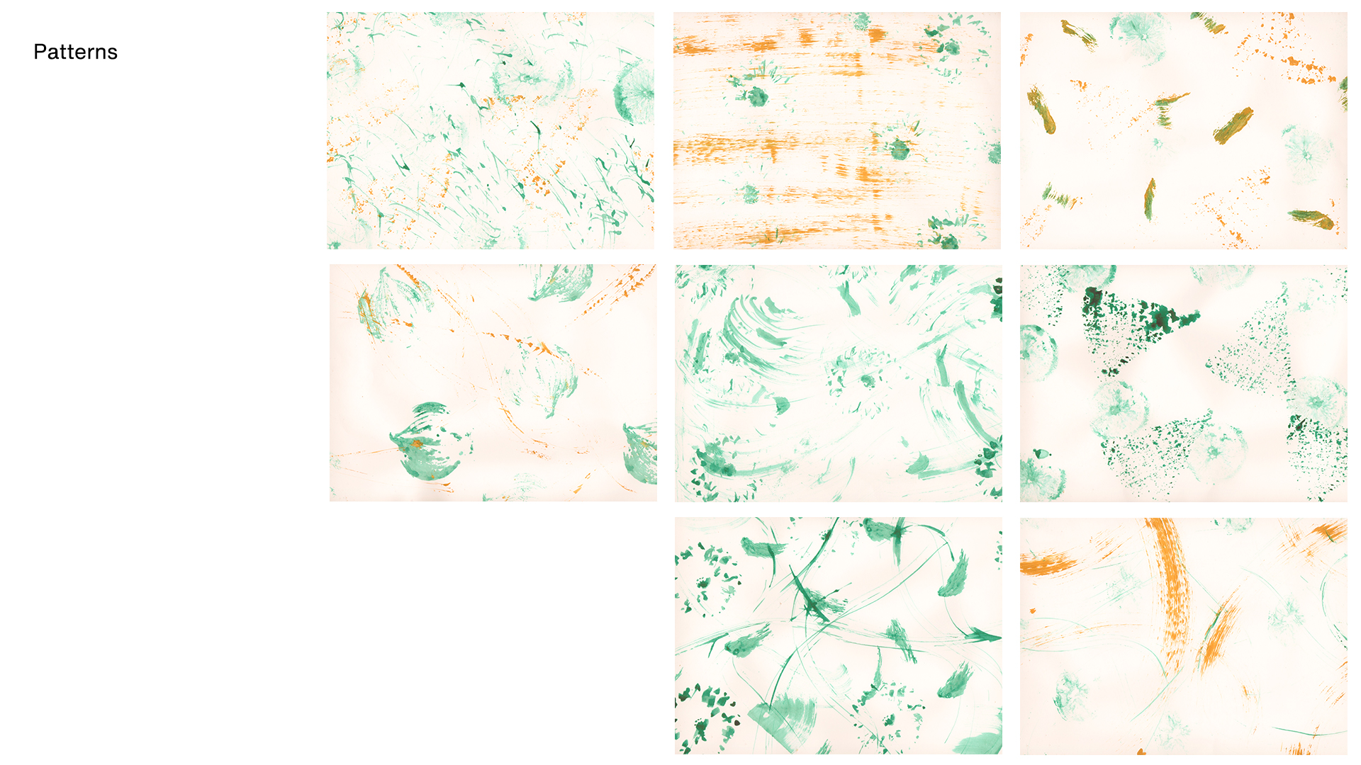
When designing the identity I wanted the brand to feel soft, relaxing and organic. I chose to make hand-made patterns using sticks, plants and fruit to emphasise the idea of getting away from technology and back into the world.
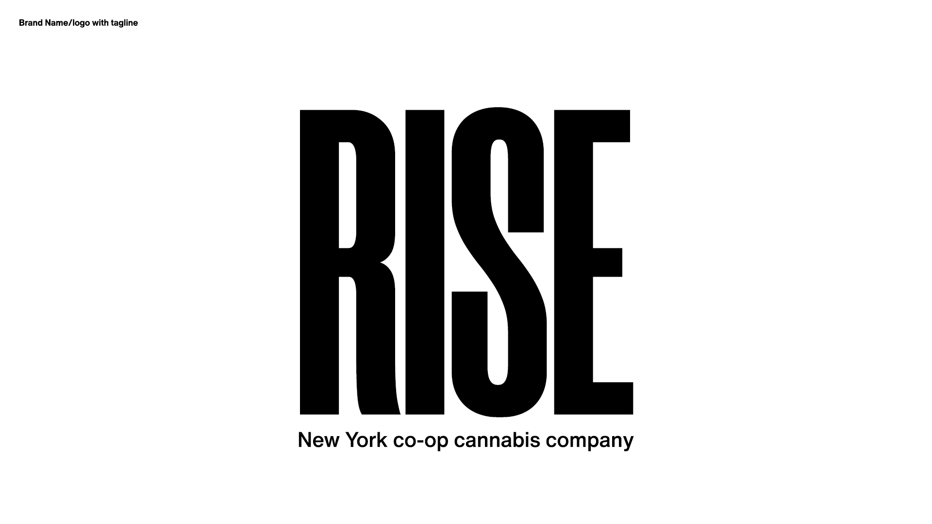
Project 3 | Sustainable environmental graphics
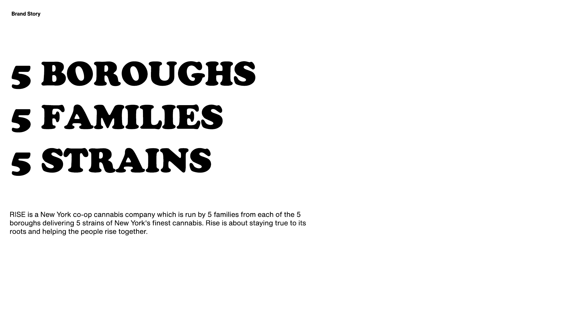
Pentagram challenged us to create a cannabis brand that is true to New York and overcomes stereotypes and establish scalable design systems that communicate a newer meaning for the industry.
Research
While researching the cannabis culture in New York I came across an interesting insight: “The state’s first 100 to 200 marijuana retail licenses will be reserved for “social equity” applicants, namely New York residents with marijuana-related convictions. Almost 90 percent of those arrests were for lower-level offenses. That’s the individual getting arrested for a single joint or a small baggie. As result for these convictions New Yorkers were ineligible for federal student loans and made it more difficult to find a job or open a business.
Concept
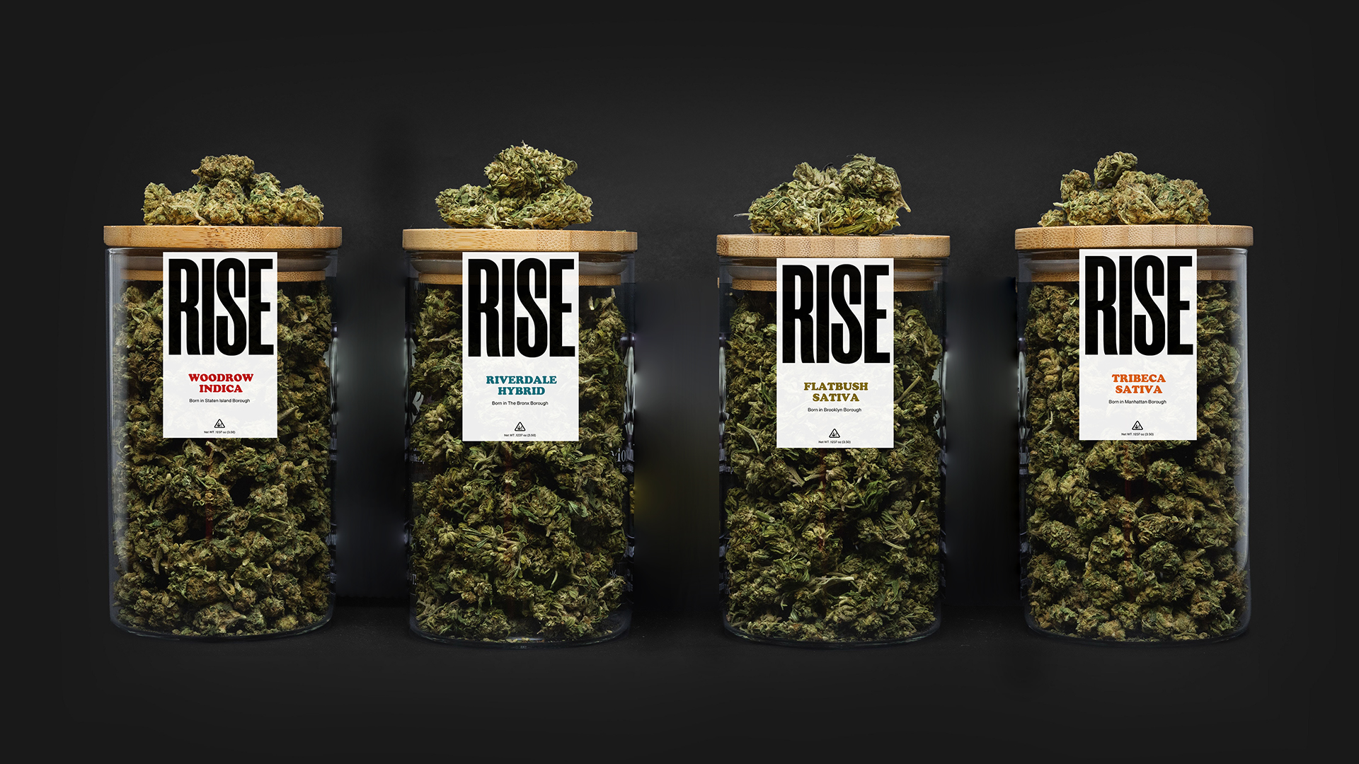
Create a New York cannabis co-op brand where the people from each borough given the first cannabis vendor licenses that were convicted could come together and make one umbrella brand working together. The brand will deliver different strains of New York cannabis.
Design
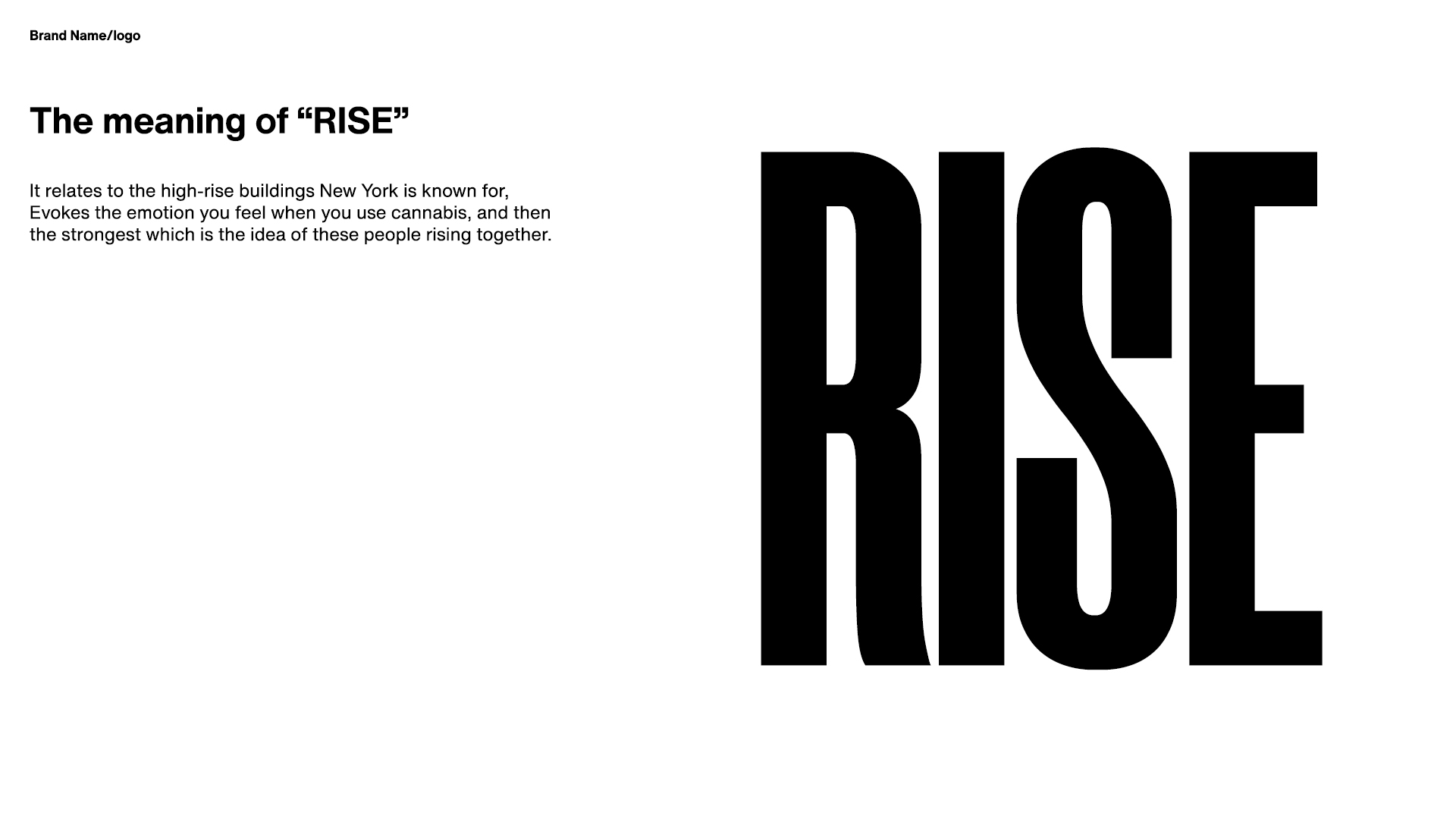
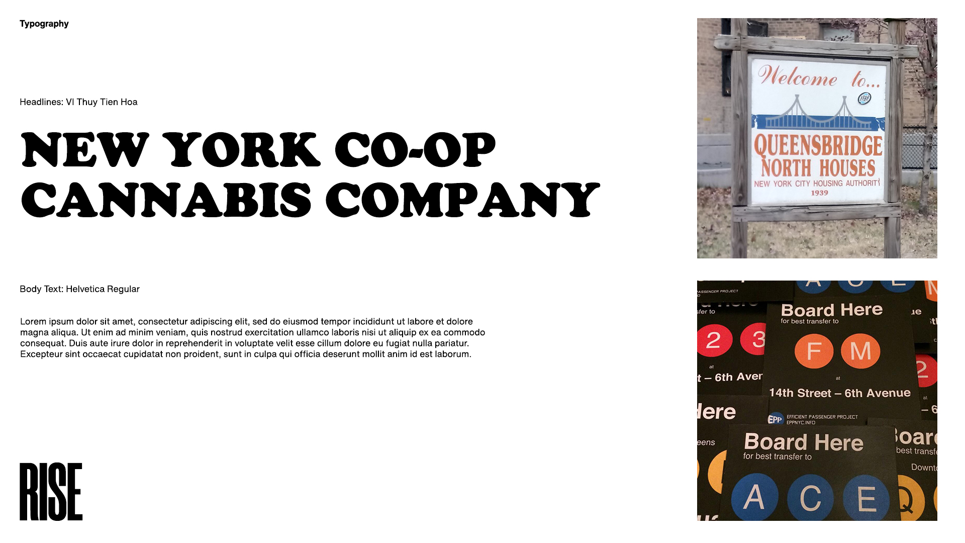
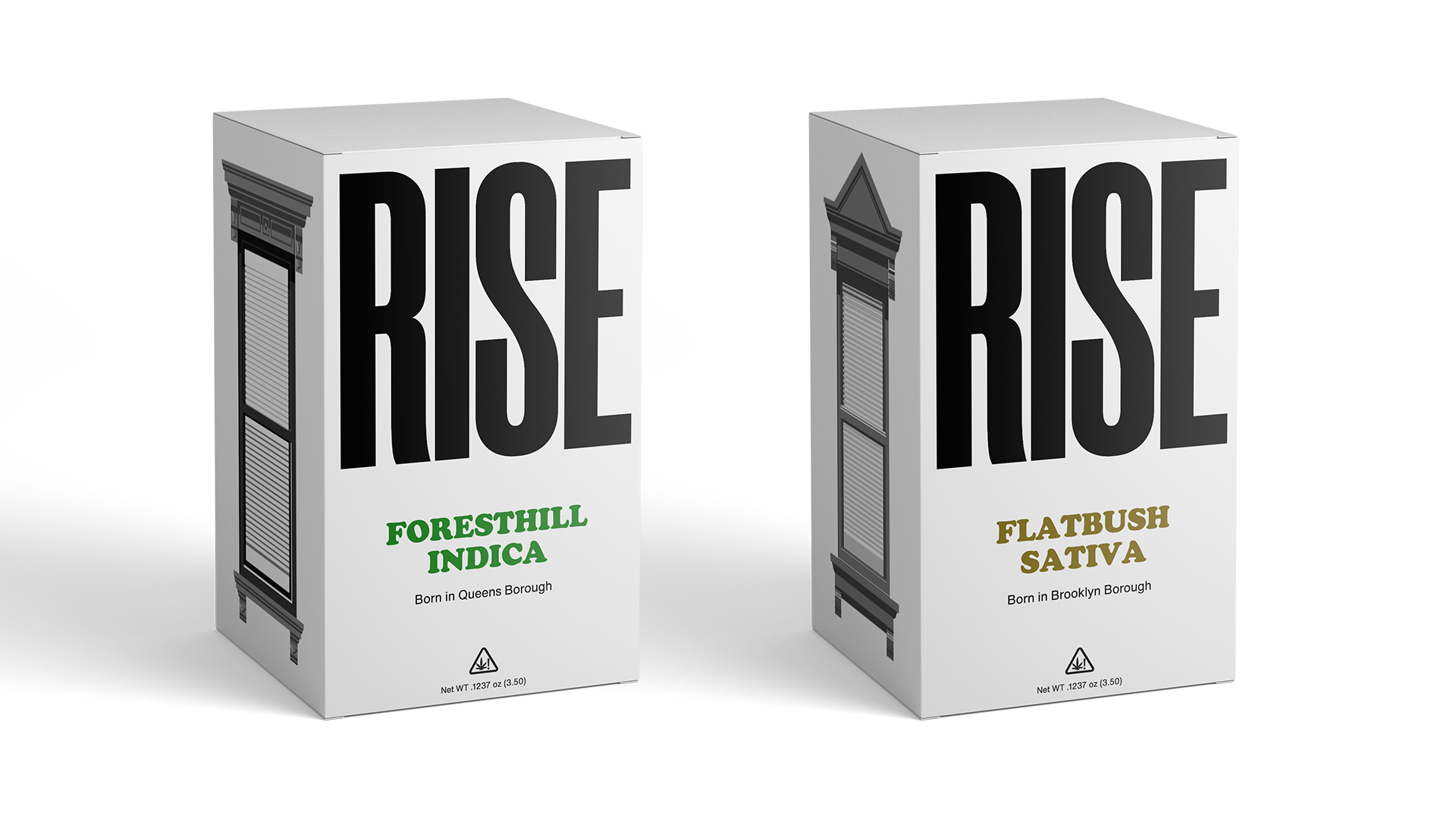
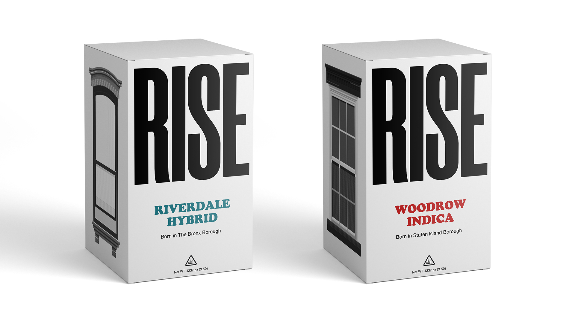
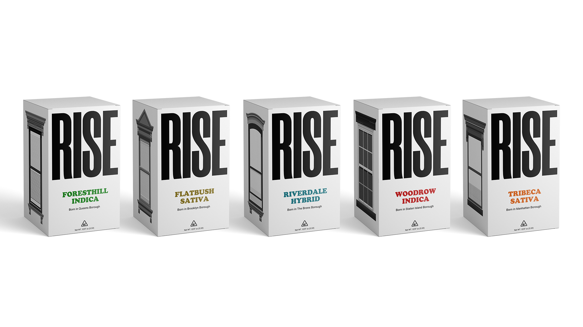
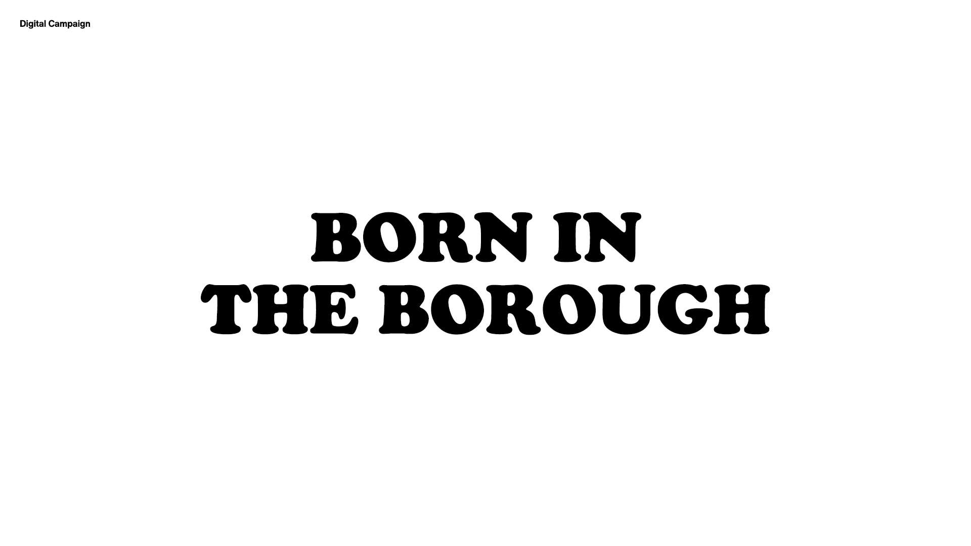
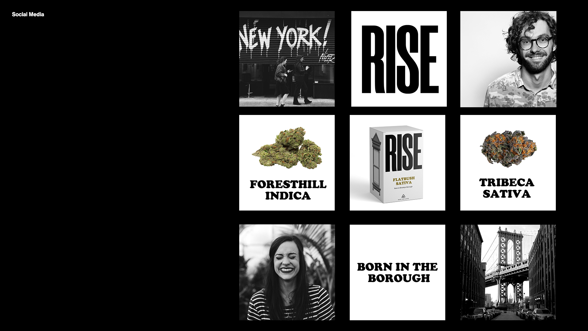
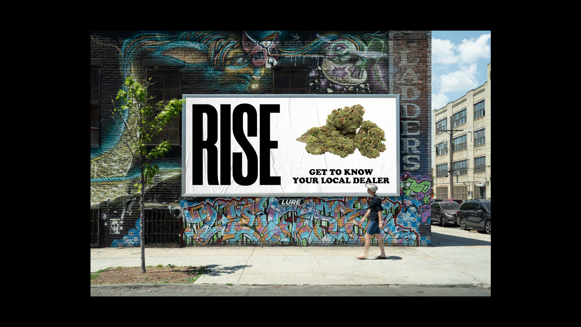
When designing the identity for RISE I wanted it to feel bold and rebelious while alot of the other cannabis brand were going for a premium look and feel I thought this would be a good way to capture the essence of New York and stand out.
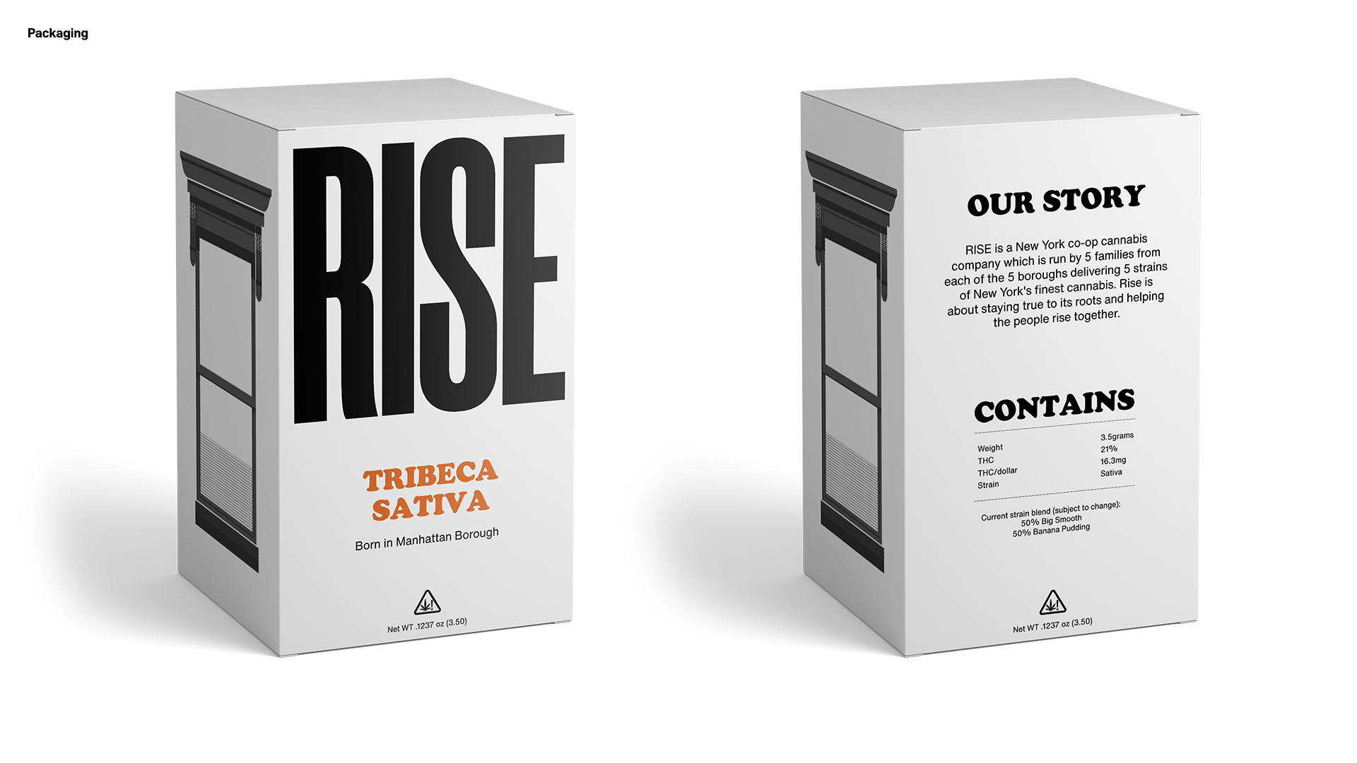
For the packaging the typography for each strain is inspired by signs that are used around buildings in New York. Each strain is named after a place in each of the 5 boroughs. As each borough has it’s own unique character and buildings I wanted each different strain to have it’s own different style of window on the side. This also plays into the idea of wanting to keep the box rather than throw it away. You can also stack each box onto eachother to create your own
high rise building.