Eoghan McMahon | Design
My name is Eoghan. I graduated from NCAD in 2019 having completed my Product Design Degree and a semester in Rome University of Fine Art studying spatial design. Since then I have been working in the print and graphic design industry. My approach and purpose in design is to challenge the preconceptions we have with our outcomes and materials, and to create playful, memorable and beautiful projects. My work has been shortlisted at the Irish Design Awards and is highly commended by my mother!
Project 1 | CI Studio
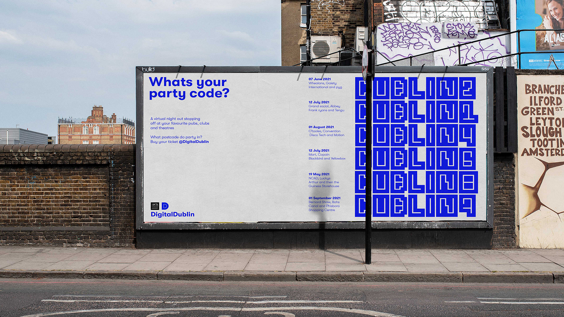
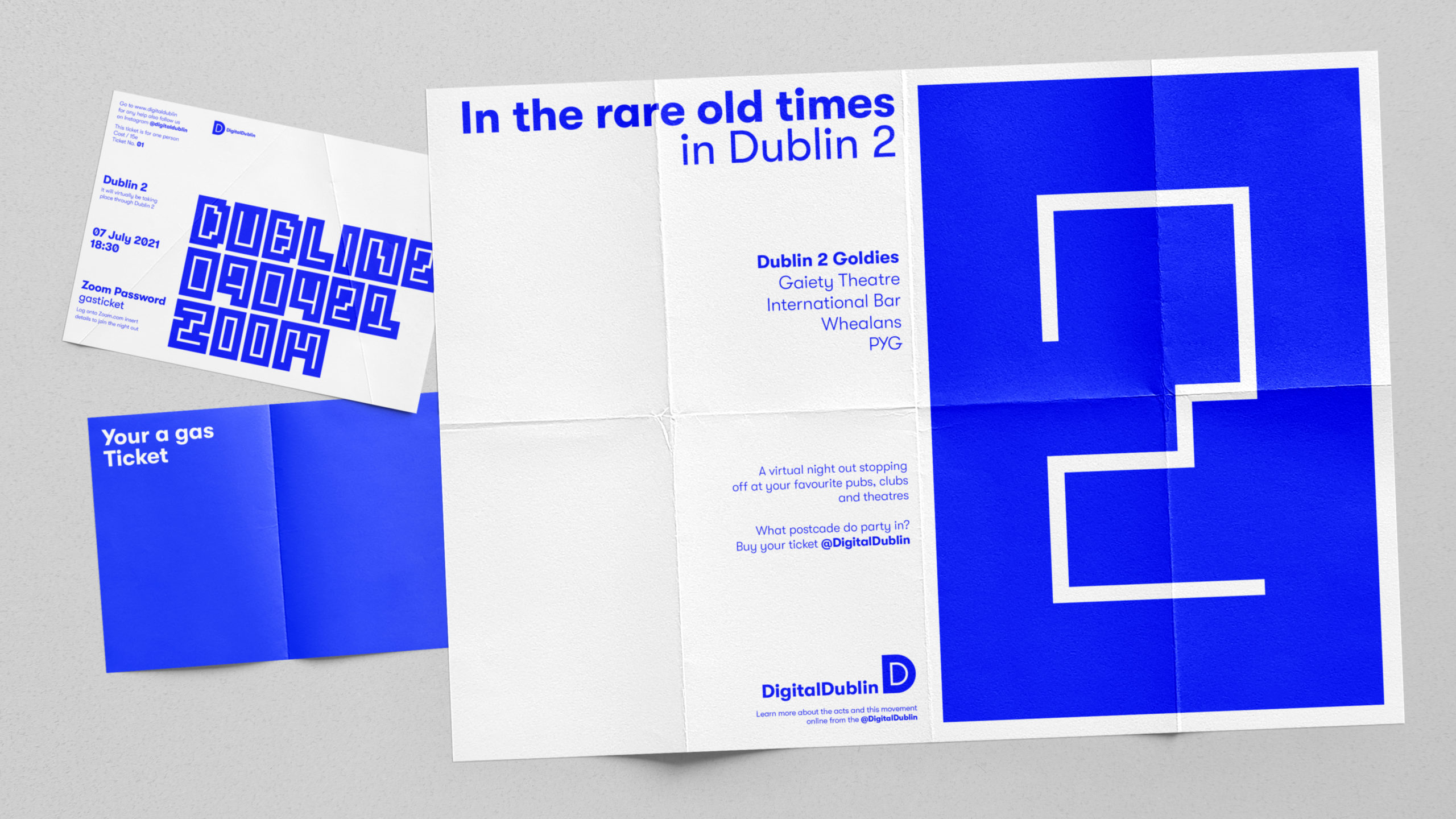
The Covid–19 pandemic has stolen the craic to Dublin’s evening heartbeat, ‘Digital Dublin’ is here to help in it’s revival. An initiative supported by the Irish Arts Coucil aims to bring the together different sectors of the arts and entertainment industry.
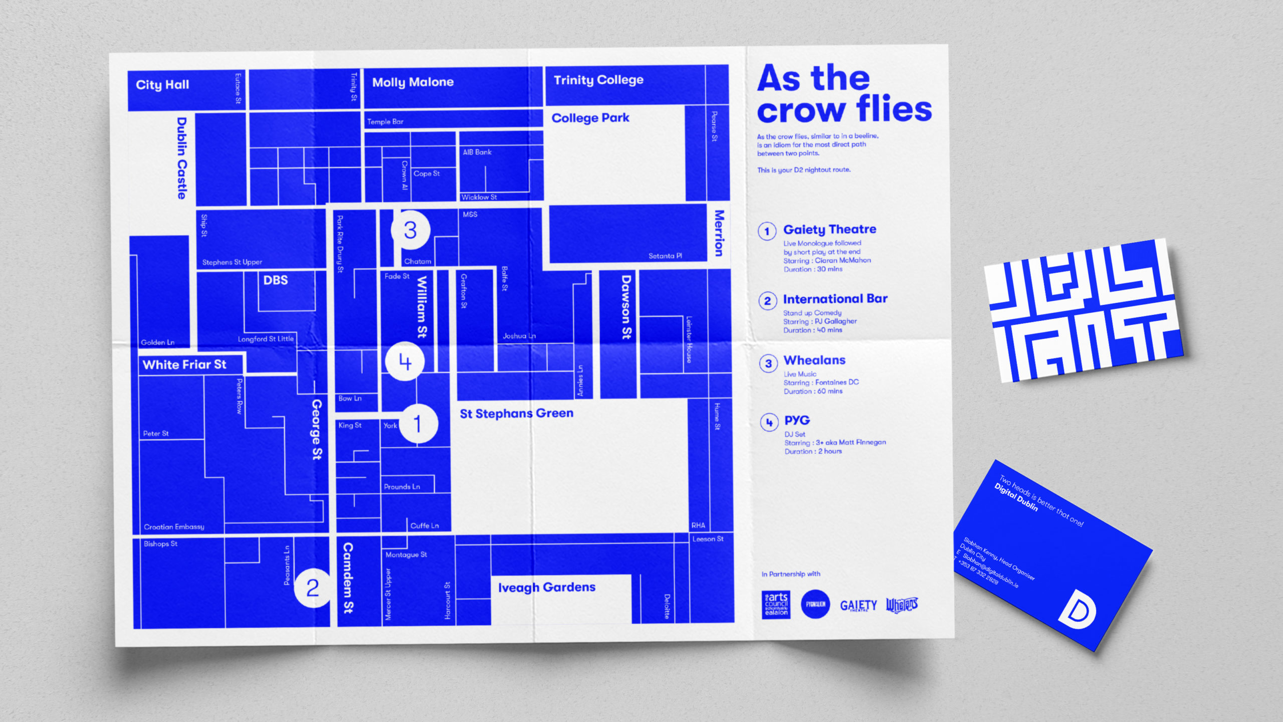
Night outs are organised digitally, and curated to bring you through your favourite entertainment
hot-spots. The patron can go from a live show in the Gaiety to music at Whealens, stand up at The
International bar to a live DJ set at Workmans.
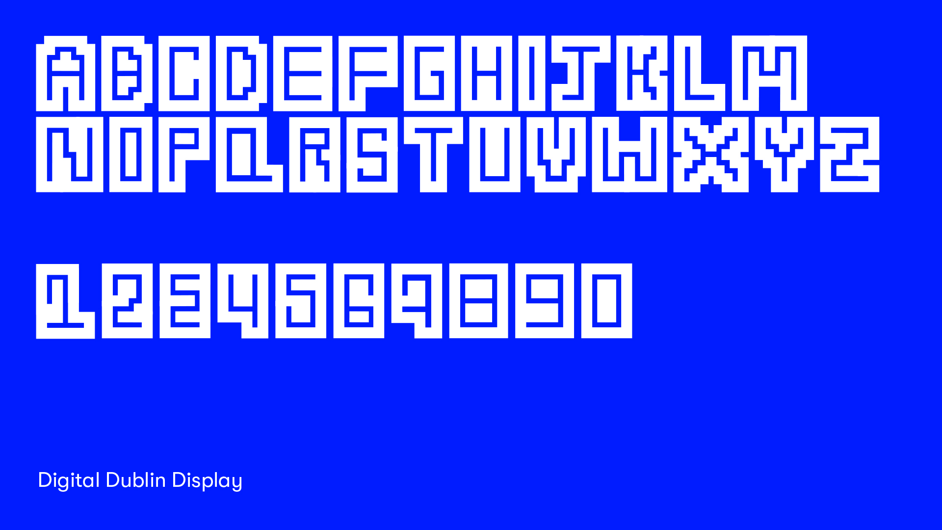
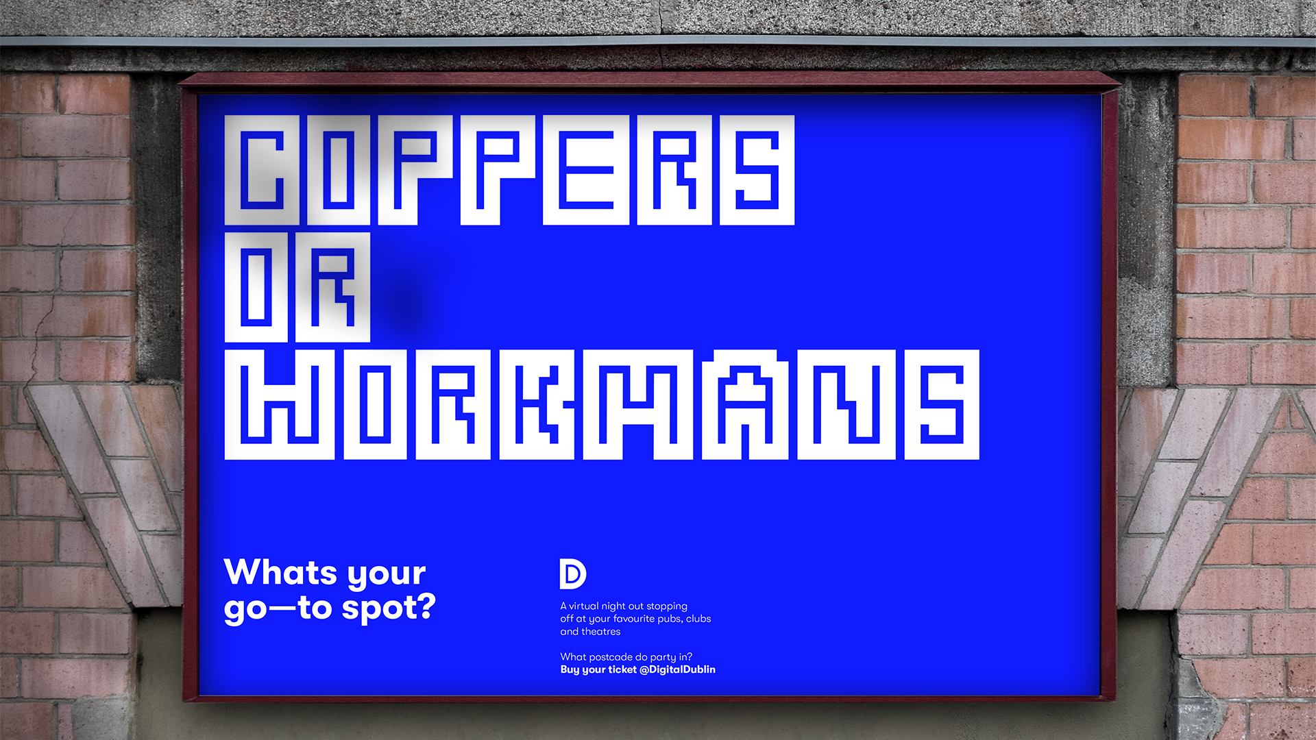
Royal azure blue palette, a bespoke typeface inspired by Dublin’s streets and a Irish-Dublin colloquial language for the copy form the identity for ‘Digital Dublin’.
Many of us mindlessly scroll through our social media feeds everyday, achieving little or no productive
satisfaction. This habitual and time-consuming activity can lead us to feel anxious or depressed.
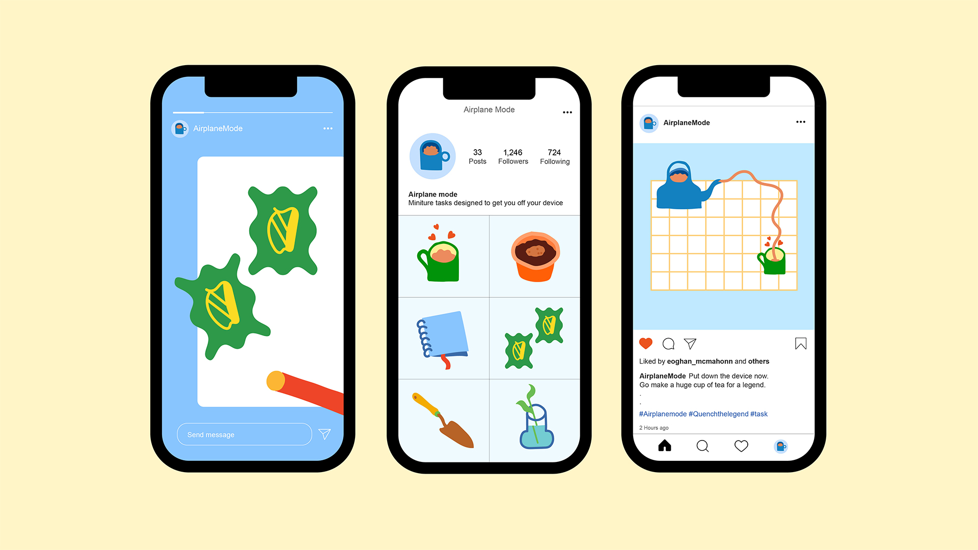
‘Airplane mode’ is an Instagram led campaign that challenges you to interact with the physical world.
By sending out miniature playful tasks, this nudges the user to come off their device and to mindfully Interact with the real world.
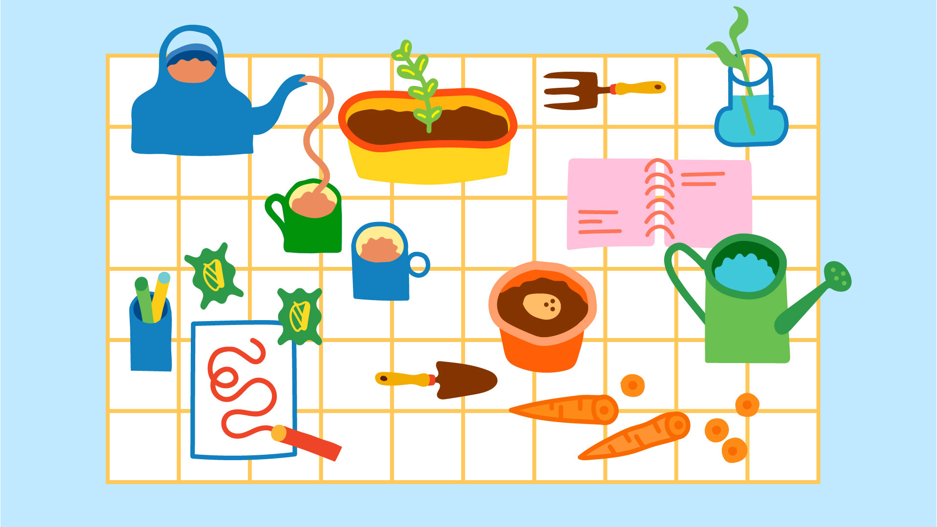
A soft colour palette assisted with playful illustrations form the identity for this campaign.
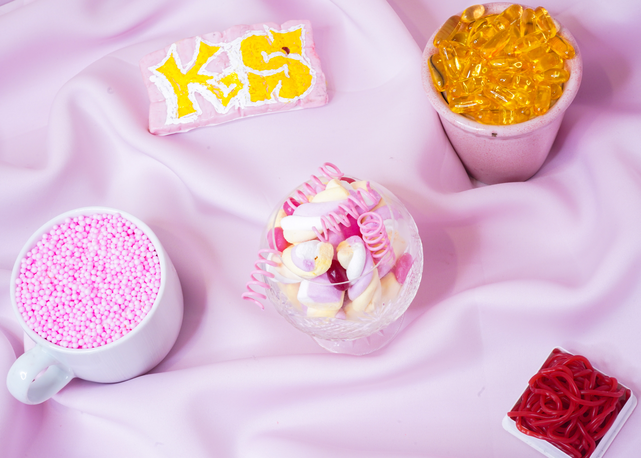
The abstract Self Portrait thoughtfully curated through objects, is set inside my stomach. Each cluster of objects represents five attributes that make up me. Family. Friends. Work. Spirituality. Well-being. The pink balls contained in the mug represents the countless conversations shared over a cup of tea with my Family. The others objects are open to your individual interpretation.
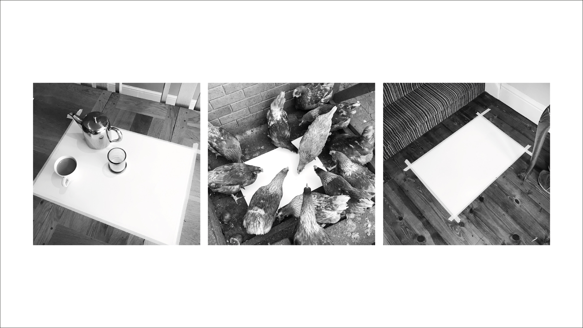
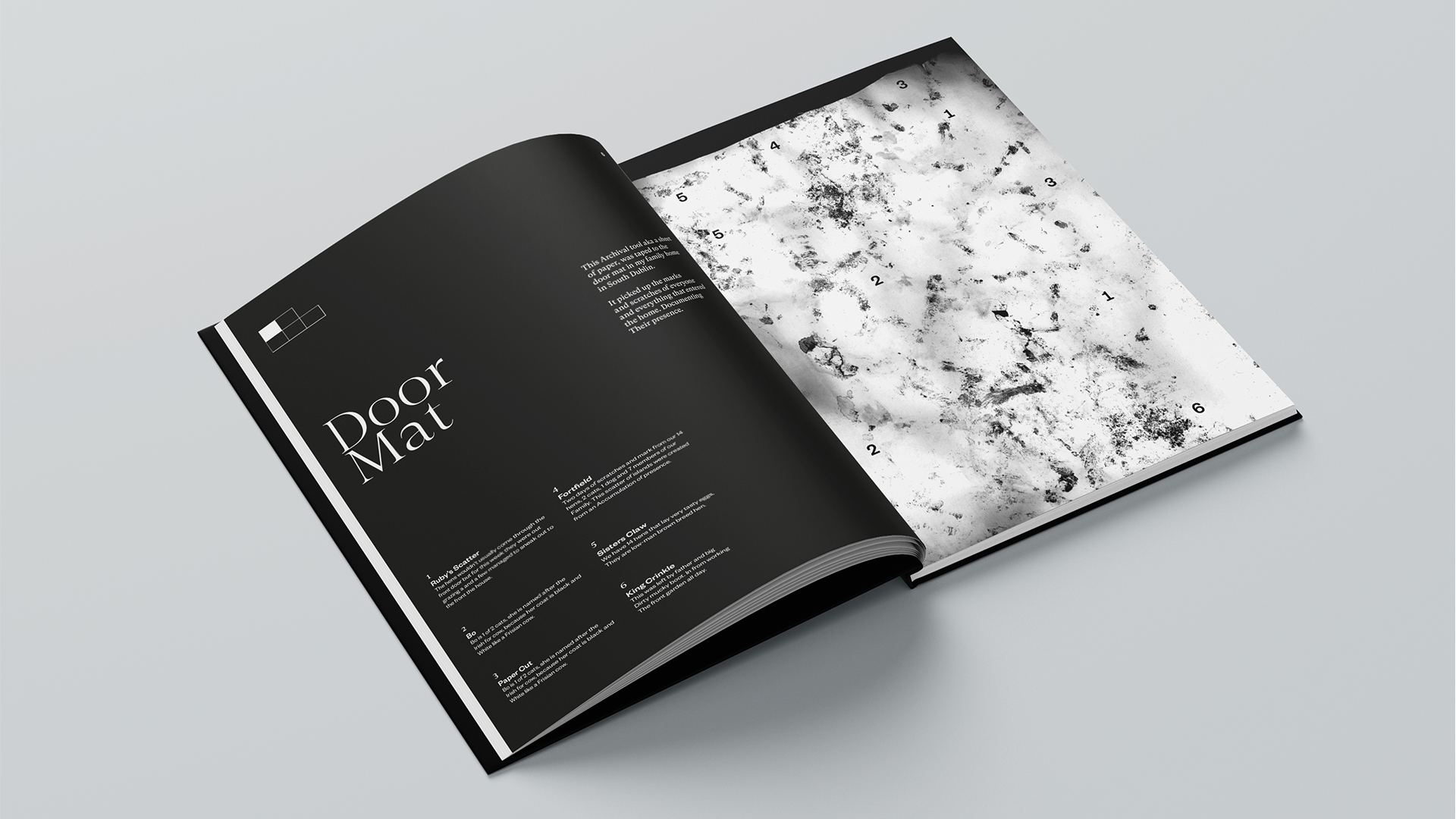
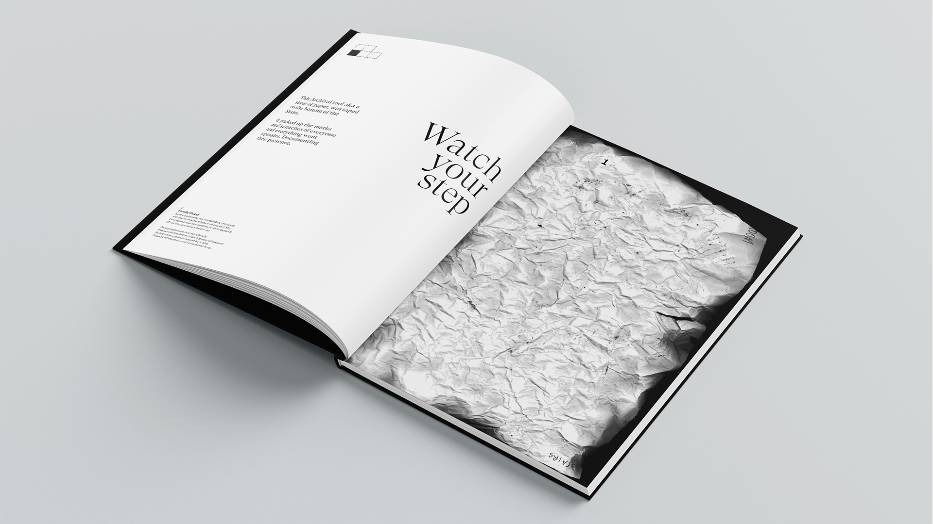
Walls with windows and doors form the house, but it the space between them that makes the essence of the home. I wanted to capture home life over time in an abstract way, so I used an archival tool–A2 sheets of paper. These A2 sheets of paper placed around the hot-spots of the home captured representations of time through living. Scratches, tears and markings communicated this living.
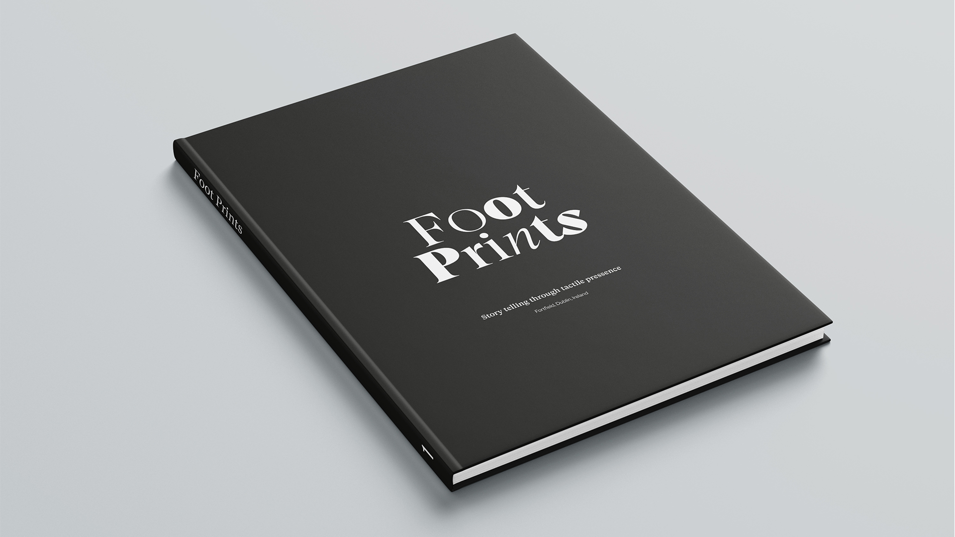
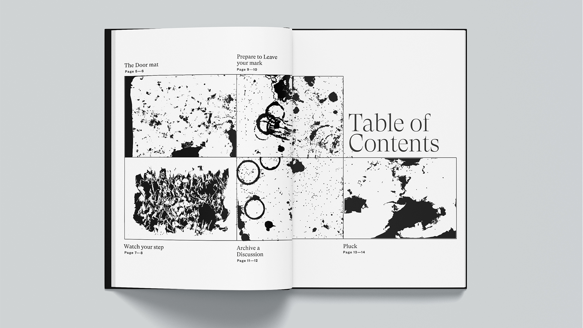
I scanned in the representations and translated the stories of the markings into an Atlas inspired 20pp A4 hardback booklet. A greyscale palette and serif typeface form the book’s identity.
