Emily Torpey
Emily Torpey | Design
Hi! I’m Emily Torpey, a Dublin based graphic designer, currently working at Bradley: The Brand Agency. I am passionate about branding, logo design, motion, concept development and illustration/image making. I graduated from IADT visual communications in 2020, with a first class honours. If you’d like to chat or see more bits and bobs, my insta is @emily_torpey_designs and my email is [email protected]!
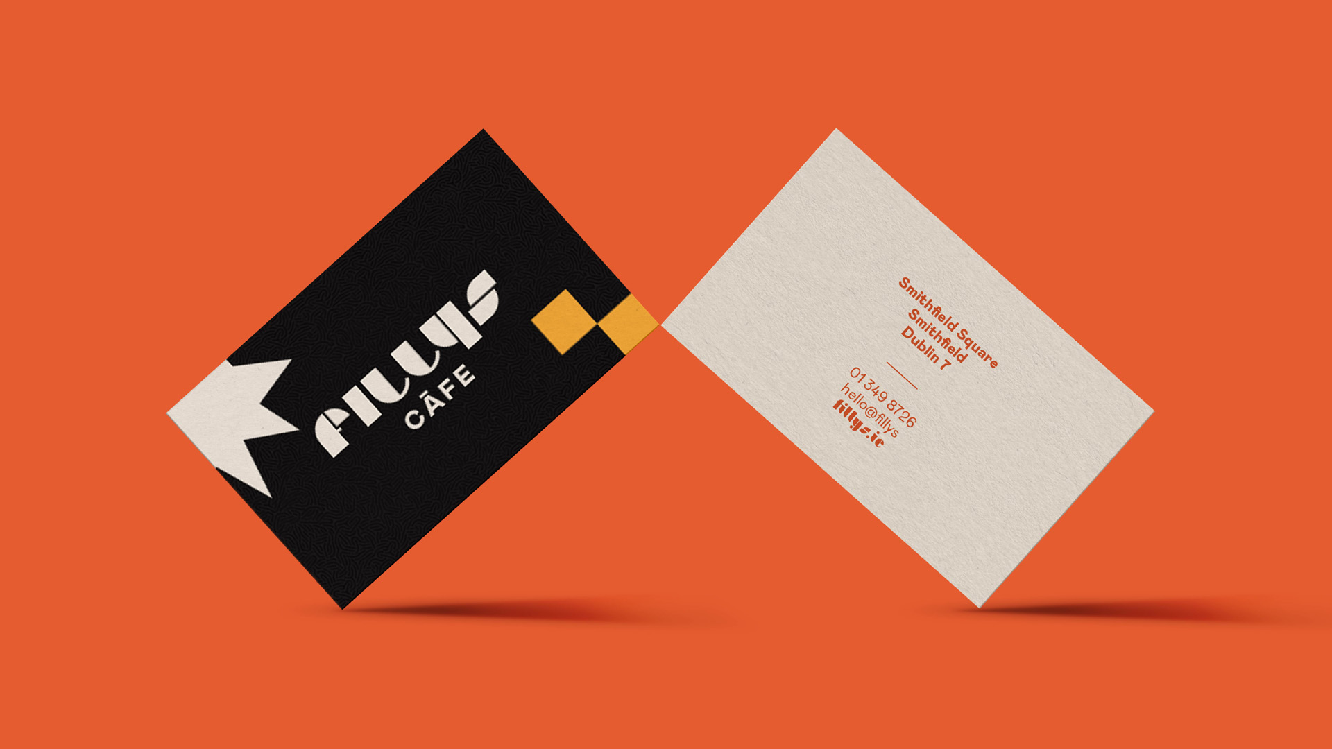
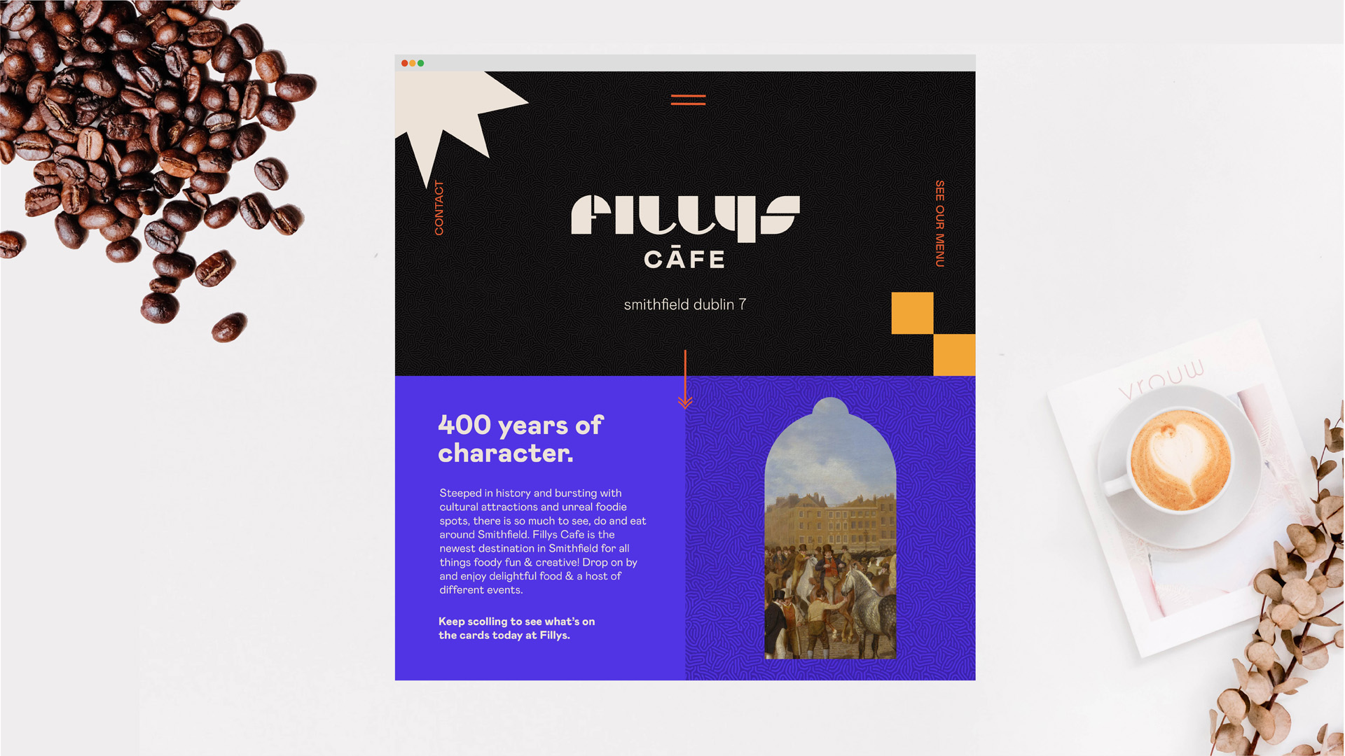
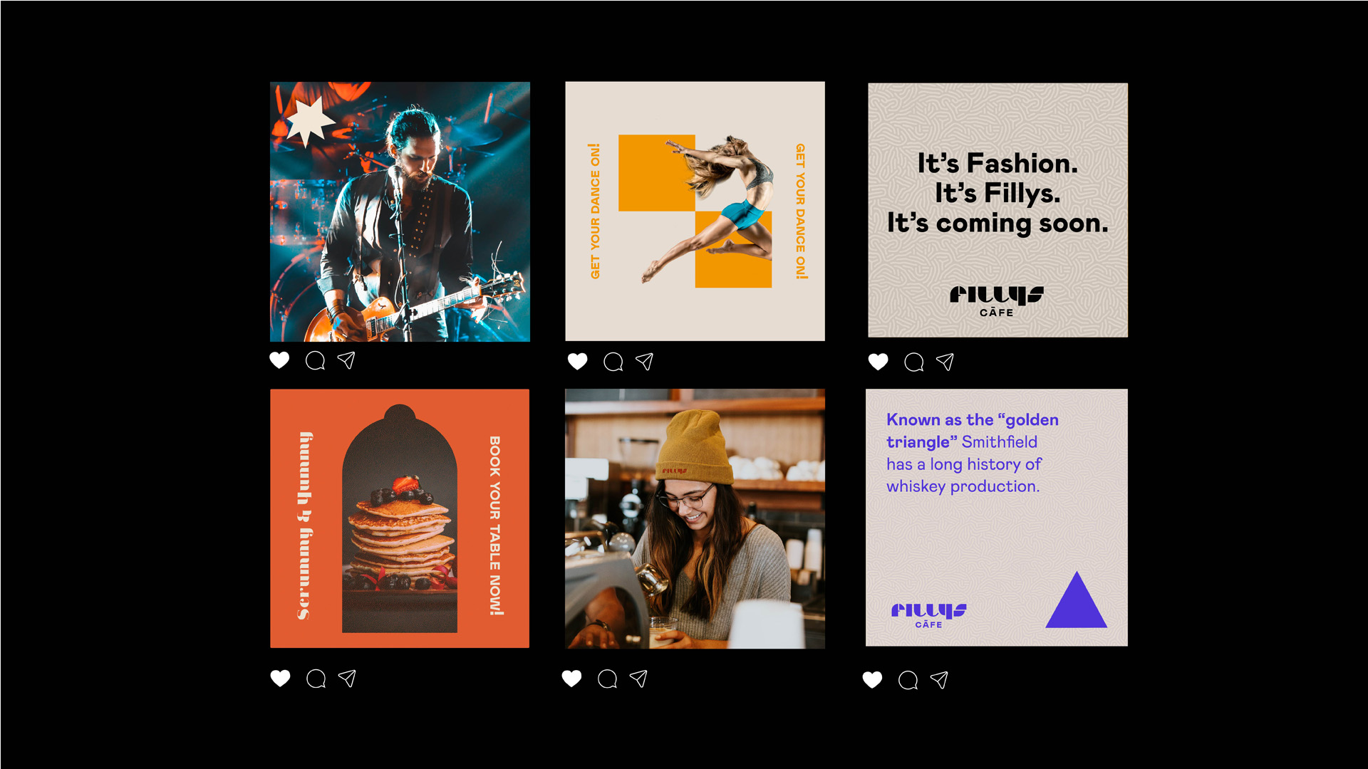
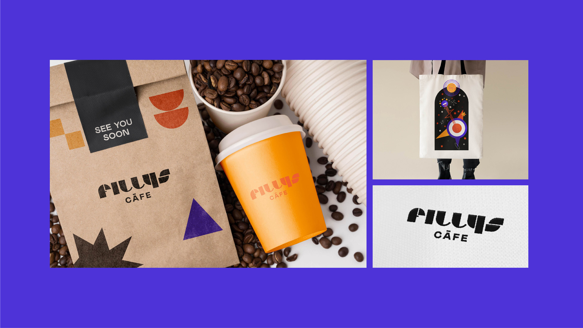
Project 1 | Filly’s Cafe
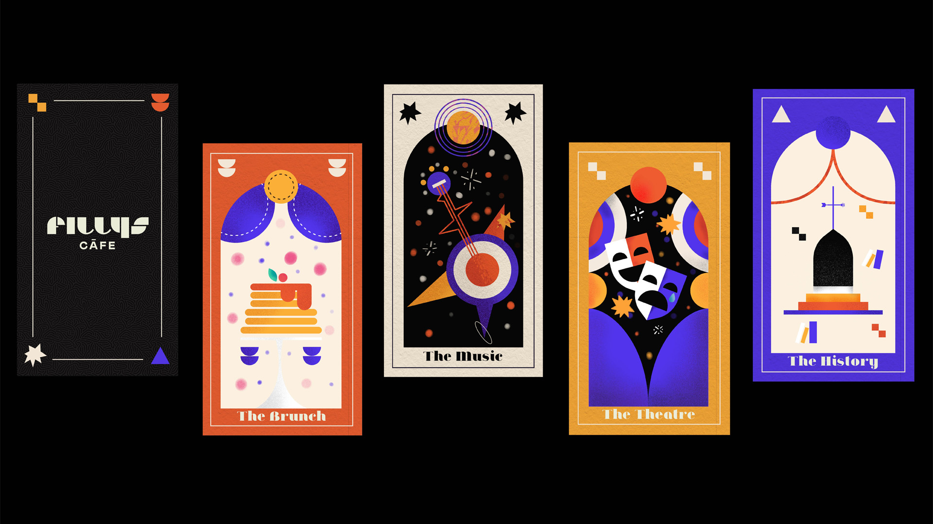
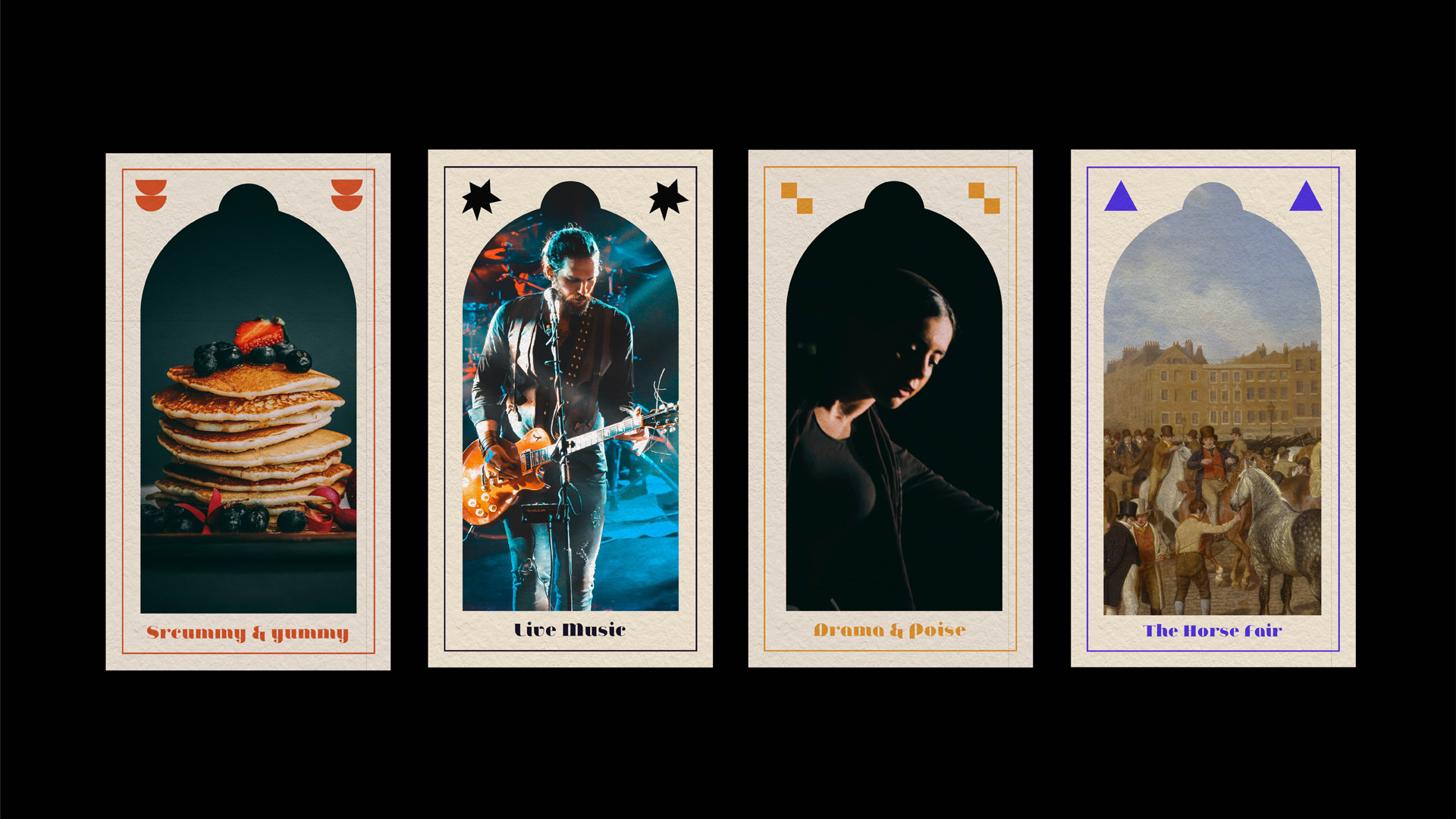
Red Dog tasked us with creating an identity & visual language for a new creative cultural cafe bar in Smithfield Dublin, an area that has been newly developed in recent years. After researching the area, I chose the name Filly (a reference to the areas well known love of horses / the horse fair that takes place each year). Also drawing upon Smithfield’s history as a market place / fair, I decided to use the concept of tarot cards to show how fillys is full of surprises and is always hosting a diverse number of events related to the creative arts.
Each card has a unique illustration representing the four types of services / events they hold, music, food, history & performance. The geometric logo, poppy colours & graphic forms plus the copy written, conveys a welcoming,
playful tone for the cafe, in order to feel contemporary & fun.
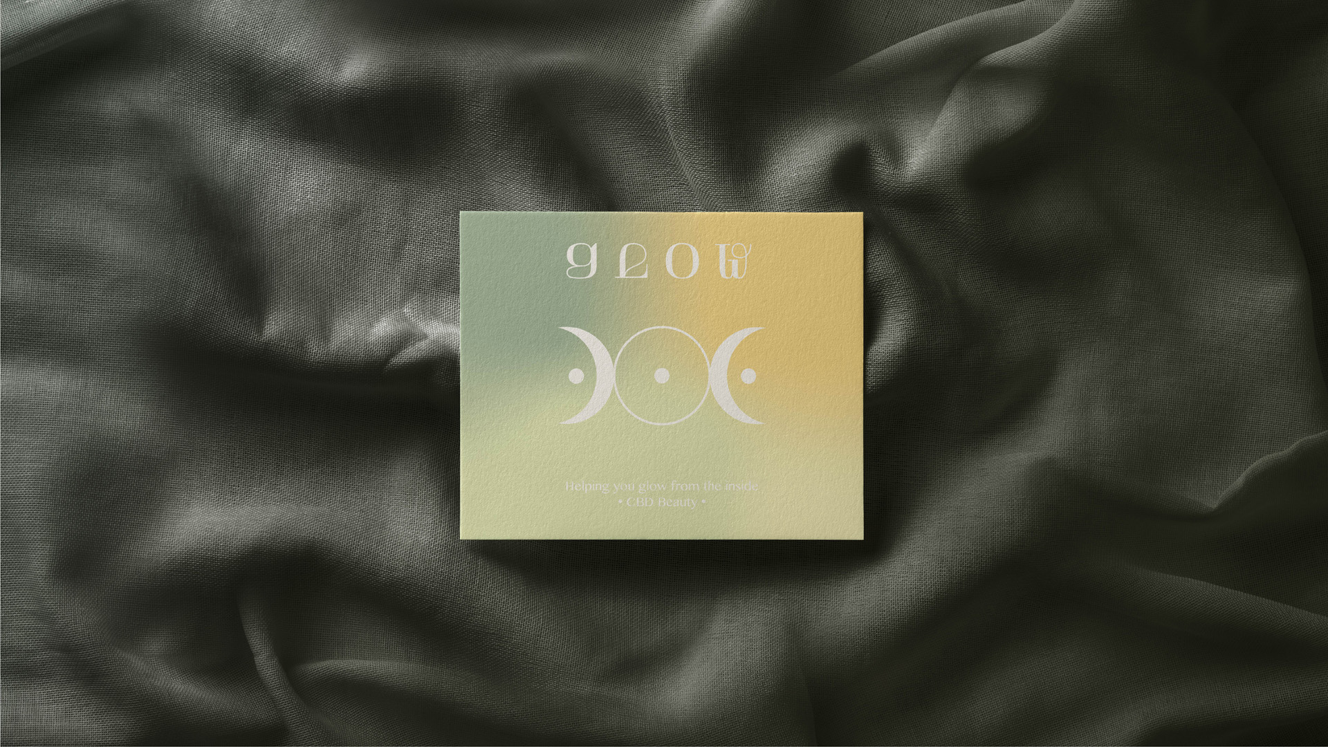
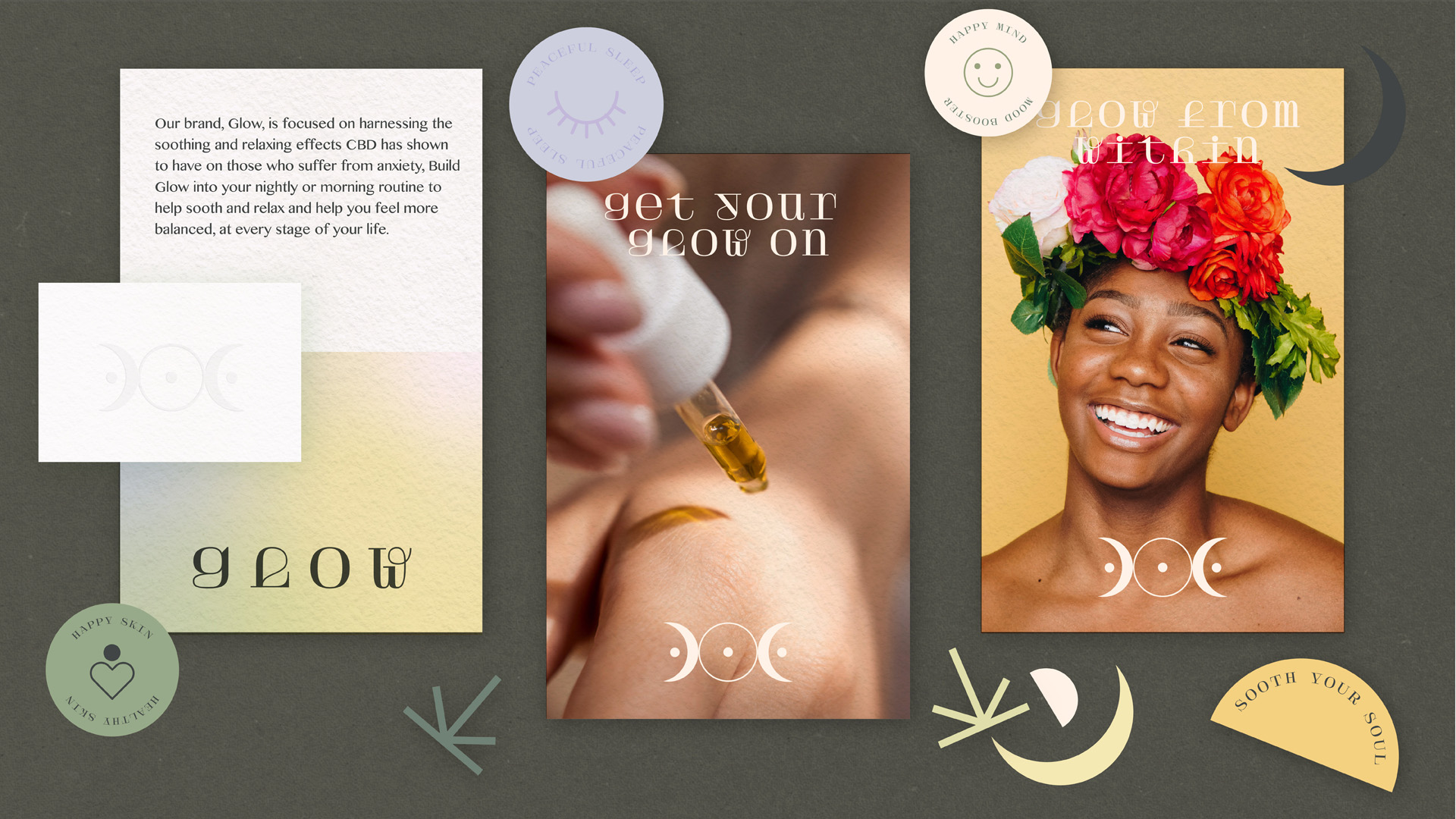
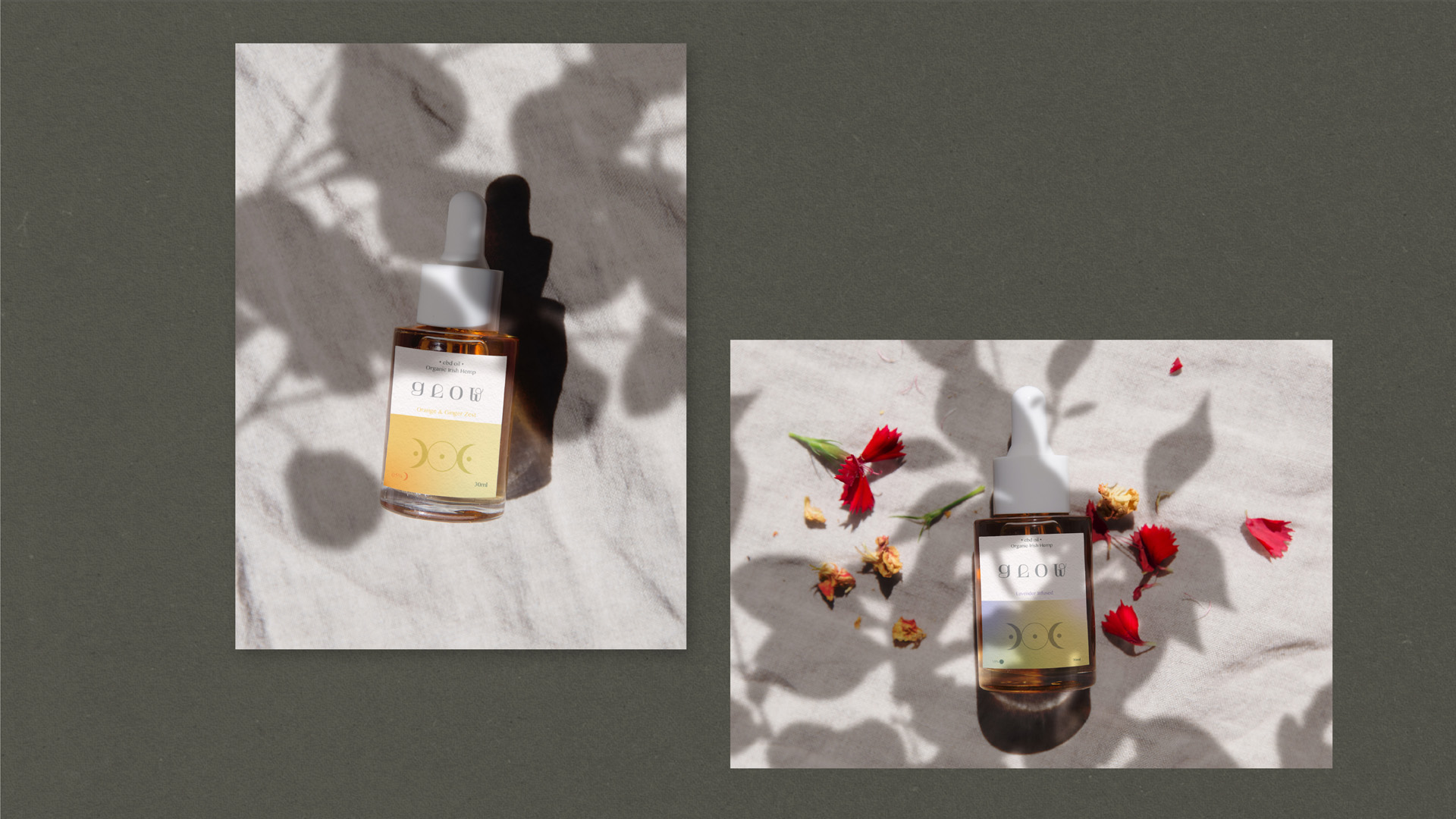
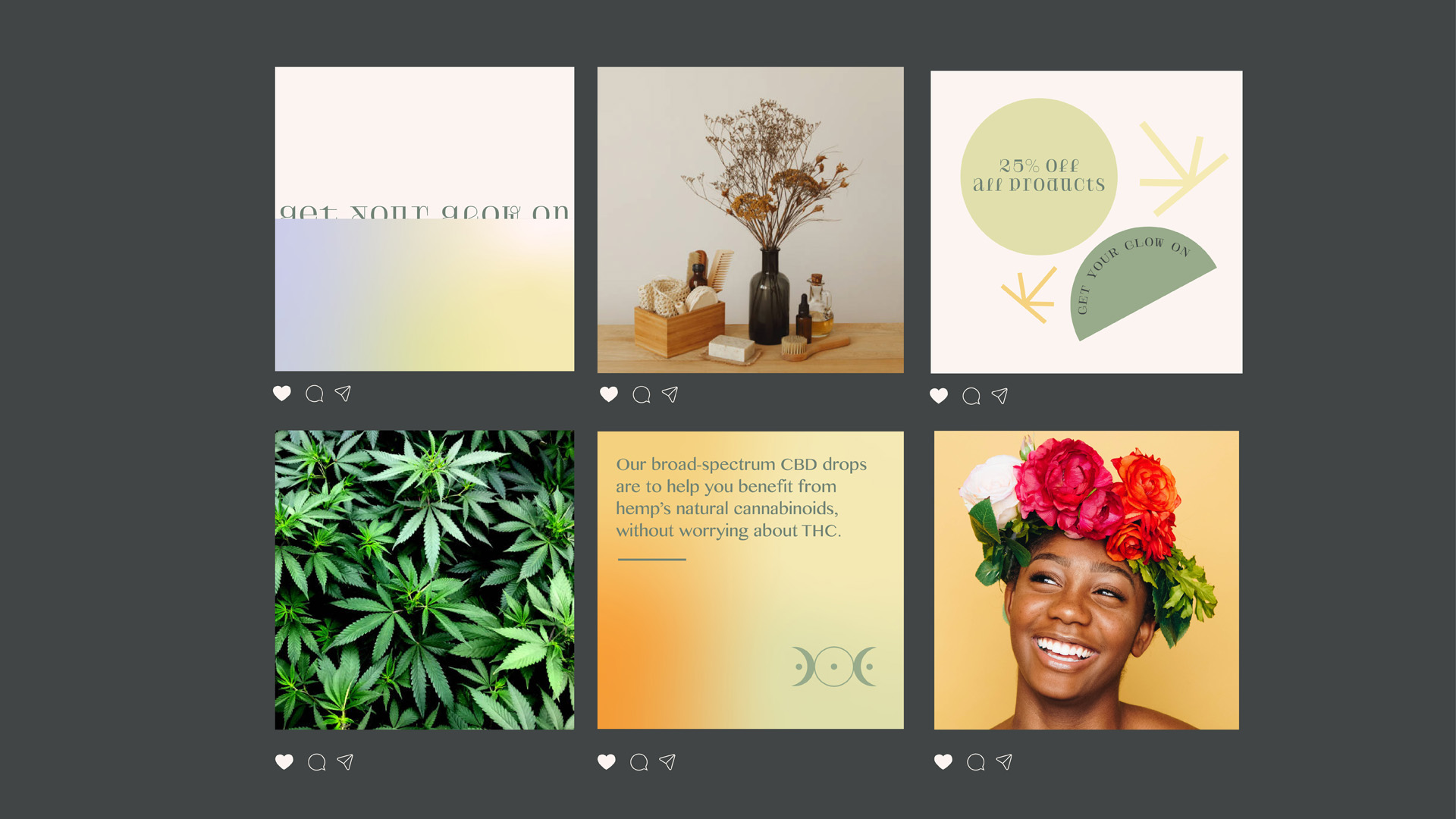
Project 2 | GLOW CBD Beauty
Slater tasked us with the job of creating pack designs for a new Irish CBD beauty brand, without relying on visual cliches associated with cannabis products. After researching existing CBD brands, I found that CBD is known to have soothing effects for those with anxiety & for women suffering with period pain.
With this in mind, I created Glow, an Irish CBD oil which helps woman and those who suffer from anxiety. For the identity, I used soft gradients to reflect the peaceful glow from using the product. The moon symbol, references femininity but also the search for balance. Finally, the supporting language, graphics and the curved logotype reinforces the idea of a gentle, happy and friendly product.
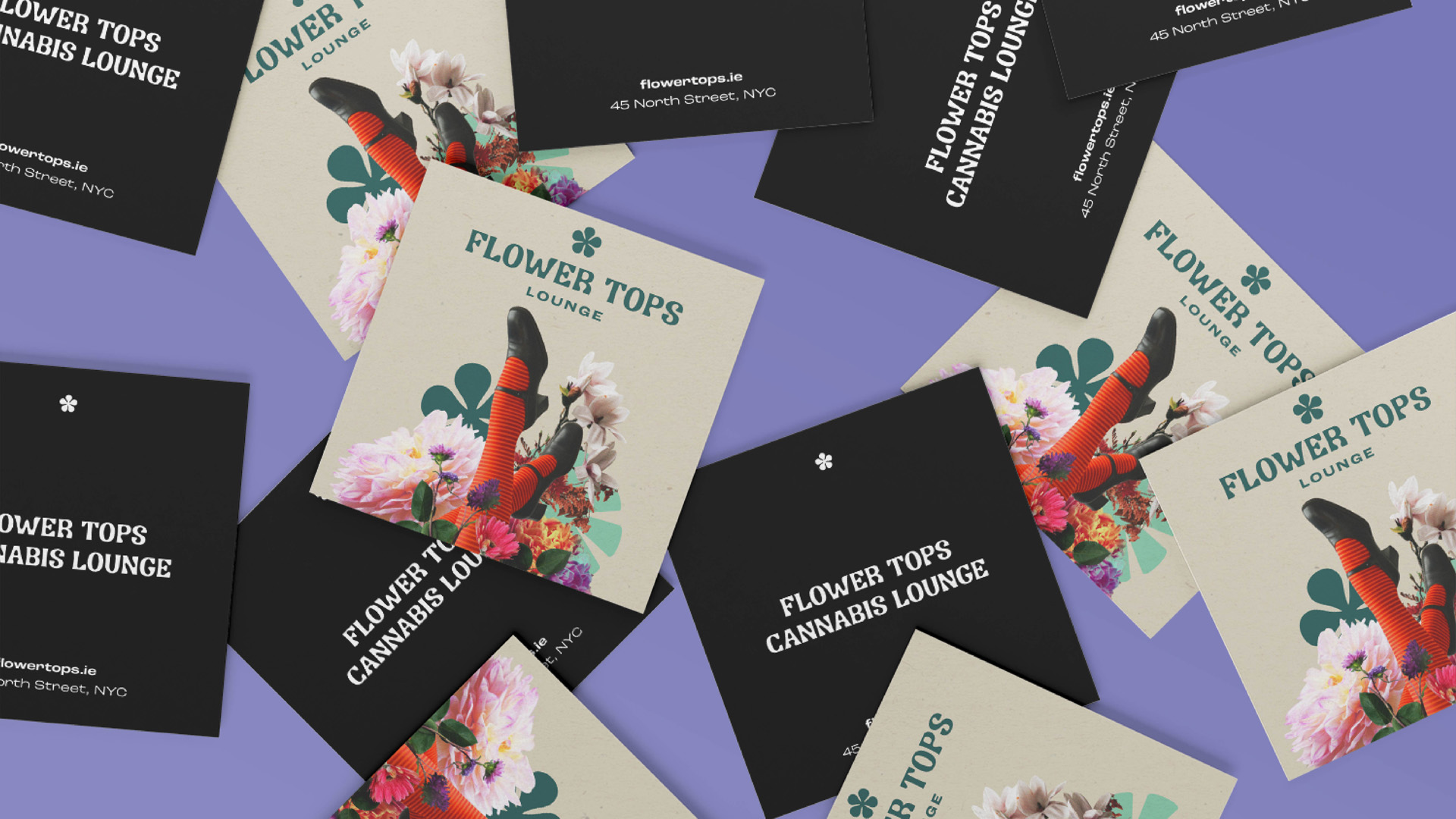
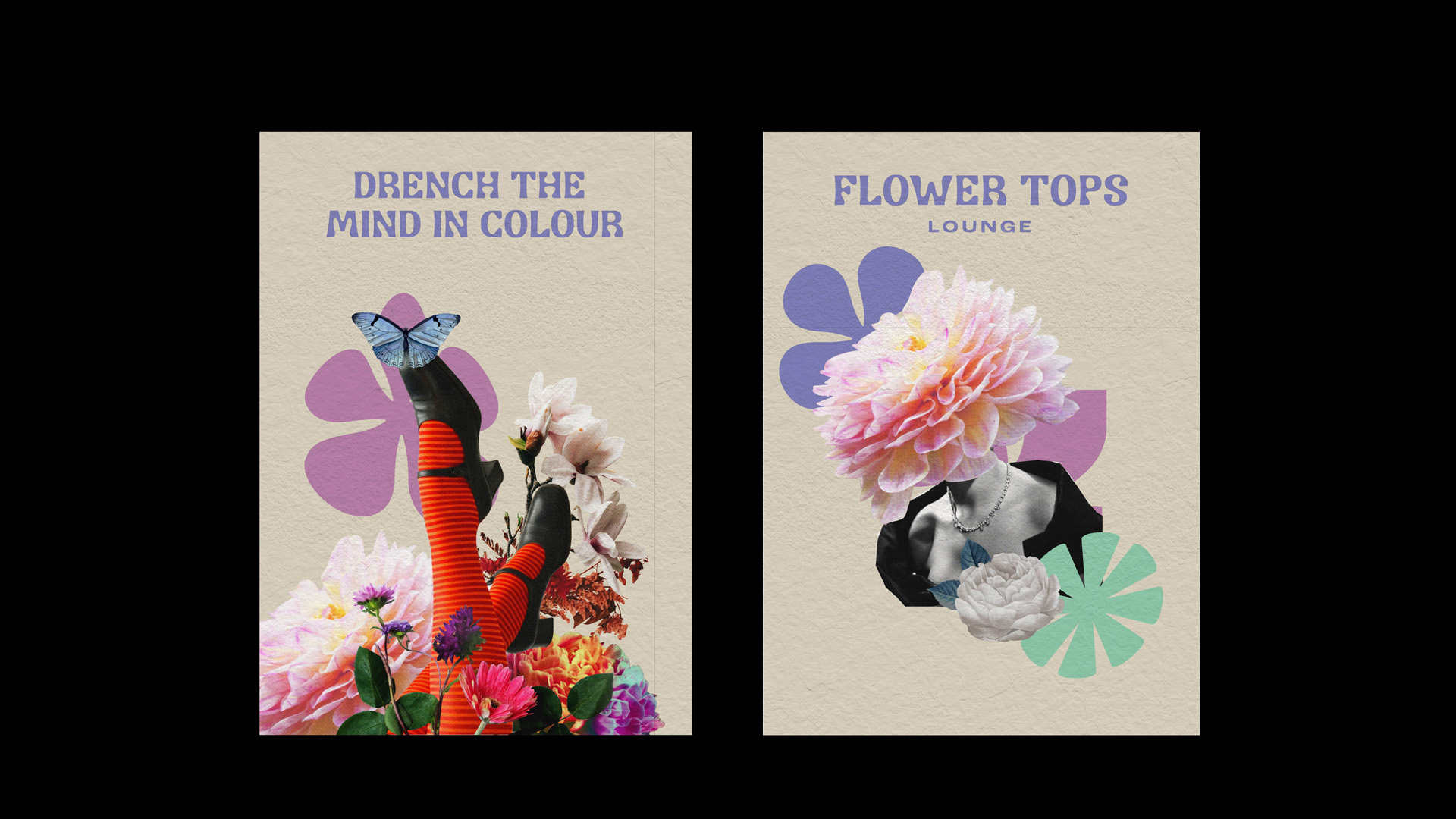
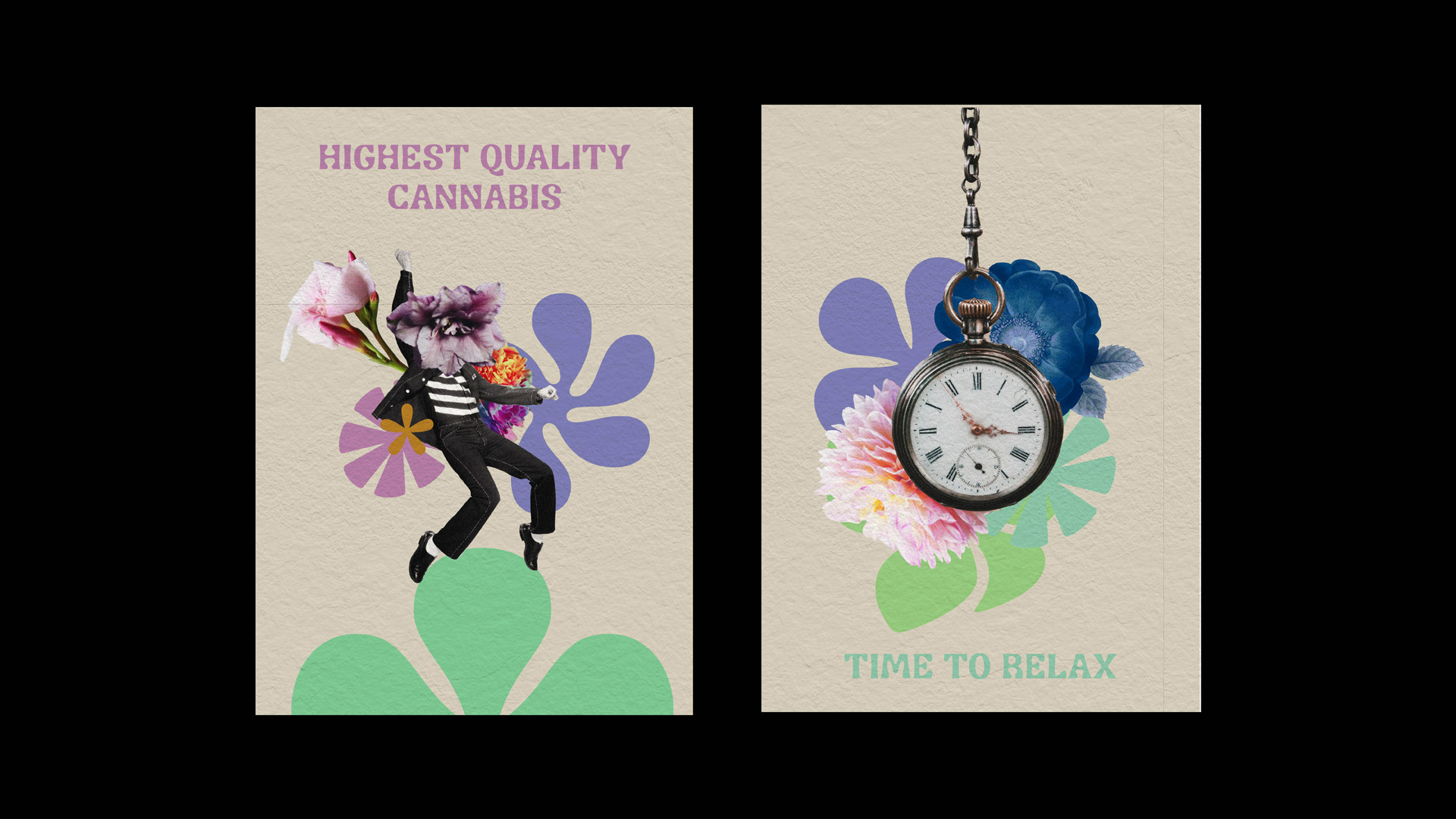
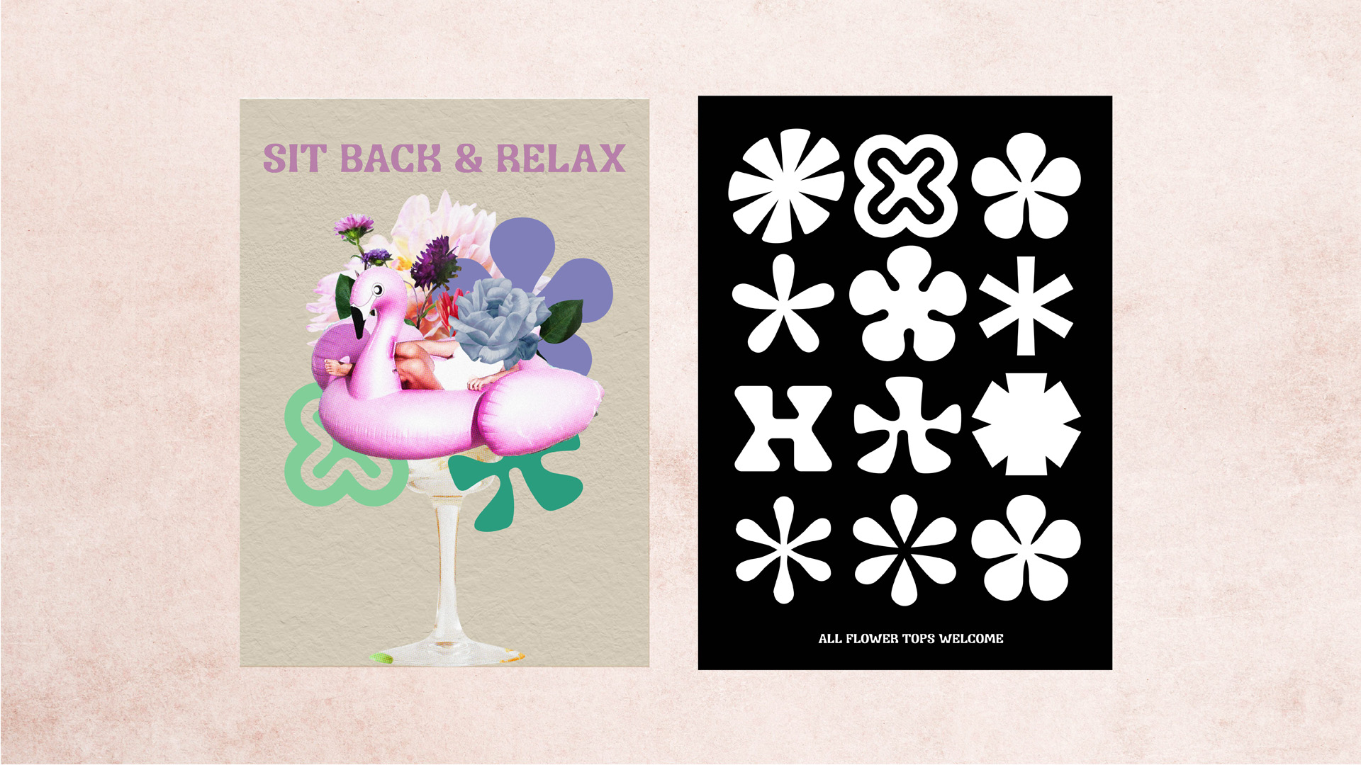
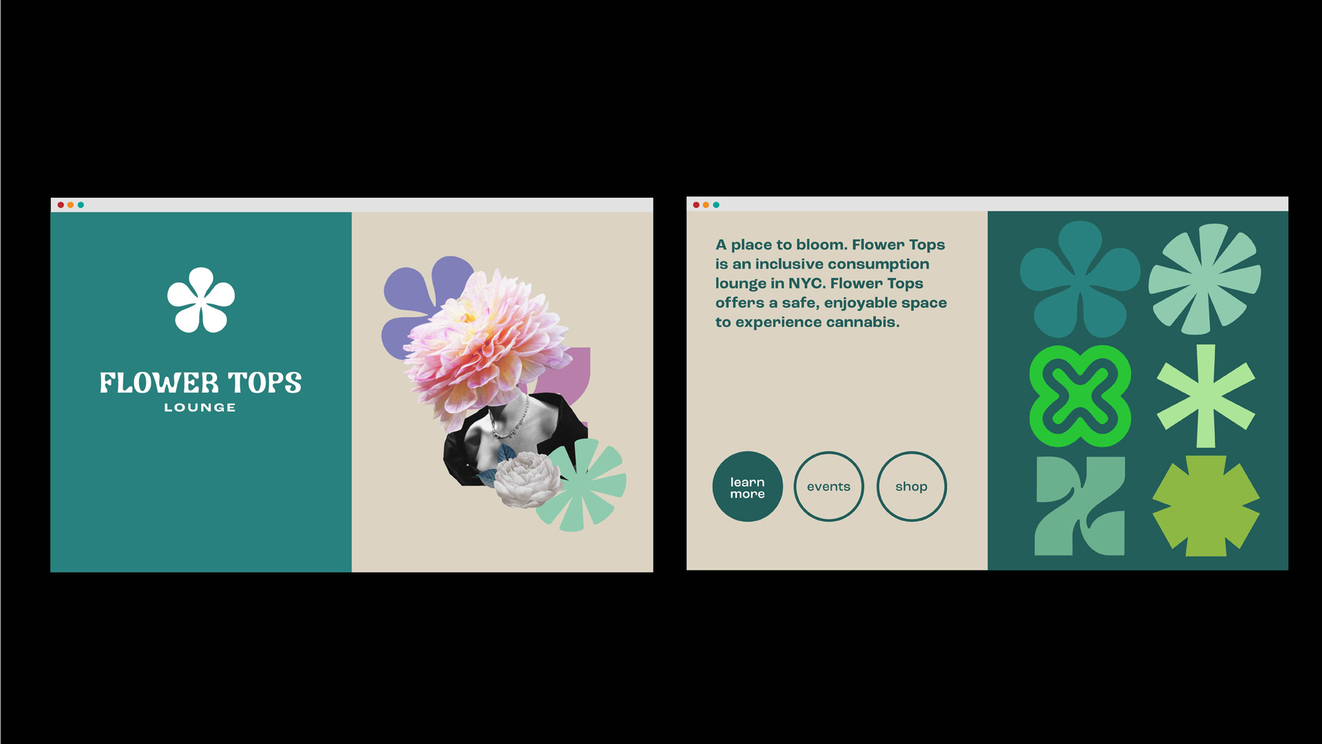
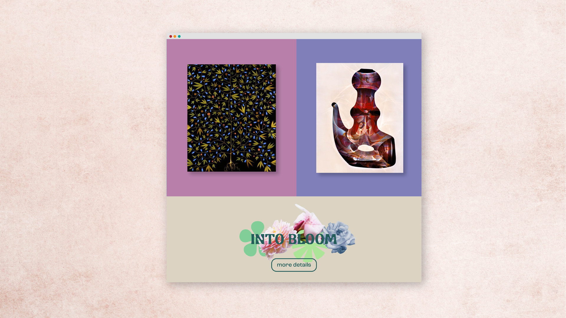
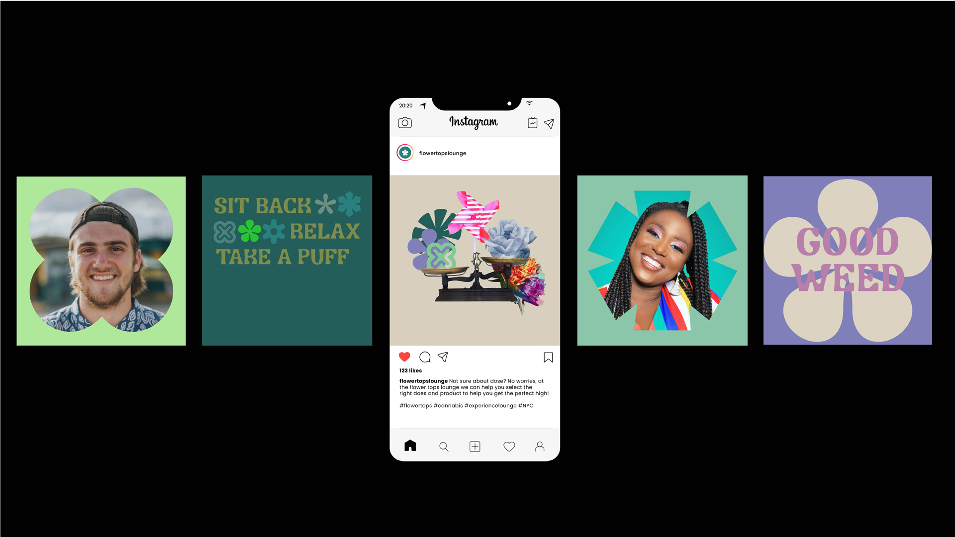
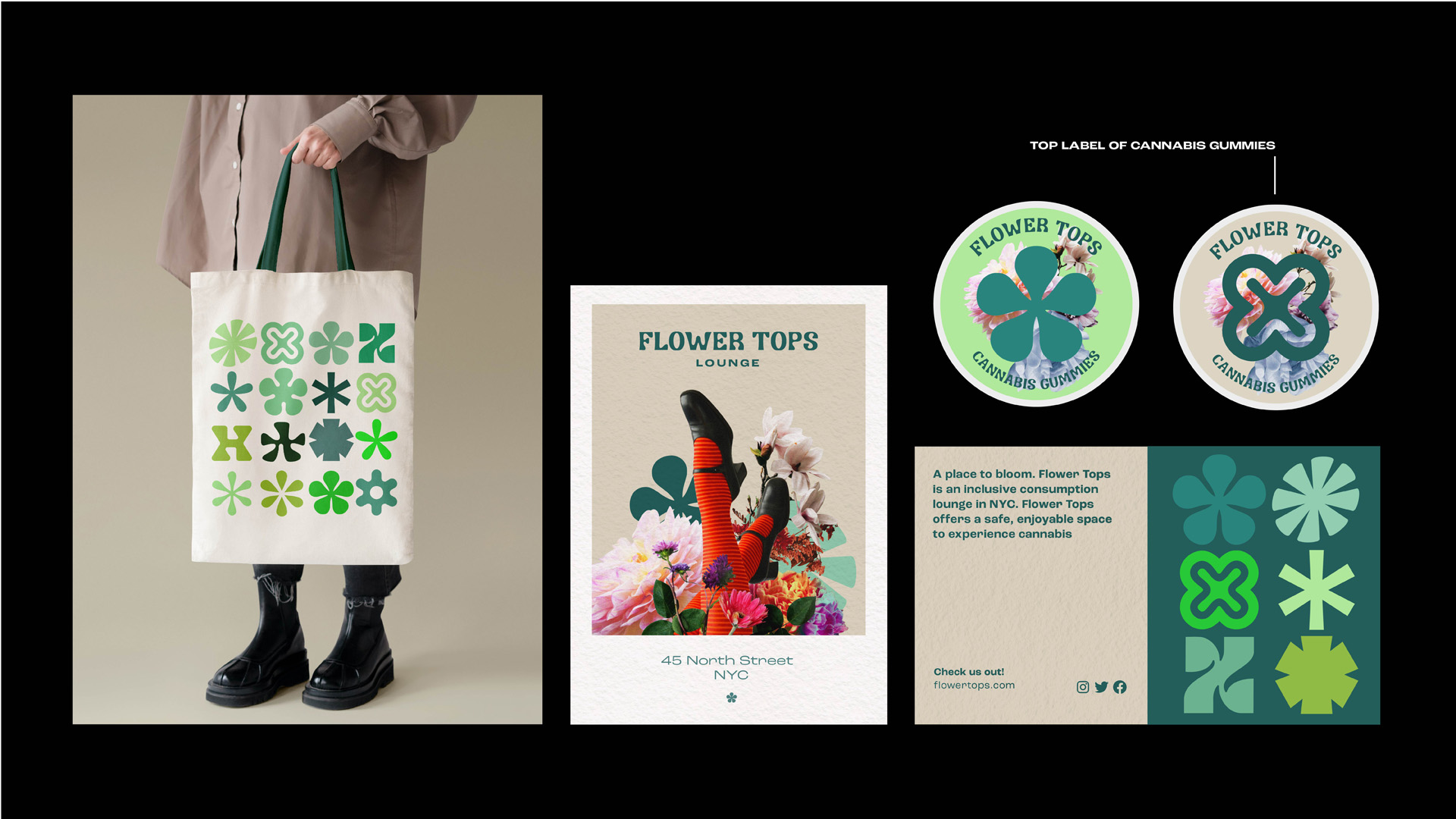
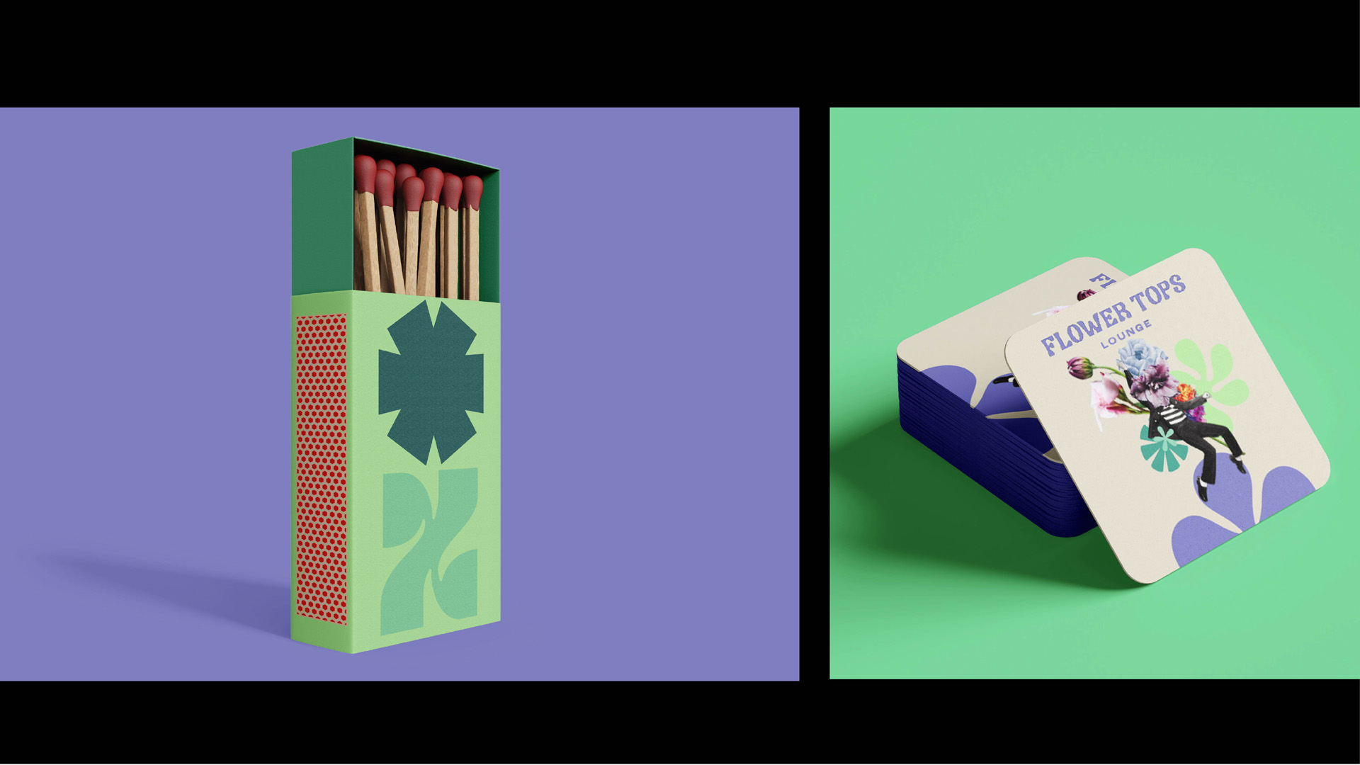
Pentagram New York challenged us to design a new based brand that sold cannabis products, as cannabis is very close to being legal to sell in the state of New York, so many companies are starting their own cannabis businesses. To start off, I did some research into the cannabis culture in NYC. I found that once cannabis became legal in the state, there would demand for cannabis lounges, where people could consume cannabis in a safe/stimulating environment.
My concept was to create a brand for friendly cannabis consumption lounge, which encourages first time users to come to an inviting environment to experience cannabis. In this project, I mainly focused on the image making, surreal playful collages that reflect the high you experience. the use of the many different asterisks as graphic forms reflect the diverse and welcoming nature of flower tops – everyone is welcome. Finally, the copywriting and colours try to reflect the laid back, relaxed nature experienced by cannabis users.