Colin Carthy | Design
My name is Colin Carthy and I’m a graphic designer from Kilkenny. I graduated with a first-class honours
degree in Design (Visual Communications) from Waterford IT. I have an interest in illustration and brand
application across both print and screen media. My work has recently been commended for an IDI Graduate
Award and would love to hear what you think about my work for Upstarts. You can reach out to me and find
more of my work on instagram @colincarthy or through my website.
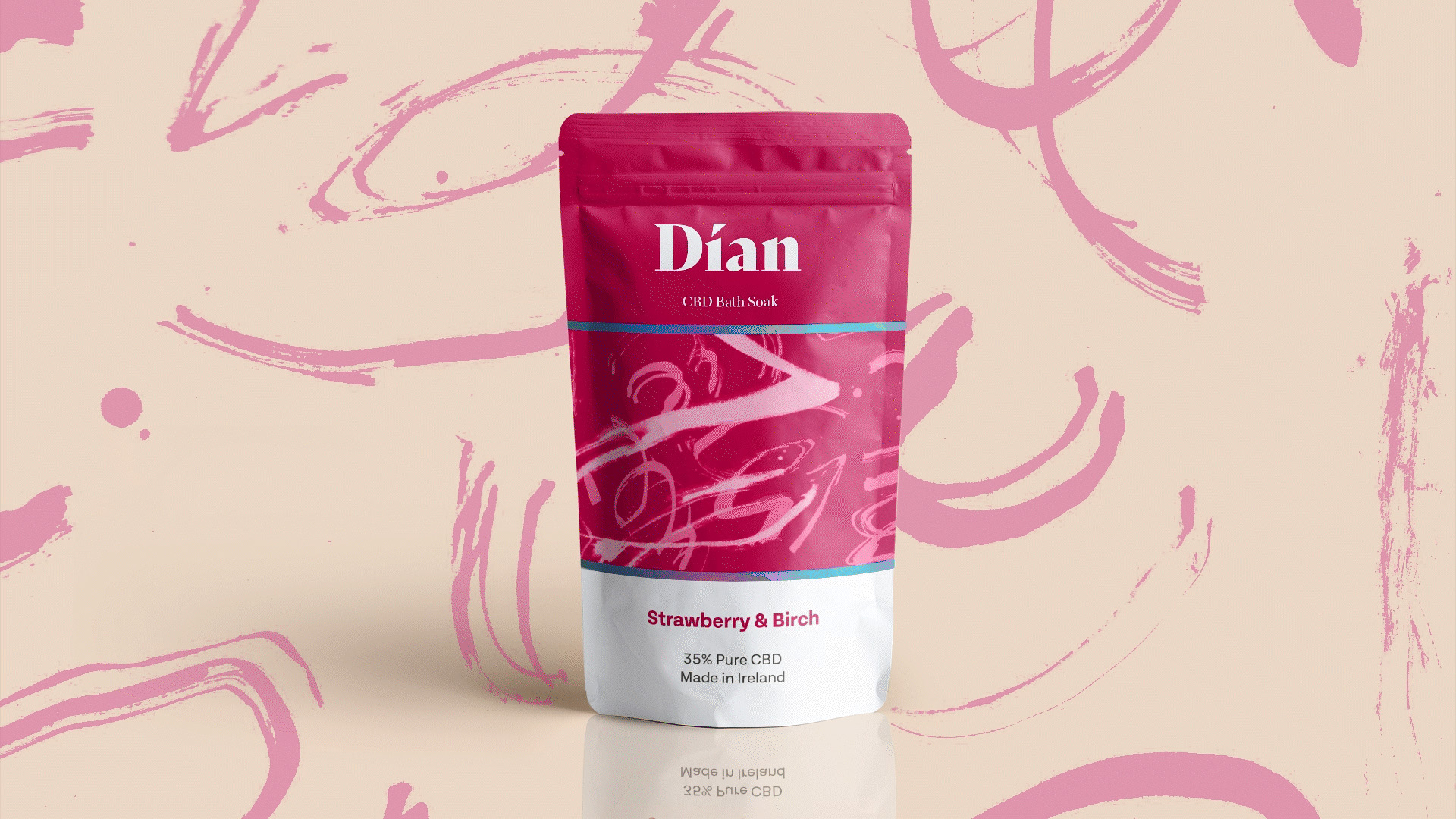
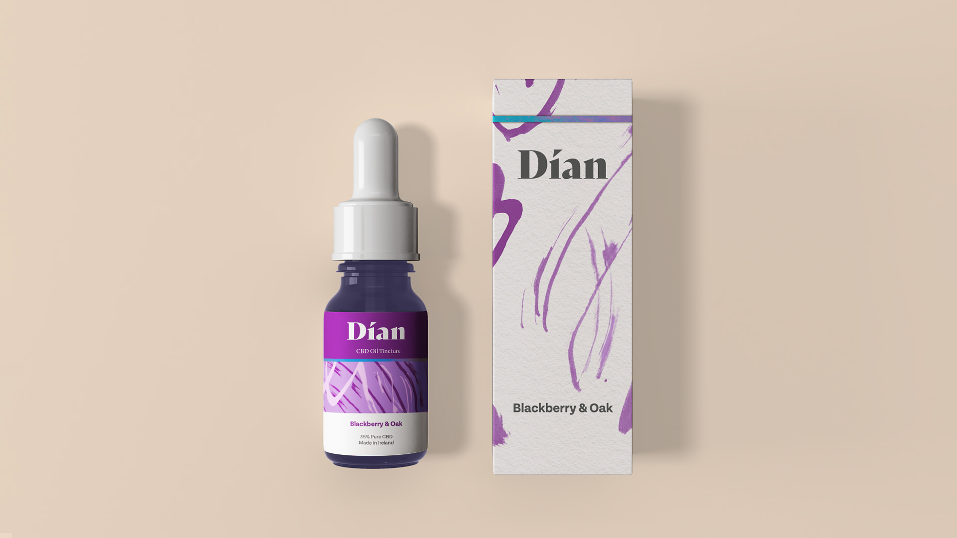
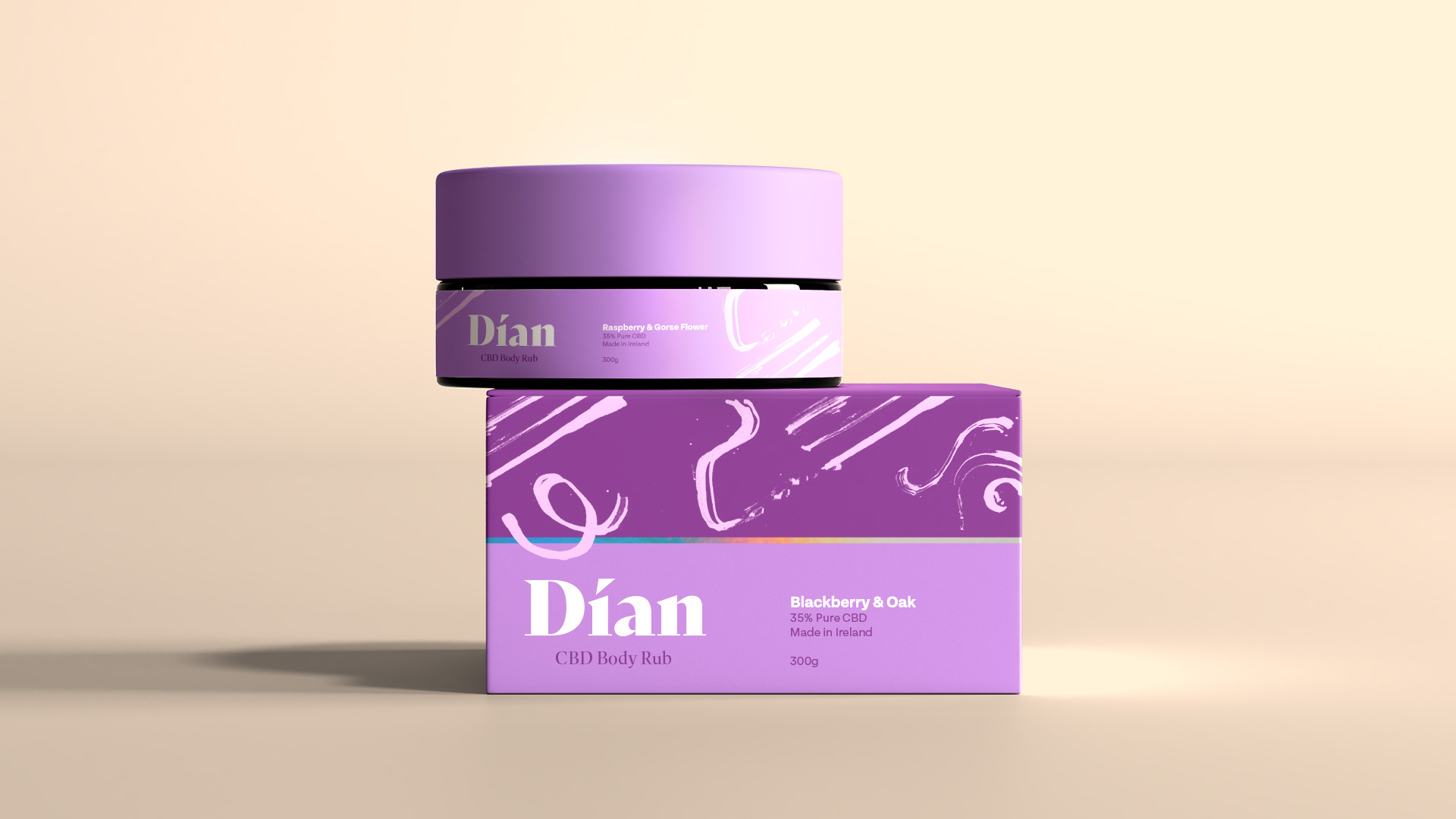
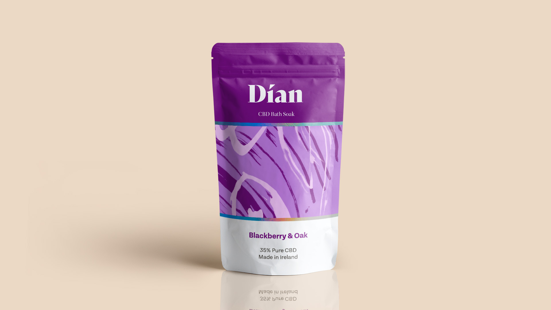
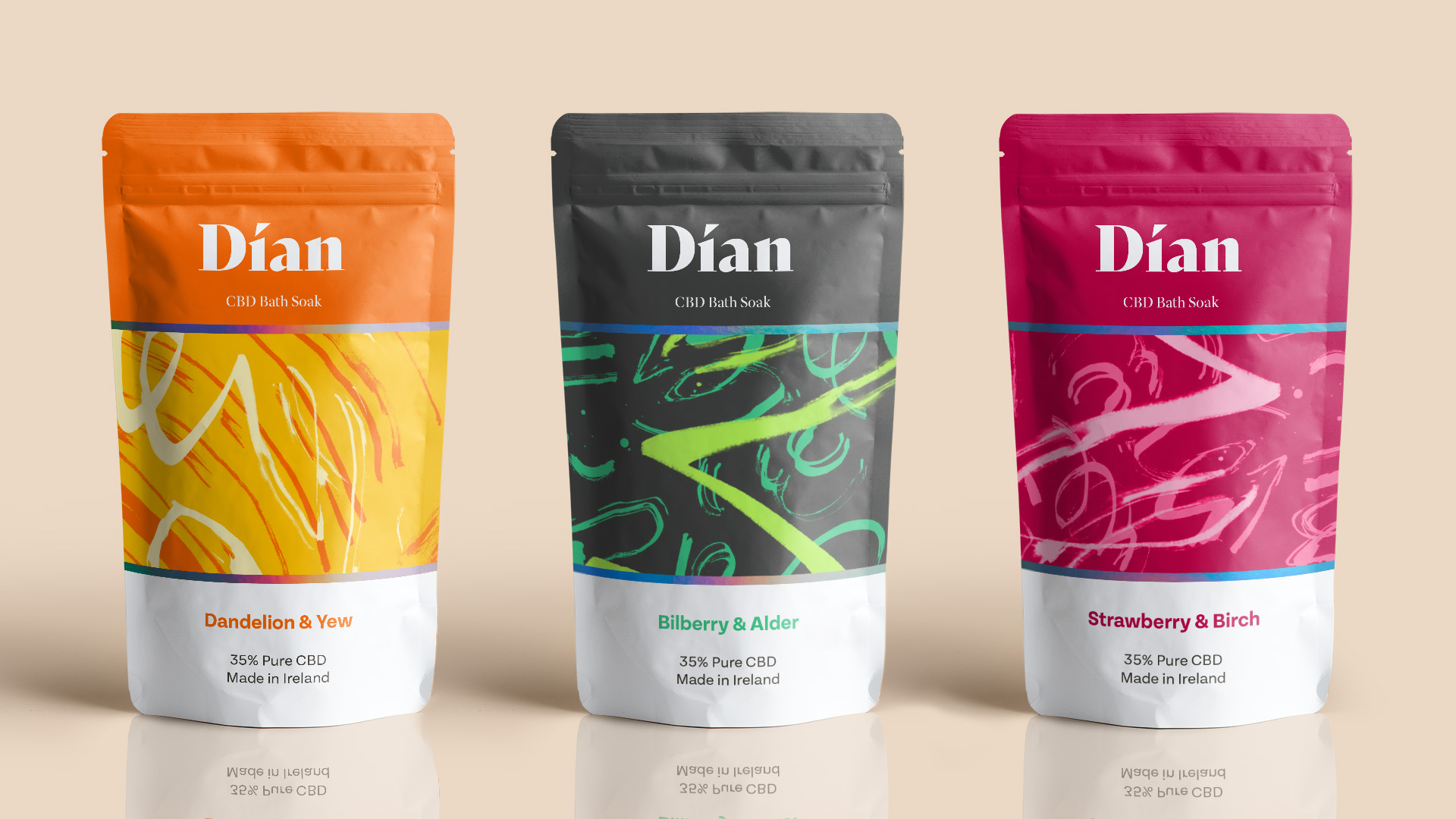
Project 1 | Dían | Irish CBD Personal Care Products
Dían takes its name from the Irish god of healing, Dían Cécht, who’s name roughly translates to ‘Swift Power’ from Old Irish. We were asked by Slater Design to develop a range of personal care products with CBD as a key ingredient that would help slowly shed the taboo of cannabis based products. With a range of products, Dían aims to refresh everyone’s outlook on CBD products. For this brief it was key to create something rooted in its ingredients.
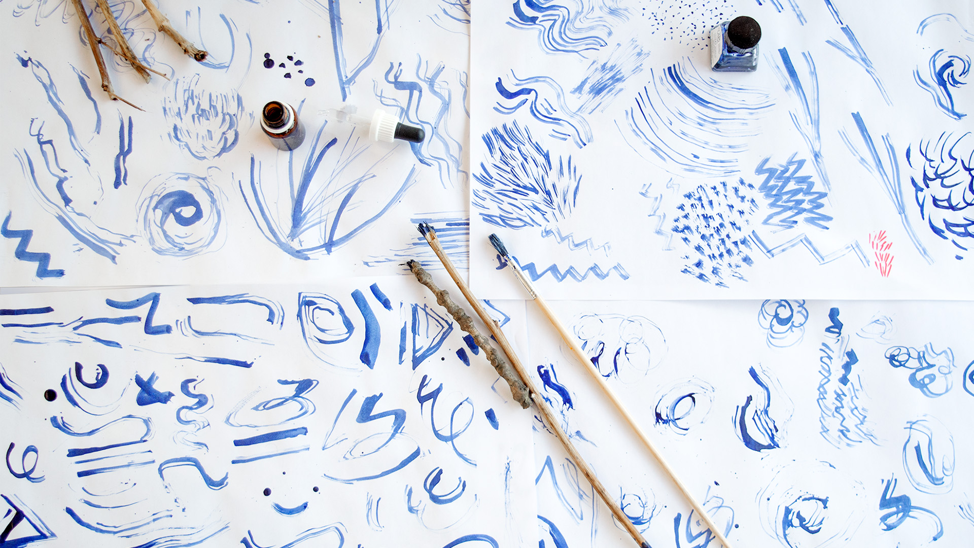
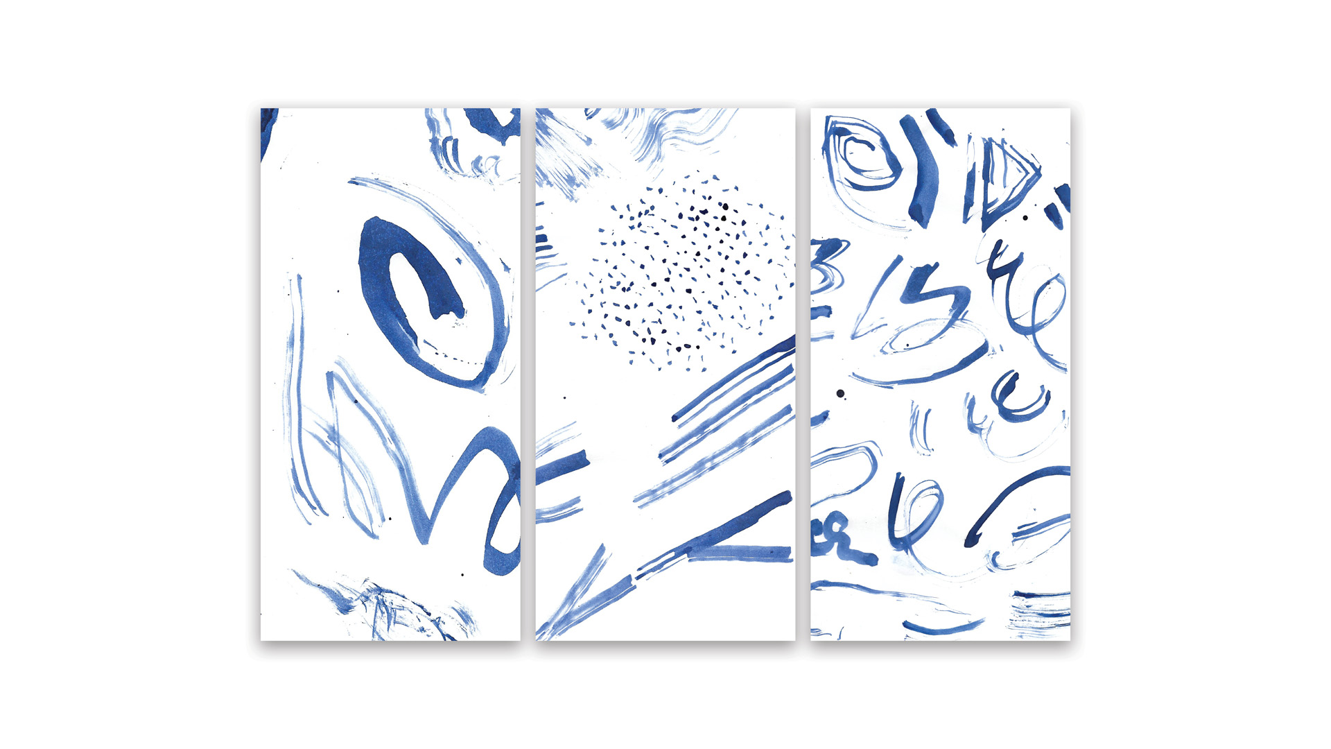
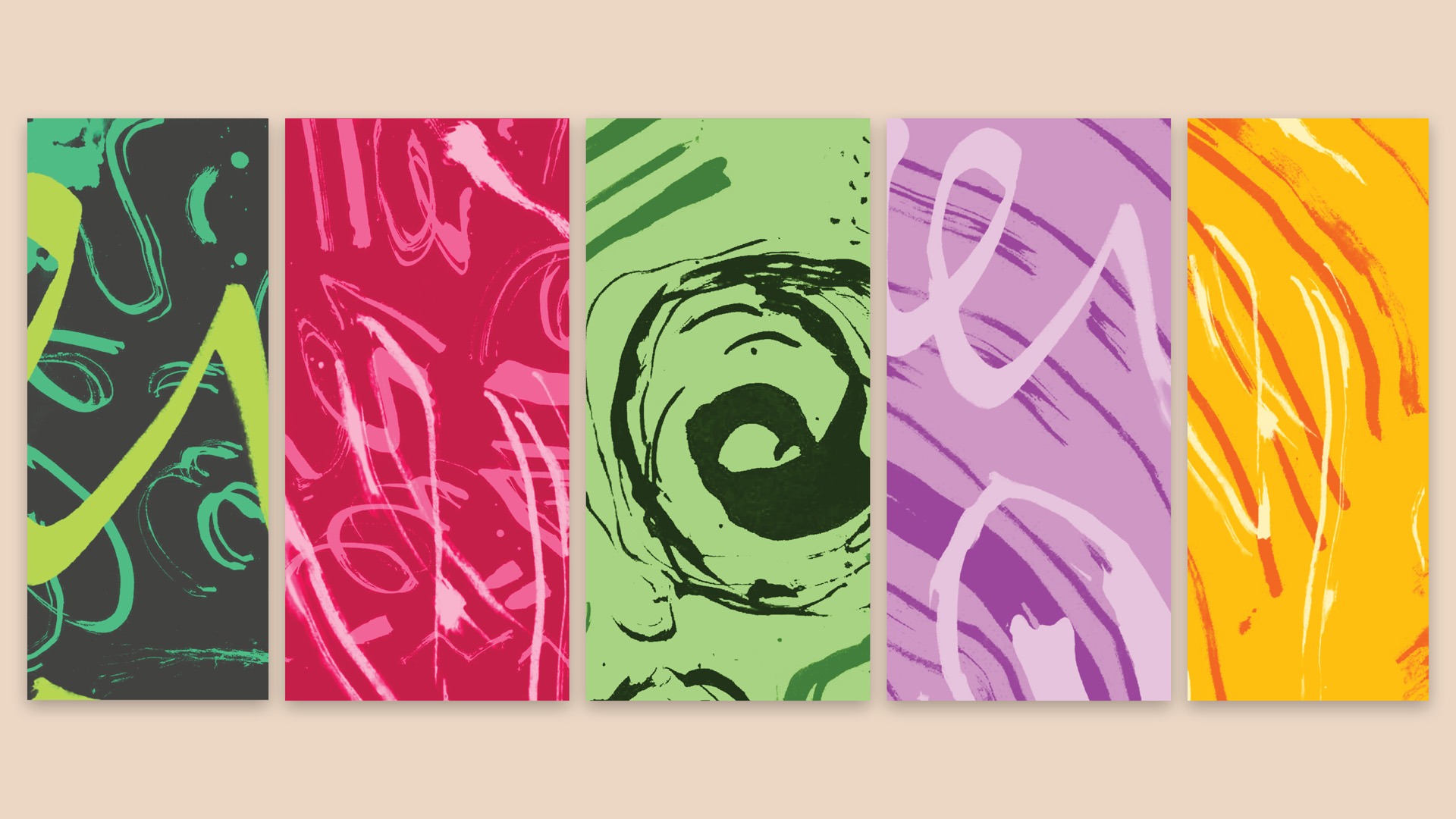
I have always been inspired by natural forms and material to inform my design and illustrative work. I have a passion for Irish landscape and nature, and explored this with an illustrative approach. Last year at Design West I explored this process of design even further. For such a natural product based on the Irish landscape, I decided to go outdoors and collect material that I could use to create an organic feel to Díans visual system. I used these branches and stones to create a variety of textures and patterns. These marks create flow and intention across the brand. The range of flavours and scents is displayed in wholesome and fresh colours. Aware that these products are for personal use, the packaging offers a considered approach when holding the product. The use of varnishes, holographic foil and uncoated stock would mimick the rough and varied Irish environment.
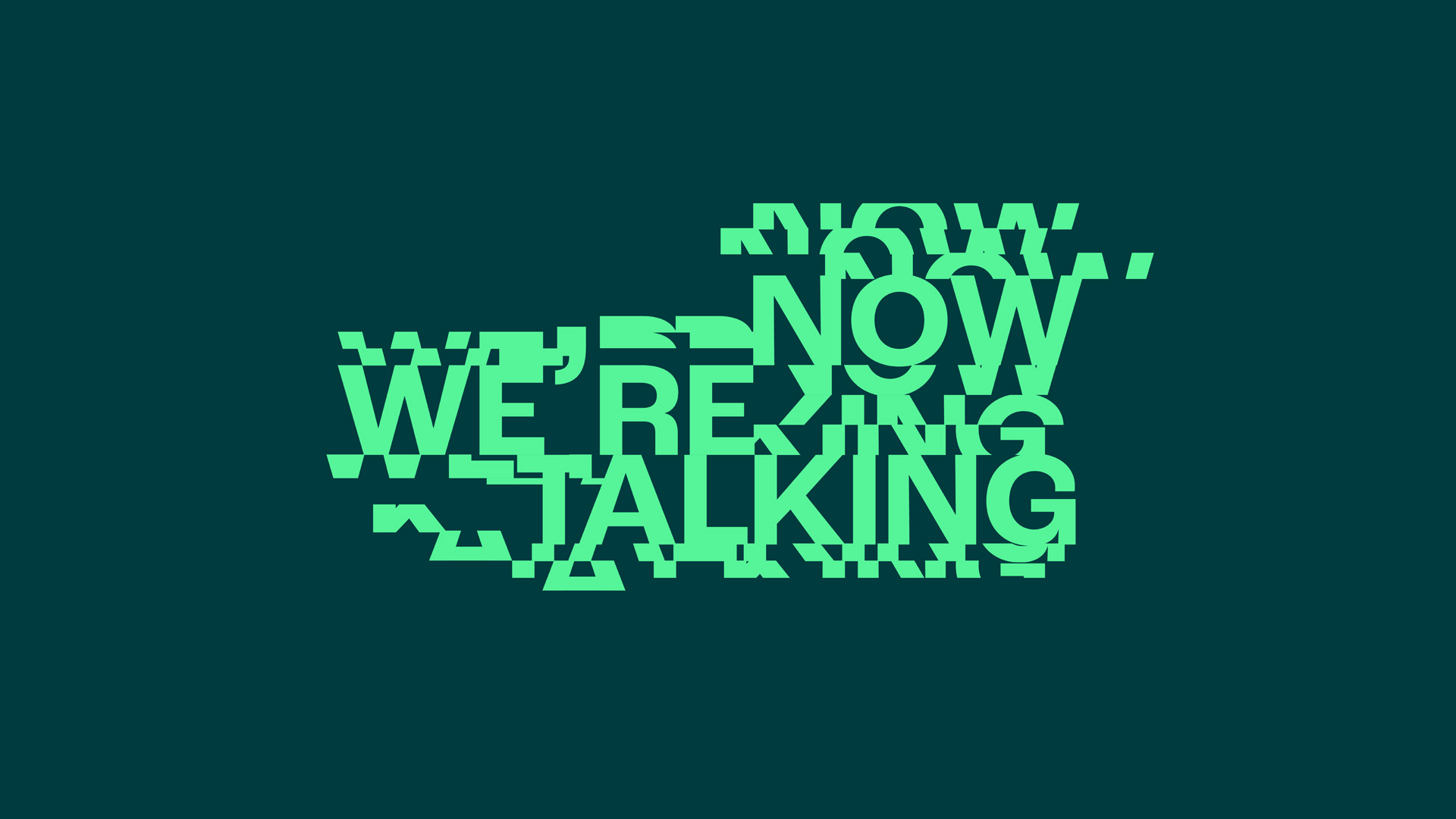
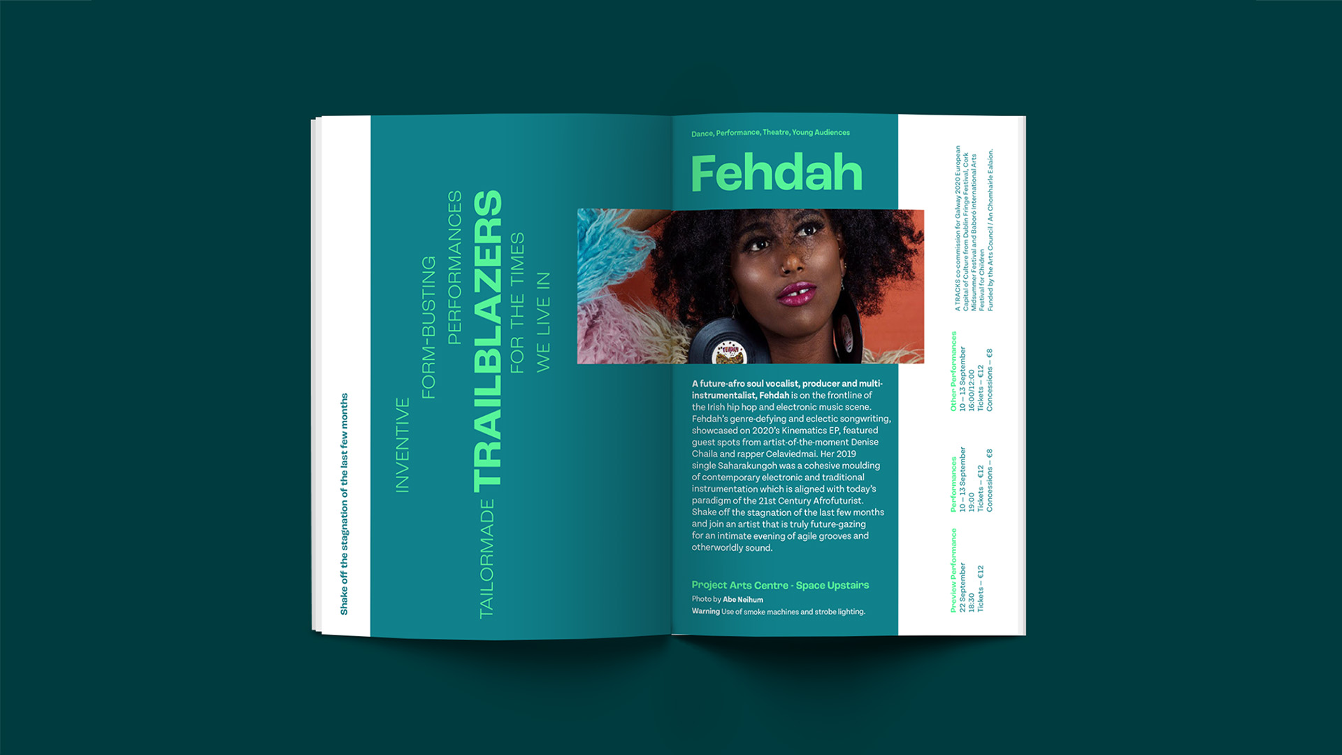
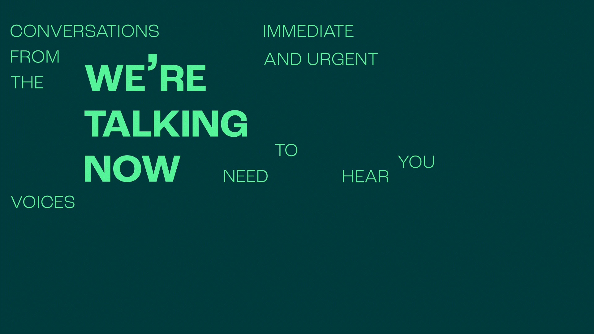
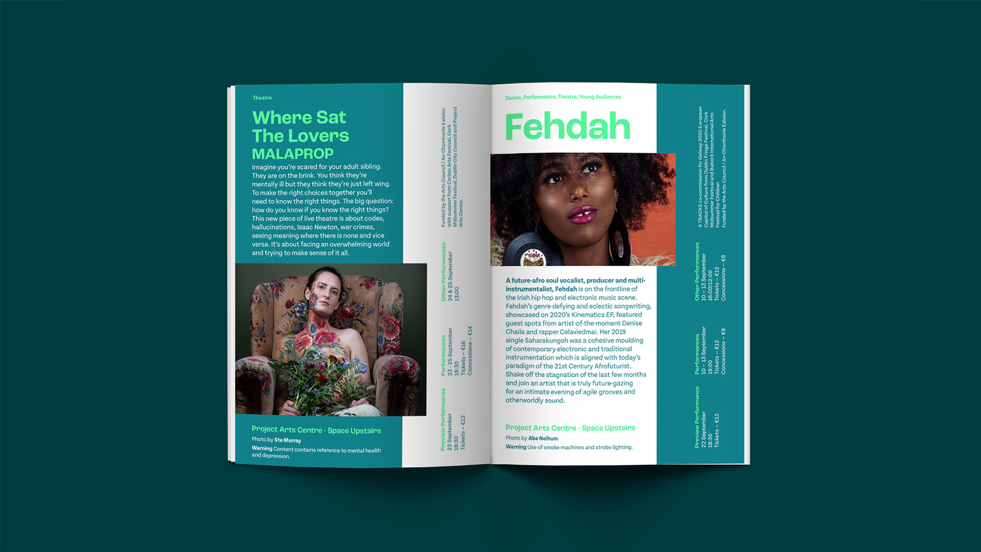
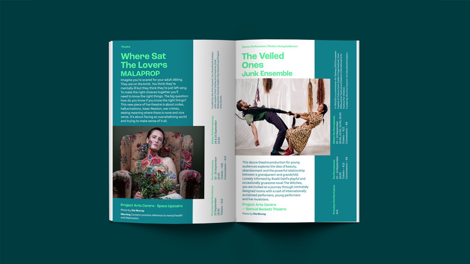
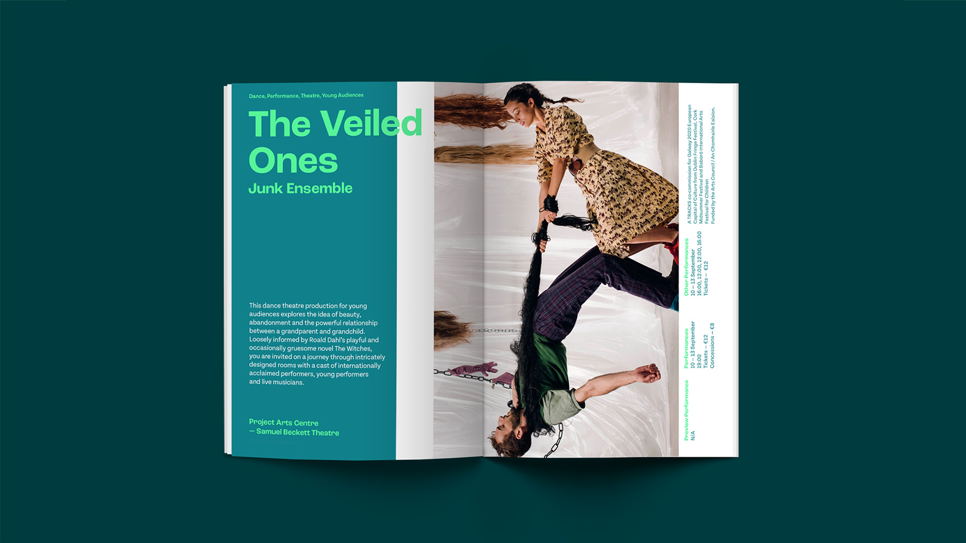
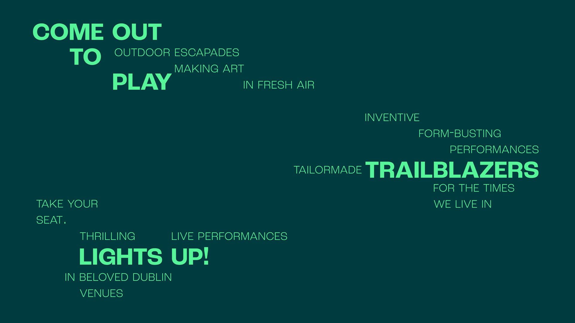
Supplied with copy and images from a previous festival, BigO asked us to develop a visual style for the Dublin Fringe Festival brochure. To capture the liveliness of the festival, I based the fresh mint green colours on the quote ‘Making art in fresh air’. I created an experimental text treatment so it can be read in a variety of ways, such as: ‘Trailblazers, inventive form-busting performances tailormade for the times we live in.’ or ‘Tailormade trailblazers, for the times we live in.’ The modular grid allows everything to be split and rearranged, giving the information a chance to move around. This shows the nature of the festival, refreshing and energetic.
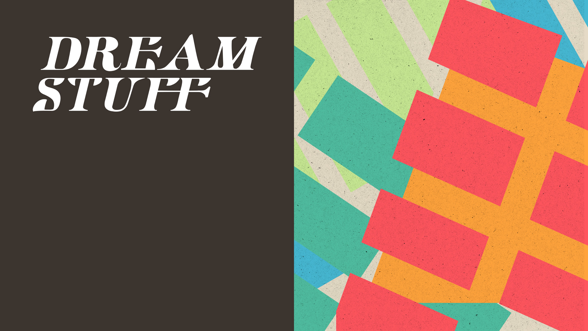
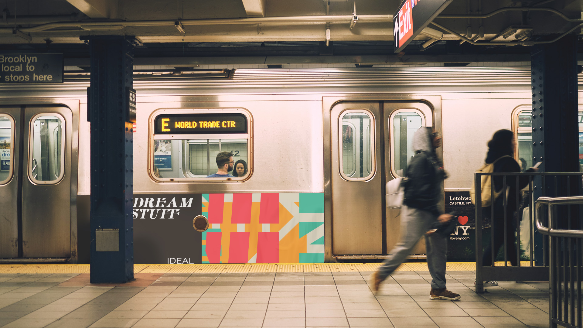
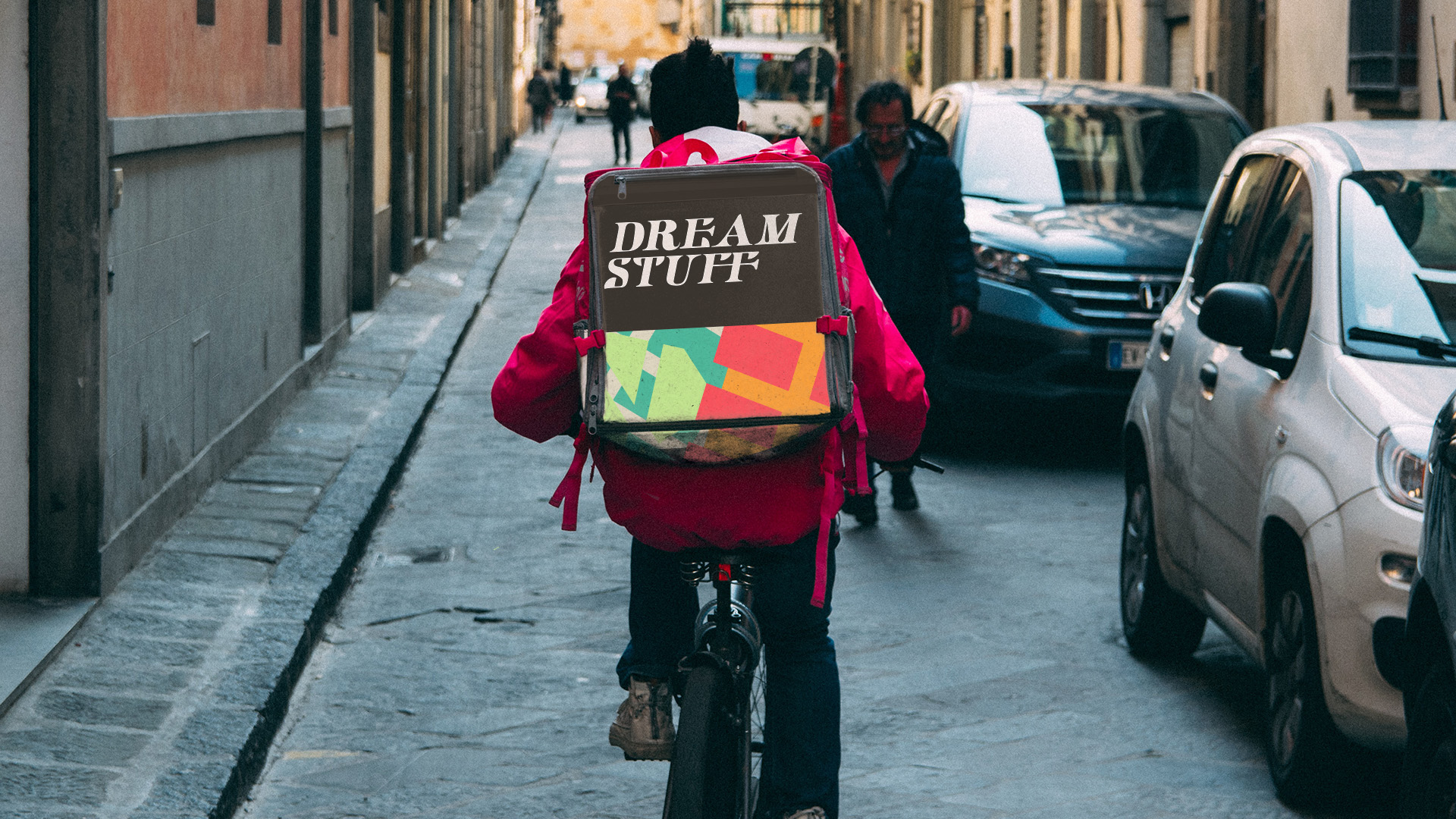
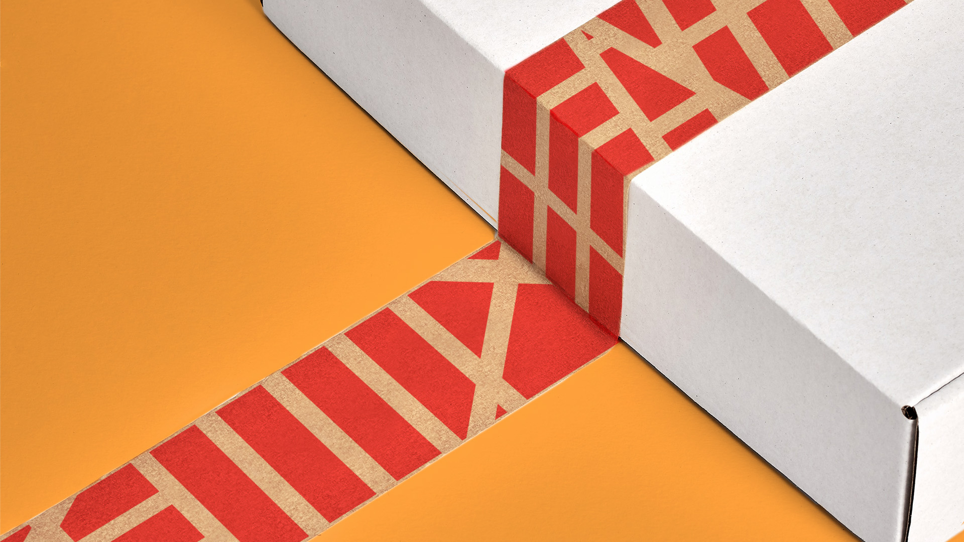
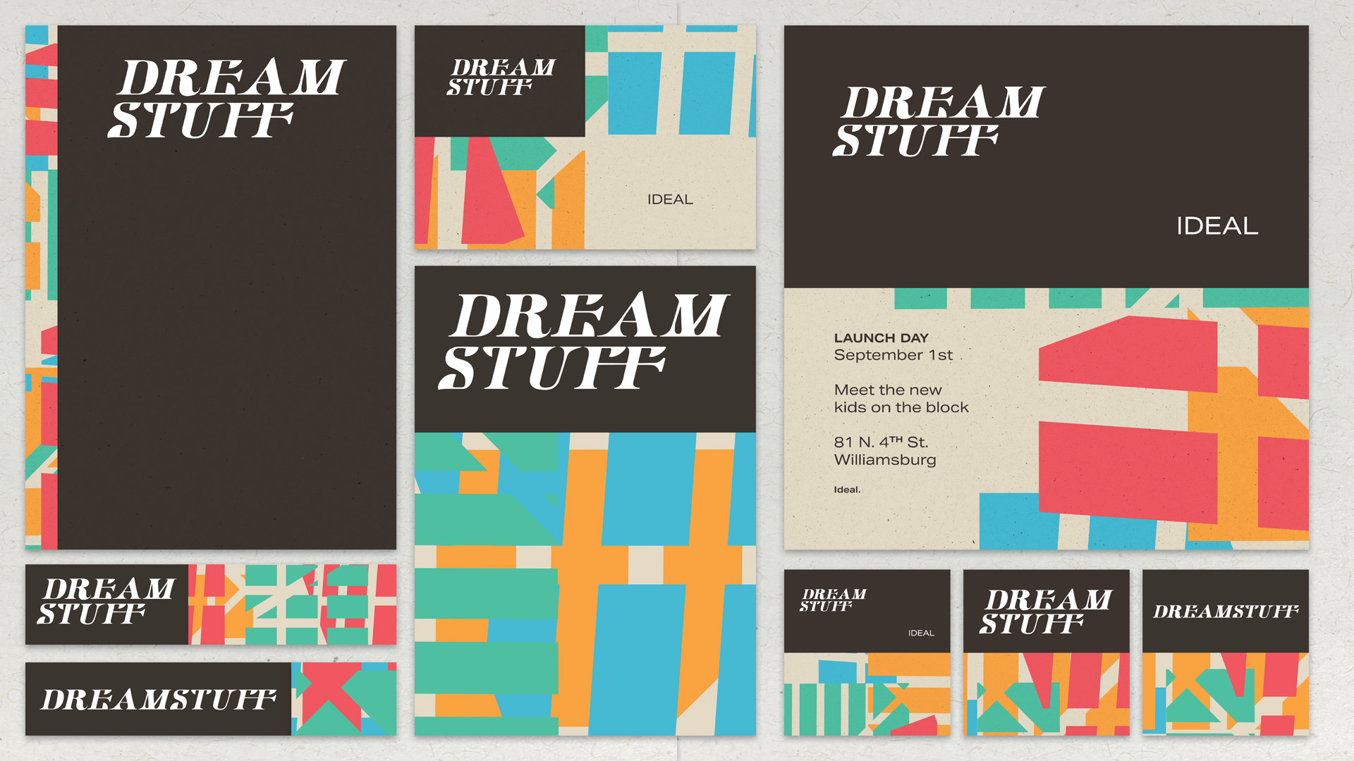
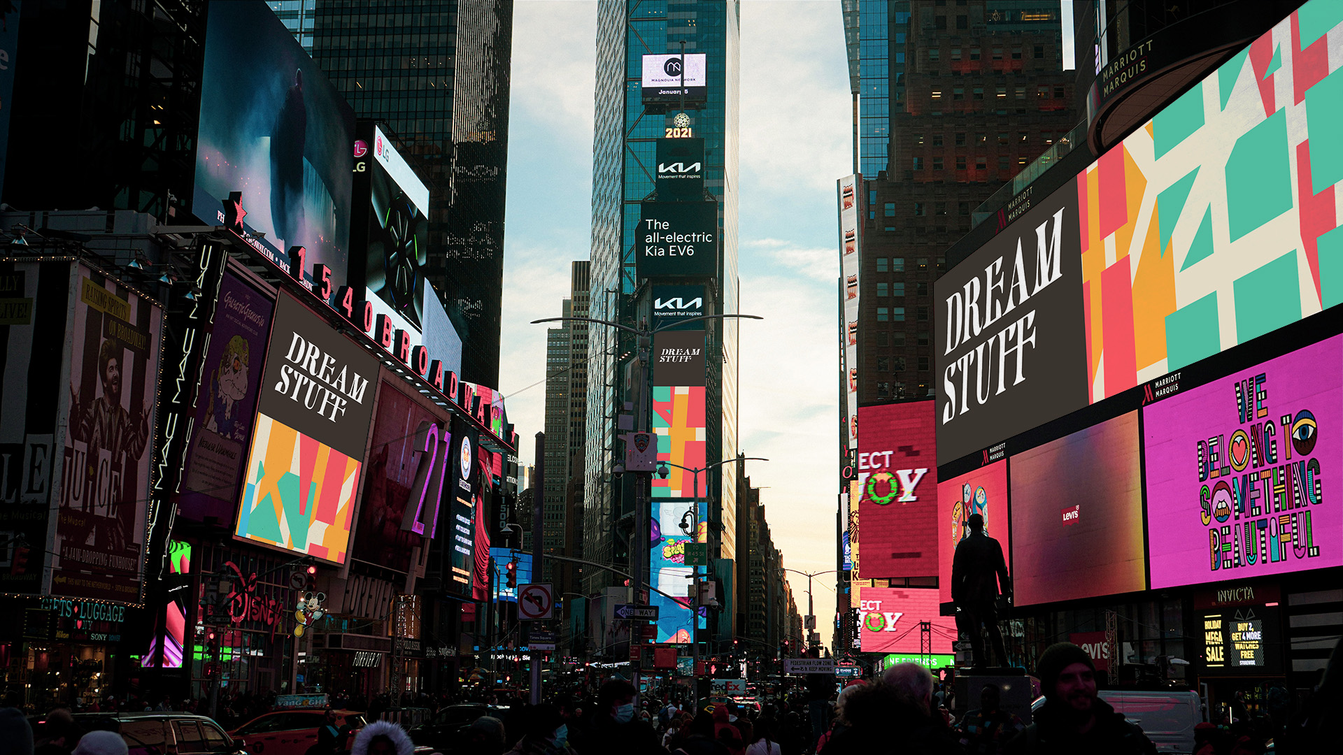
The brief set by Pentagram was to design a brand and identity for a company with its origins in New York that produces CBD based products. The aim was to differentiate and dominate the CBD market as the recreational use of marijuana is slowly legalized across America. For this project I researched the areas of New York and its history with the plant. I came across news articles of stories that took place in the 1950s, when the city was eradicated of marijuana. One street in particular was 81 North 4th Street, Williamsburg in Brooklyn, that was so overgrown with marijuana, that the plants were ‘as tall as christmas trees’. I decided to base the new company on this street and took inspiration from Sanborn maps of the Brooklyn area that were illustrated at the time. I noticed some similarities when researching the news articles about the eradication of marijuana in the ‘50s and todays legalization. Throughout the media, everyone spoke about its legalization as ‘the stuff of dreams’ and even in the ‘50s, it was called ‘dreamstuff’. I decided to use this as the name for the brand.
Focusing on the brand rollout across the States, I focused on different touchpoints of the brand, from packaging to advertising. I created a handdrawn, custom logotype based on the lettering from the maps of Brooklyn. Using the identity as the main focus with a variation of a single tiered and stacked lockup, I developed a visual language alongside this. I applied graphic elements based off of the streets and avenues on the maps of Brooklyn to the different assets to created a varied and colourful approach to this large, international brand.