Cliodhna Ryan
Cliodhna Ryan | Design
Hi, I’m Cliodhna. I’m a recent graduate from BCFE. After many years teaching English in Paris, I made the change to graphic design. I’m particularly inspired by music and art, and I’m interested in social issues, accessibility, and sustainability.
Project 1 | Little by Little app
![]()
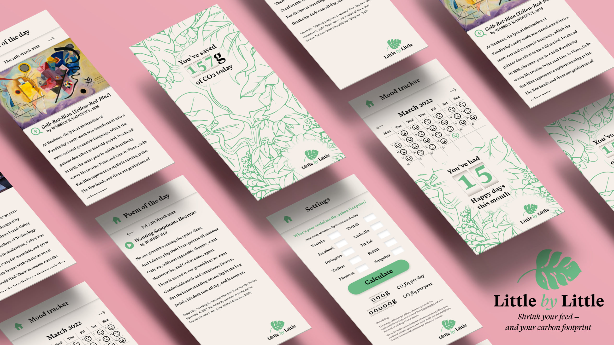
I created this app in response to Unthink’s brief asking us to encourage people to reduce their social media usage, and engage with the world around them. Because social media addiction is strongly linked to mobile phones, I decided that my solution would also live in people’s mobile phones.
We are increasingly concerned with climate change and our carbon footprint, but we don’t often consider the carbon impact of our social media activity. In my research, I was shocked to discover that Tiktok, for example, uses 2.63 g of CO2 equivalent per minute, and Instagram 1.05g.
I decided to create an app highlighting the amount of CO2 we could save by reducing our social media usage. Although the app uses the lens of carbon footprint to encourage users to reduce their social media time, the real benefits are actually in terms of improved mental health, better relationships, and better quality of life. These are all proven benefits I discovered in my research. The real responsibility for reducing the carbon footprint of servers should be on the corporations and governments, but it is a useful metric to allow users to gain a measurable benefit.
I called the app Little by Little, to highlight the positive impact of small incremental changes. The app works by calculating a user’s typical social media time, and showing how much CO2 is saved by reducing this amount of time on an ongoing basis. It also has features aimed at reducing social media usage and encouraging more rewarding and in-depth engagement.
Research has shown that social media relationships are shallow and passive; the app has a paper-look messaging service that encourages longer and more in-depth conversations, in contrast to simply “liking” a friend’s social media updates. The “random” messaging feature encourages users to maintain friendships in an active manner, writing longer messages instead of simply following contacts on social media. Taking inspiration from “one-per-day” games like Wordle, the app acts as a hub allowing the user to access just one photo and one painting per day, as well as one poem and one page from their current Kindle book. These limitations prompt deeper engagement, and act as a complete contrast to the endless scroll of social media. A mood tracker is incorporated to underline the positive mental health impacts of distancing yourself from social media.
The app is specifically designed not to be addictive, with a purposefully neutral colour palette and limited features. I hope that by linking social media use to carbon footprint, users will feel motivated to cut back on their social media scrolling, and start to feel the benefits of improved mental health, better relationships, and better quality of life.
You can see the app here.
Project 2 | New Amsterdam
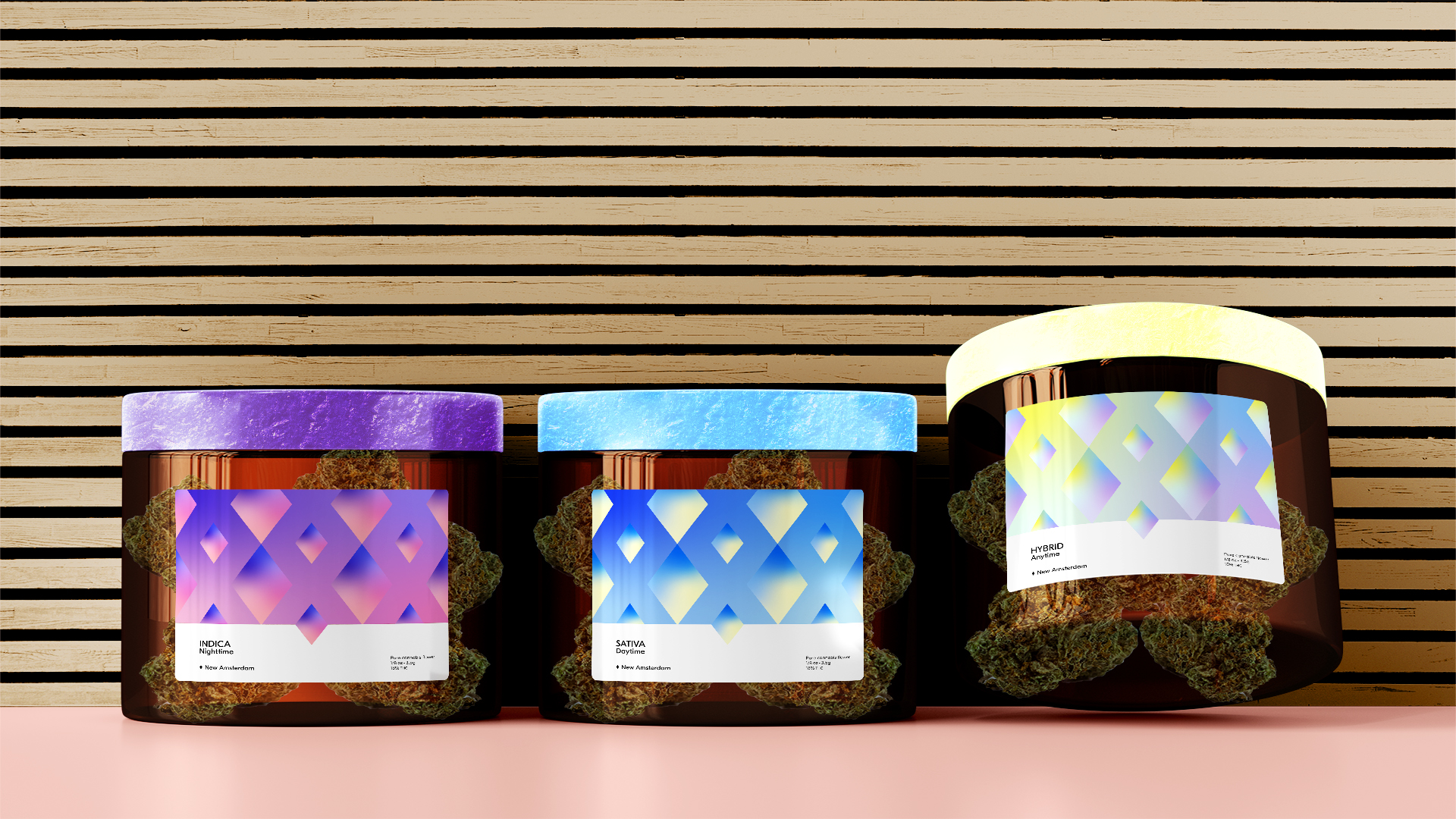
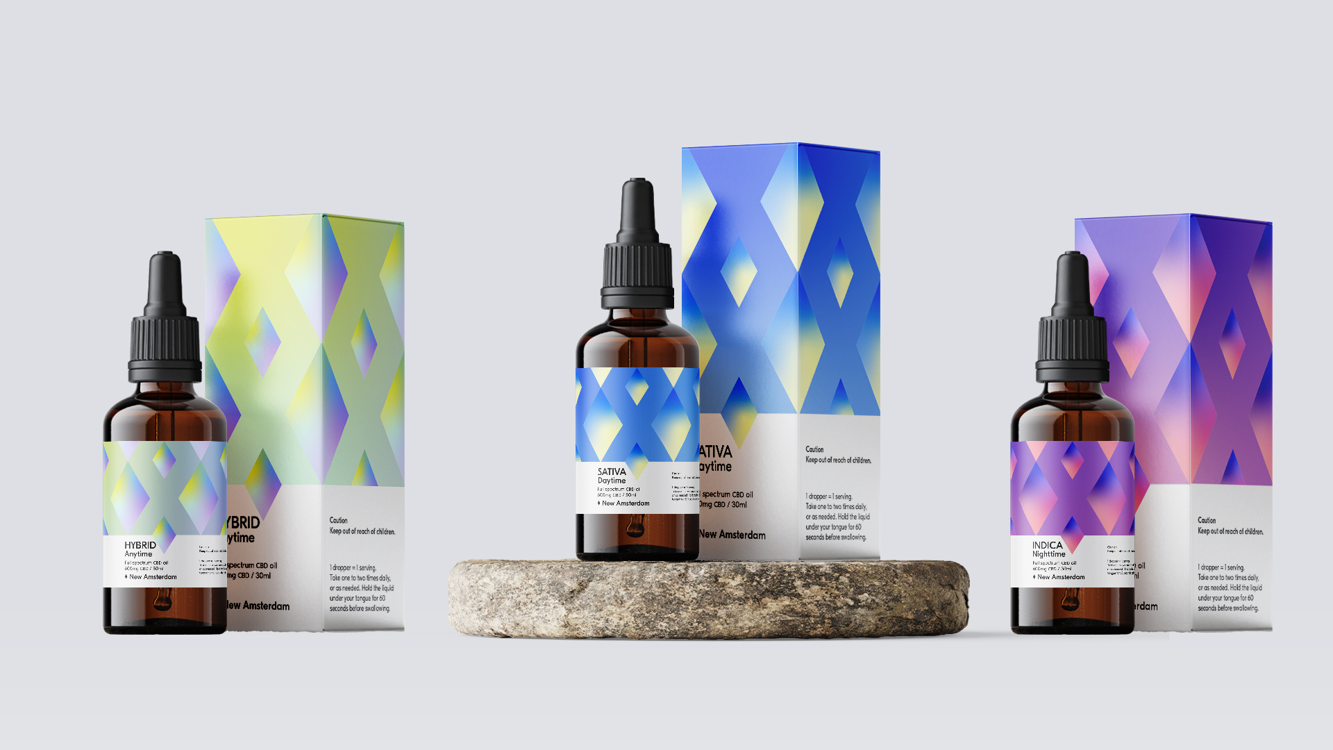
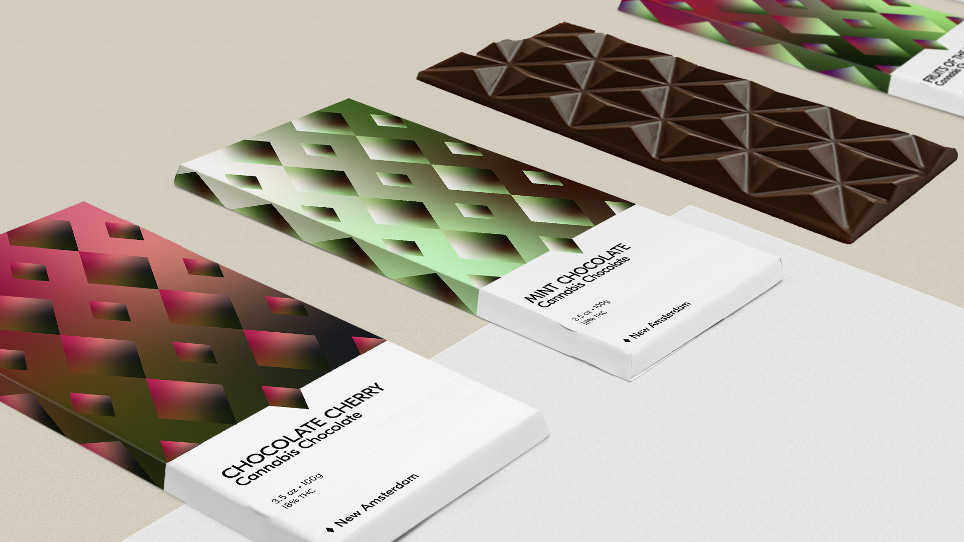
Pentagram challenged us to develop a legal recreational marijuana brand, creating a visual design system and name rooted in New York, while avoiding tired stoner clichés.
I was inspired by the Dutch settlers’ original name for New York, New Amsterdam. For many years Amsterdam was a haven for legal recreational cannabis, and New York will soon be just as well-known for the same thing. I explored Amsterdam’s triple-X city crest, and combined these forms with colour gradients reflecting the health and wellness benefits of cannabis.
I wanted the brand to be approachable for first-time users, steering away from the stigma of illegality, and focusing on the physical and psychological benefits rather than the idea of getting high. The brand is scalable and the product range can easily be expanded. I also focused on using more sustainable packaging solutions.
Cannabis flowers
The buds are packaged in amber glass, to protect from UV light. This glass is highly recyclable. The lid is made from hemp bioplastic, which is renewable and biodegradable. This material has an attractive flecked appearance. The labels are made from 95% sugar cane fibre and 5% hemp and linen, with compostable adhesive and soy- or water-based ink.
Oil dropper
The dropper and box use the same sustainable materials as the jars. The colours help communicate the best time of day to use each product – sativa in the daytime, indica at night, and hybrid anytime.
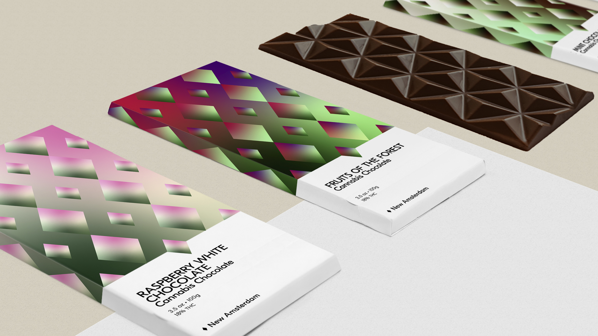
Chocolate
Again, the chocolate packaging is sustainable – 95% sugar cane fibre and 5% hemp and linen, with compostable adhesive and soy- or water-based ink. The colours convey the different flavours in the range, and the chocolate itself comes in diamond-shaped pieces to reinforce the brand image.
Project 3 | Sustainable environmental graphics
The brief from Detail asked us to create environmental graphics for a Dublin-based company with a visual narrative based on the building and location, taking into account sustainability, hand painting to cover large wall spaces, recycled textiles, and projections.
I chose to focus on Etsy, headquartered at the former Quaker Strand Street Institute at 67-67 Great Strand Street. I took inspiration from the Quaker “ragged school” which trained children in sewing and carpentry, and Etsy’s position as the marketplace for handmade goods, as well as their ethos of minimising waste, embracing differences, and keeping commerce human.
My sustainability goals were to use biodegradable or recycled materials, durable modular design which can be changed, disassembled, and re-used, and low-energy solutions. I also wanted to incorporate elements of biophilic design.
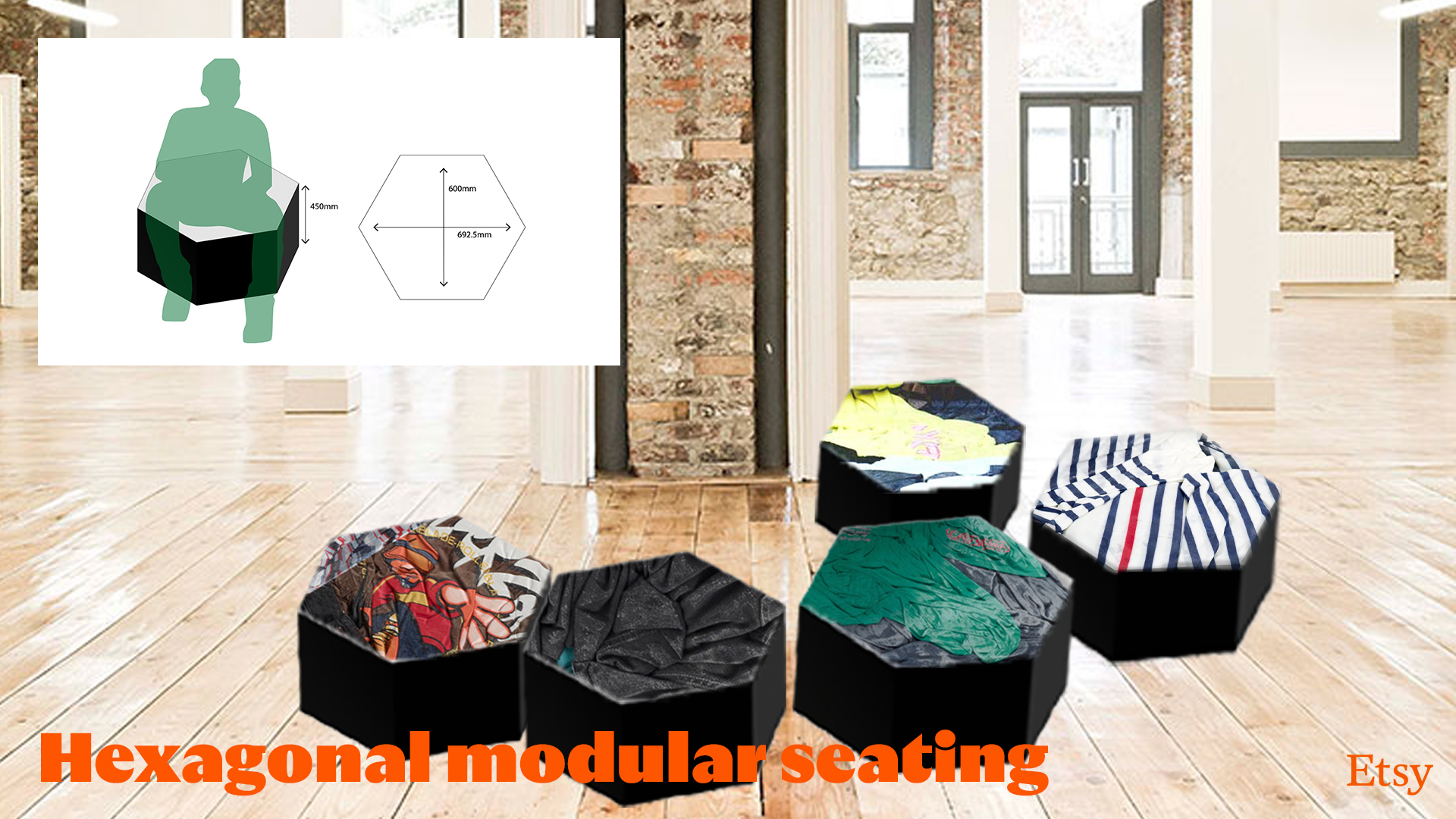
The hexagon shape is a reference to the traditional textile craft of patchwork, as well as natural honeycombs. It is a modular shape with endless combinations.
Hexagonal modular seating:
Made from recycled clothing and Ecopoxy, a plant-based alternative to resin made from bio-renewable sustainable sources, this seating is modular, stackable, and portable. Biophilic design is incorporated through the biomorphic form and complexity of materials and colours.
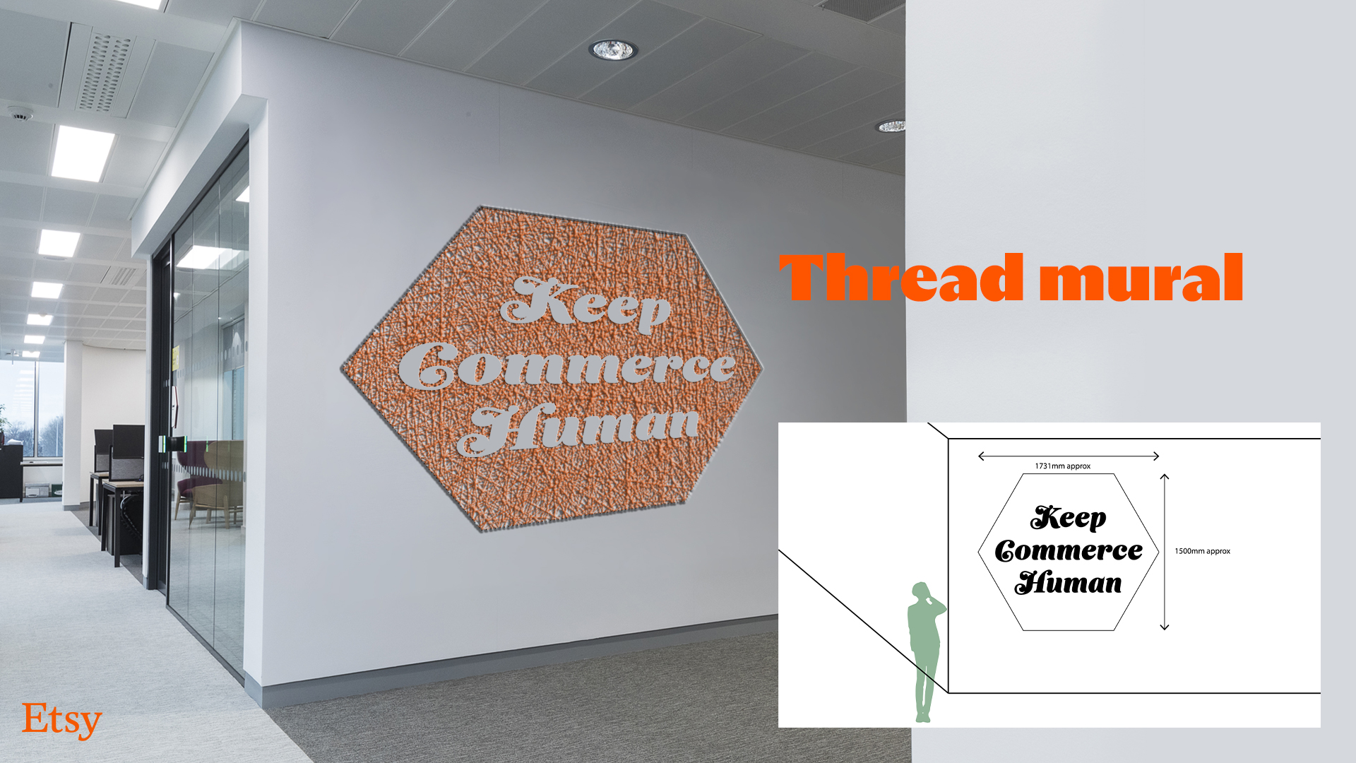
Thread mural:
This non-permanent alternative to a painted mural is made from nails and thread which can be disassembled and redesigned. The complex texture is one of the tenets of biophilic design.
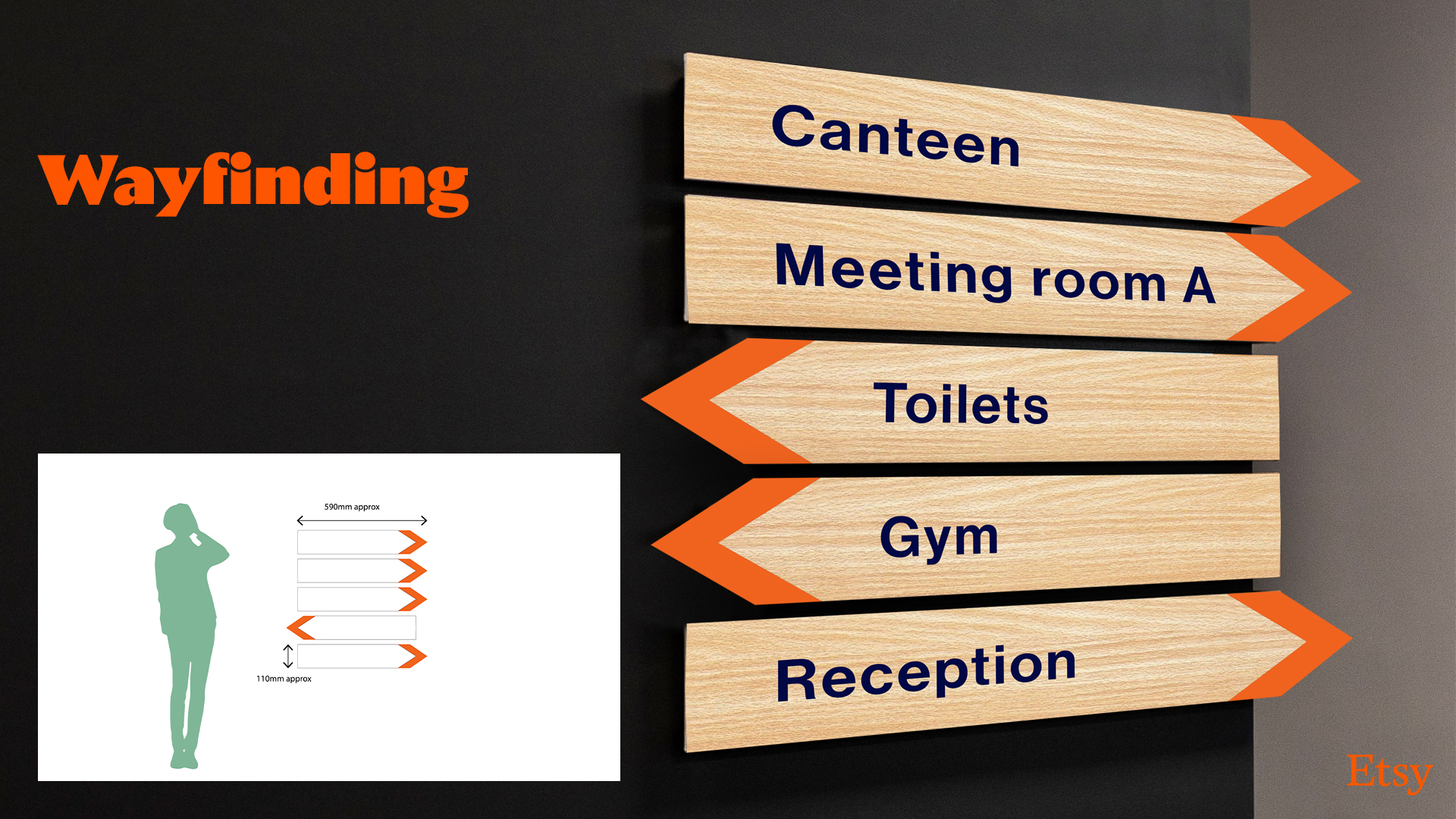
Wayfinding system:
Wood and organic paint signage is durable and long-lasting. The wood is biophilic as a natural material.
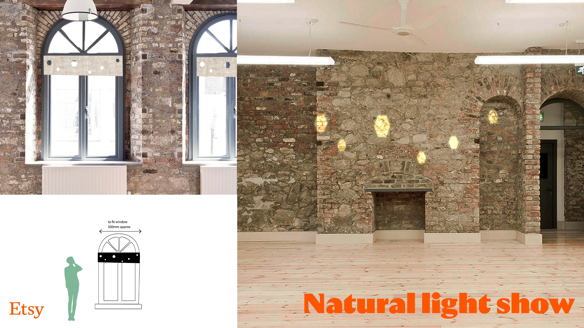
Natural light show:
Instead of energy-consuming projections and screens, this natural linen window covering has cut-outs which allow light shapes to form on the walls. The constantly changing and moving light appeals to our senses in a biophilic manner.