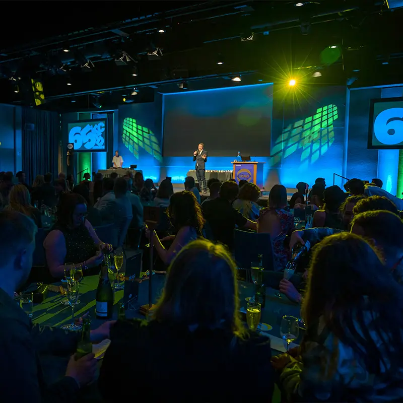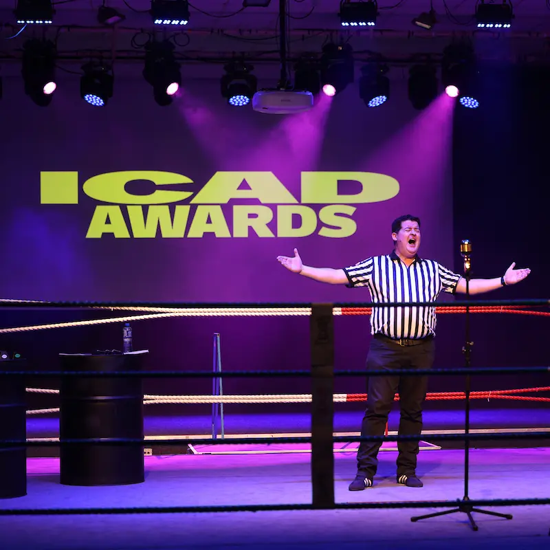
Open exclusively to ICAD members, the ICAD Awards have stood as the very benchmark of creative excellence in Ireland since 1958. Recognised nationally and internationally, the coveted ICAD Bell represents the highest standard of creative work, achieved by the finest creatives. Uniquely, the ICAD Awards unite the Irish commercial creative sectors together, recognising production, design and advertising disciplines in one programme.

KEY DATES 2026
April: Launch and call for entries
May: Deadline for entries
June: Judging
September: ICAD Awards

ENTRY FEE
To keep the ICAD Awards accessible to all members, entry fees remain unchanged from 2025
Early Bird rate: €100
Standard rate: €125
Student & Greenhorn (≤3 years experience) rate: €25
20% Discount: For freelancers, not for profits, charity and businesses with 3 or less employees. Contact us at [email protected] to claim this discount.
Fee Waiver: In certain instances, we may grant a fee waiver to applicants who can show significant financial hardship and for whom paying the application fee would be an insurmountable barrier to entry. For more details see the Fee Waiver Policy or email [email protected]

ELIGIBILITY
All key creatives for a given entry must be current ICAD members, or in the case of craft categories, the key craftsperson e.g. the photographer for a Photography entry. The person actually entering projects into the awards platform does not necessarily require ICAD membership; however, the creative on whose behalf the work is being entered does. Anyone you’d expect to go on stage to accept the award should be a member.
Entries must have been commercially released between April and March 31st in a given awards cycle, produced in response to a genuine brief from a client or approved by a client and made available to the public.