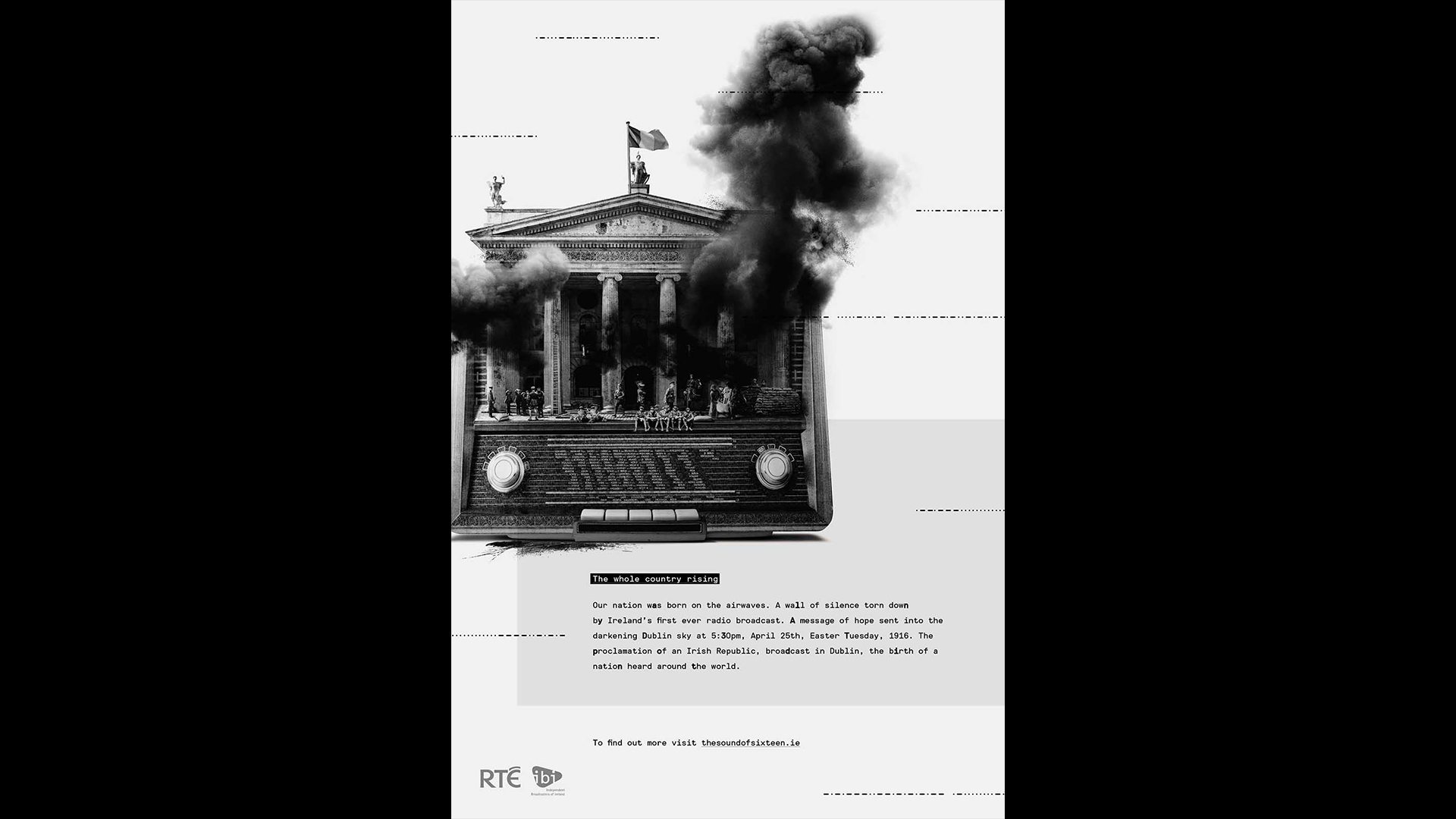
Ireland’s first radio broadcast was transmitted on the 25th of April 1916, in the middle of the most significant week in Irish history – the Easter Rising.
Everyone in Ireland knows the story of the Easter Rising, but the story of Ireland’s first radio broadcast is not so well known. Our objective was to mark the anniversary of Ireland’s first radio broadcast and raise awareness of this amazing piece of Irish history.
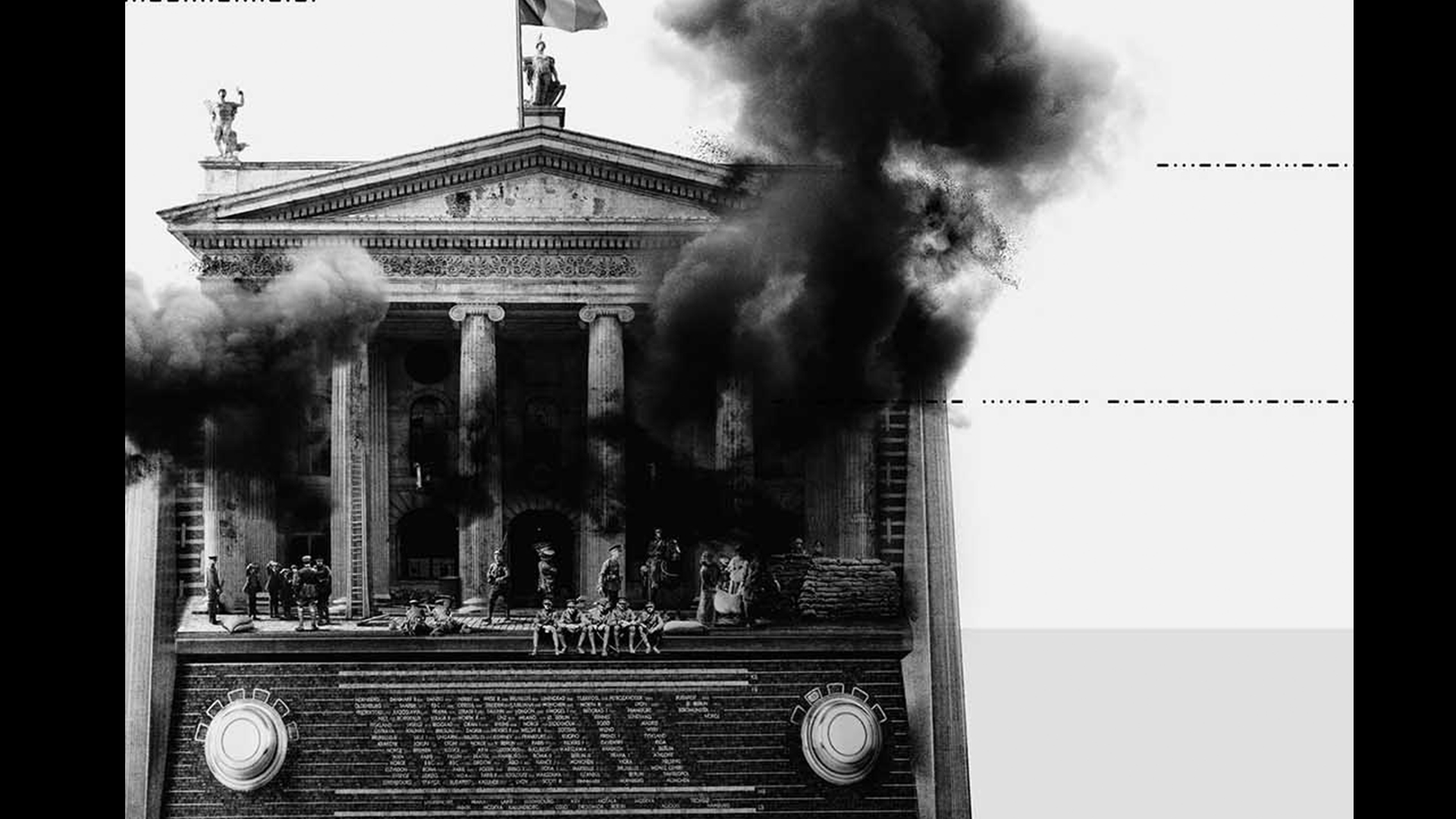
It was our intention that the design should convey a sense of distress and ferocity, reflecting the time period of the broadcast and situation surrounding it. Therefore the art direction in this piece was intentionally led by the 1916 period, specifically that famous Easter week.
In addition this piece needed to raise awareness, so immediacy was important. This led to the decision to reduce the copy, and rely on one key visual to communicate our message.
The response consisted of four main parts: grid layout, key visual, typography and historical material.
Our grid layout is a tri-colour grid system, based on the Irish flag raised above the GPO during the Easter Rising. This allowed us to create a foundation to the design based on the events surrounding our main message.
The key visual of the piece is a unique image, created using a mixture of historical stock photography and purpose shot photography of an era-accurate shortwave radio.
In terms of typography we wanted to reflect the time period of the event, and used a modified mono typeface to replicate the British government typewriters of the era. To increase authenticity, random letters were individually treated with a thicker weight,
Finally, historical material was incorporated into the design through the original Morse code message, its placement mimicking bullets whizzing through the evening air during the week-long rebellion.