In 2017 Rua Red Gallery and the South Dublin Arts Centre appointed a new executive director, Maolíosa Boyle. Maolíosa, along with her team at Rua Red have sought to create a stronger framework for the galleries identity and the creation of its exhibition printed media. On average the gallery produces 6 exhibitions in any given year. Our brief is to design the printed media for these exhibitions. Typically each exhibition is accompanied by a poster and catalogue which are produced on a tight budget and short turnaround. The fundamental challenge for our work is that whilst each exhibition has vastly different content and the exhibitions themselves are curated by varying independent curators the work must retain a sense of overall identity that can be associated with Rua Red. We have been asked that our work be flexible enough to accommodate the ideas being explored by each curator whilst developing this new approach to the galleries identity.
In certain cases the exhibitions we have worked on run concurrently in partner galleries throughout Europe bringing challenging aspects to the development and creation of design work. From the outset we created a highly adaptable grid system and approach to the creation of printed media, laying down a foundation for how any of our design work is created and printed. Rua Red have asked us to specifically explore different approaches to how the work can be formatted into exhibition collateral and thus far we have implemented our designs as fold out posters of varying formats as well as booklets. In designing any work for the gallery we also have to maintain tight production budgets across all printed media. As we have developed the series we have laid down rules for myriad of considerations across type, imagery, creation of illustration and colour choice. At every stage we have built in a degree of flexibility in how we use the fundamental elements that are provided to us for artwork which enables the creation of individual poster designs whilst addressing the curators ideas and preference for use of media. This has allowed for series of posters thus far that are visually unique and at the same time clearly created for one organisation. Glitch Digital media festival.
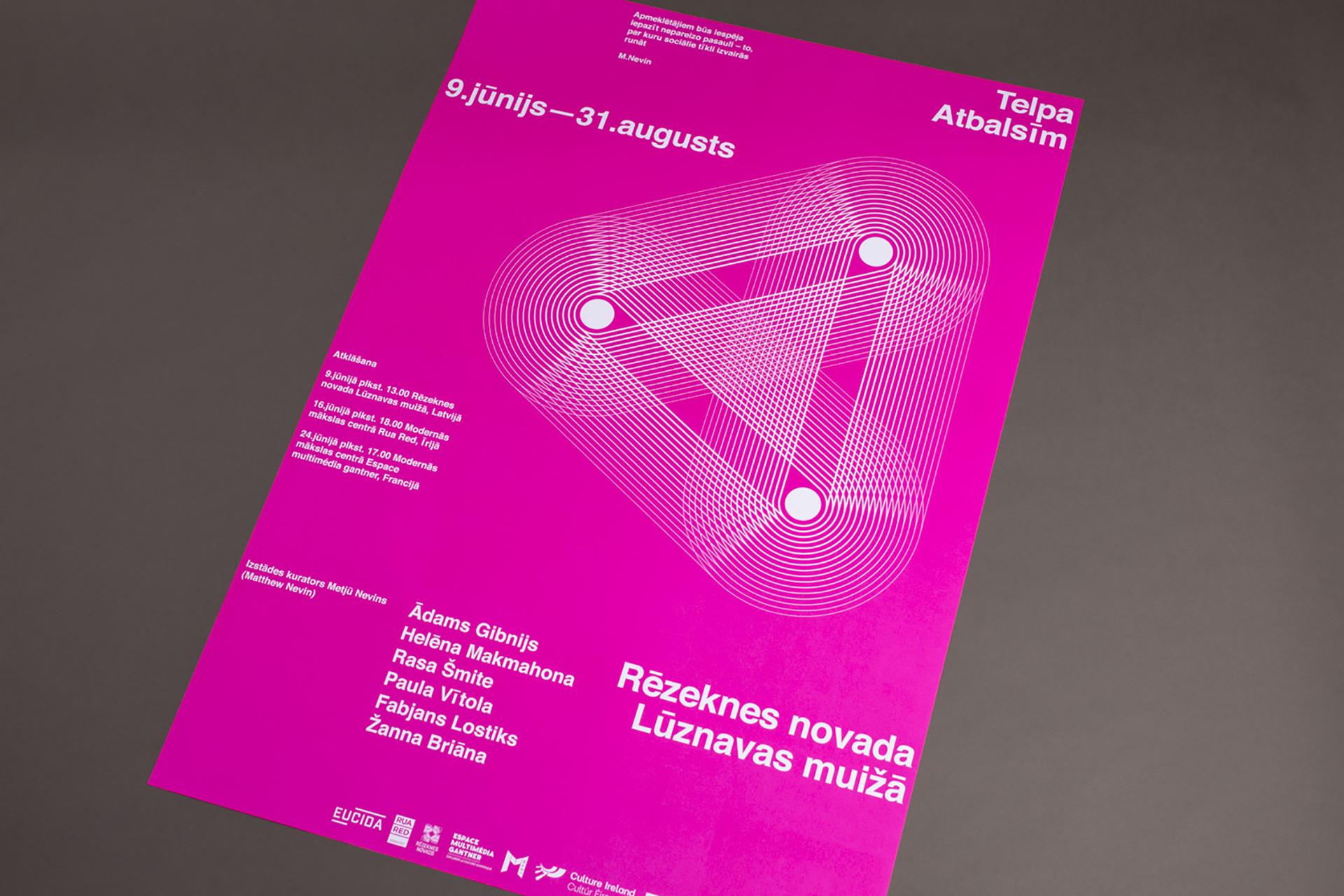
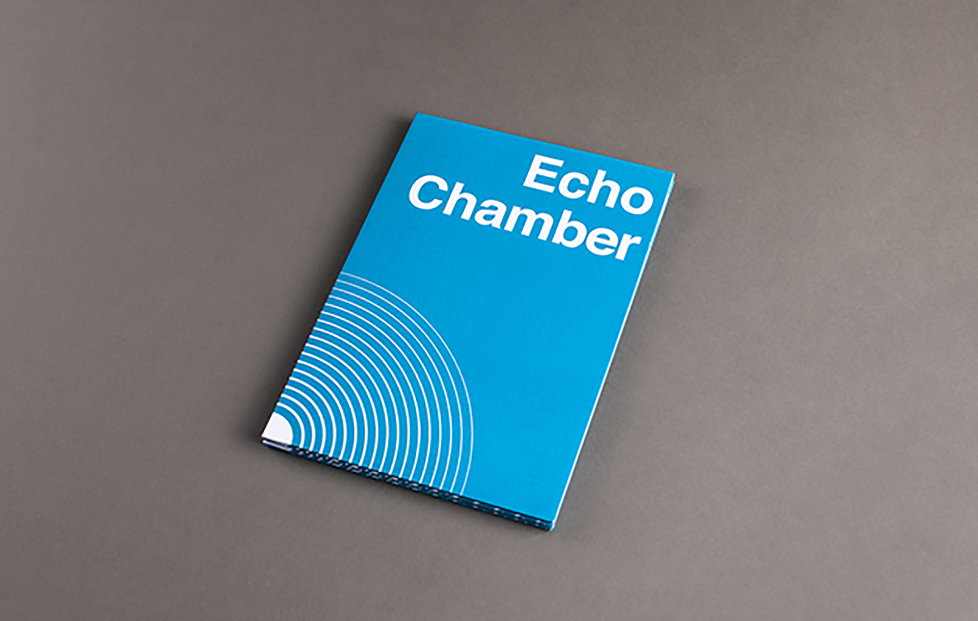
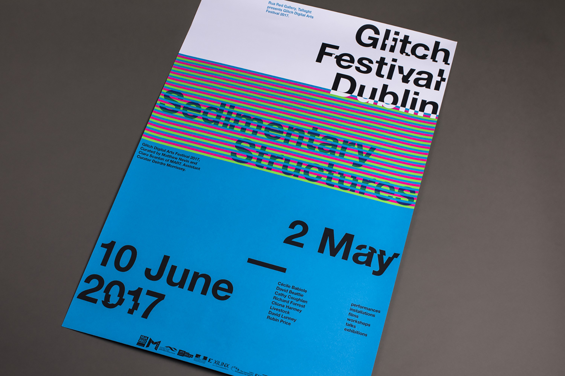
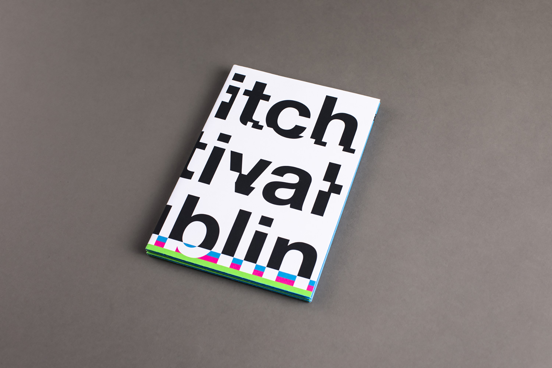
In the early stages of development we spoke at length with the project team about our concepts for the poster work and what we wanted to achieve. The resulting design featured a simple typographic poster that was ‘broken’ by inserting visual glitches determined by computer error. This was further supported by the use of an RGB colour palette implemented using fluro spot pantones. In our project research for Echo Chamber, we explored the idea of an echo chamber in terms of the online digital world and within music. We created an abstract symbol to symbolise an echo chamber drawing on three sources representing the contribution of three distinct partners. The final symbols’ orientation is a direct geographical reference to the positions of the contributing galleries. Each partner was then afforded the opportunity to print the one colour poster in a spot pantone of their choosing.
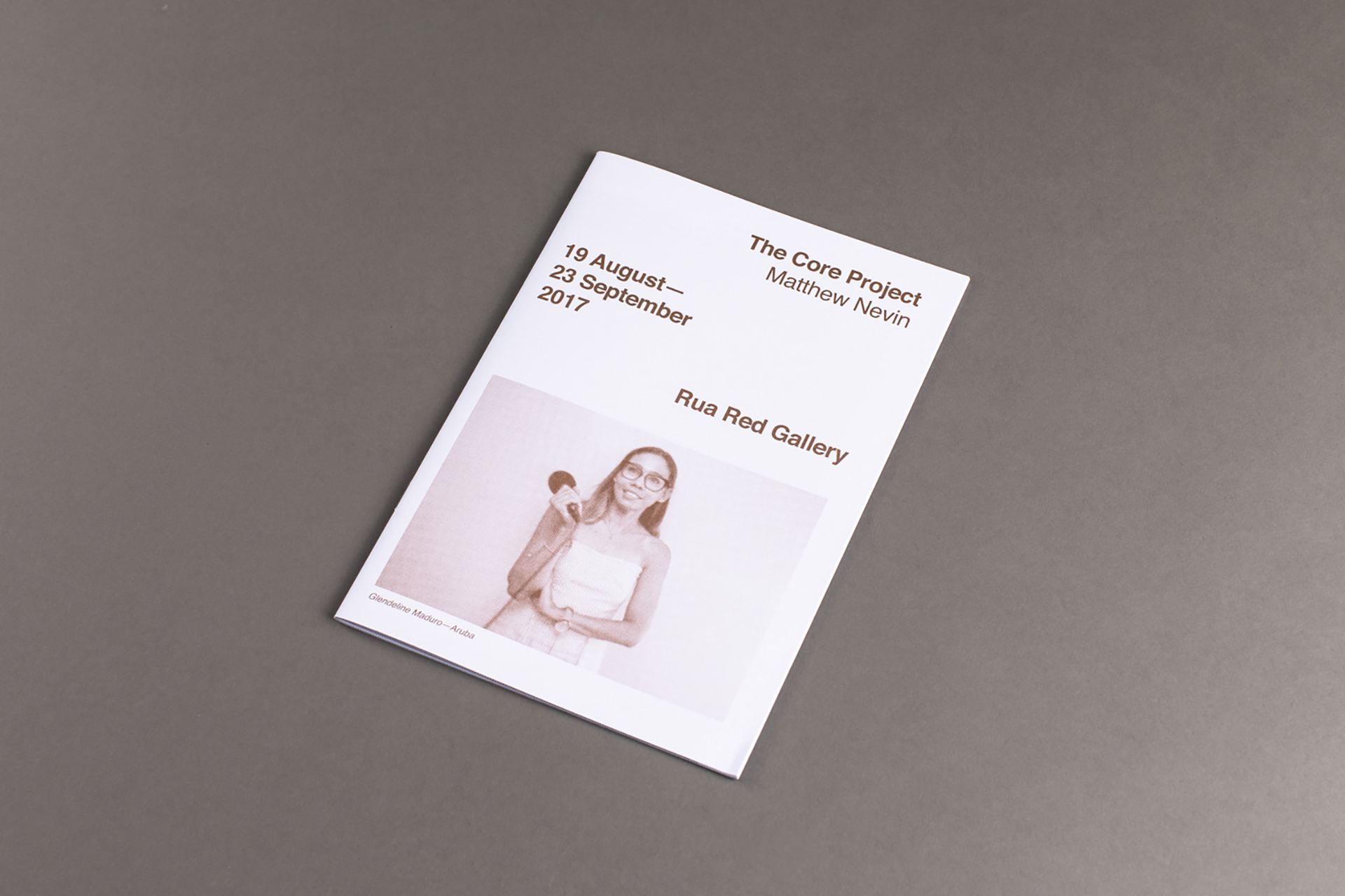
The Core Project exhibition was a large-scale installation featuring over 150 videos from participants across the globe, filmed live and answering a question that they had not previously seen. Our work for this exhibition saw us developing the galleries’ output, including a new booklet format. The booklets themselves were created by overprinting the exhibition content and an interview with the artist Matthew Nevin onto the exhibition’s A1 poster. We printed the poster using two spot colours and swapping out one of the printing plates with new content before folding the poster down to A5 and saddle stitching. The posters featured imagery from the project’s participants which when folded down, resulting in the creation of abstracted page spreads married with a more refined approach to the typography.