Project 1: Identity construction was the central research question for my thesis. My dissertation focused around the narrative of the star sign Gemini through the lens of the social construct, femininity. It questioned how identities form with society constructs, how they adapt over time and change within various outputs. Identity is not concrete. I wanted to portray an individual’s identity construction visually; through studio practice.
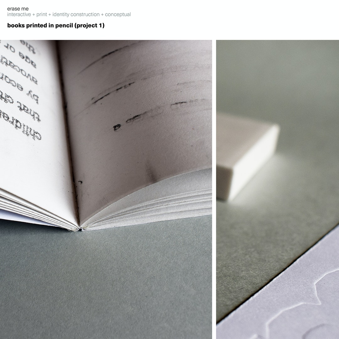
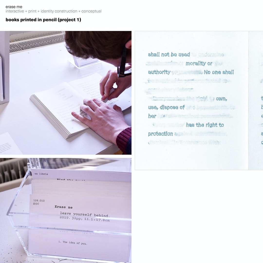
In this project, readers can choose a page, a line; anything in these books and erase the words until what is left on the page represents a fraction of their own life story; effectively portraying their own identity.
I hacked a vinyl cutter and placed a pencil in it. Each page took 15 minutes and every book was filled with randomized bits of text, from the constitution, social media, newspapers, terms of condition, user agreements, and television from the day of the project. The text was randomized using atmospheric noise.
Using GT Cinetype as the books’ typeface seemed natural, as it is based on subtitle design, and this was effectively the narration of our lives, the pairing seemed kismet. Pitch was used for labels and index cards.
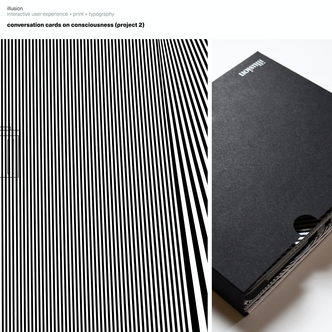
Project 2: The project represents both sides surrounding the debate around consciousness; ensuring each viewpoint is represented equally. This document, illusion: what will you talk about? cataloged a debate by philosopher Mary Midgley and scientist, Colin Blakemore. However, purely visualizing their debate was not enough. By allowing an audience to actually engage in the discussions, they can come to their own conclusions through critical thinking. From this problem identification, the design solution of debate cards developed.
Four large ‘zine’ style publications each reflect a lobe of the brain and catalog the debate. Debate cards highlighting key arguments were visually colour coded to fit into the larger publications. This ensured the cards and the publications could each stand-alone, but together work efficiently to gather the information quickly. The size of the zines and the cards are based on research as to the average size of the brain.
On the larger publications, the debate is presented as one continuous thought, meant to act like this whole disagreement is in the
head of the reader. The debate cards allow for other individuals to participate and the main content works in another way when more people are involved.
The addition of kinograms, which is a paper animation technique, was added as another way to portray both sides of the message. The hope is that this solution could be used for other large debates on important human issues.
Project 3: A subterfuge awareness campaign to recognise good moments during a daily commute was tied in with a customised typeface design. The campaign asked commuters to jot down observations on their train tickets. It could be any moment they noticed during their travels. This effectively acted like sending postcards from the train.
The observations would then be printed on new tickets, sharing these lost stories to more people.