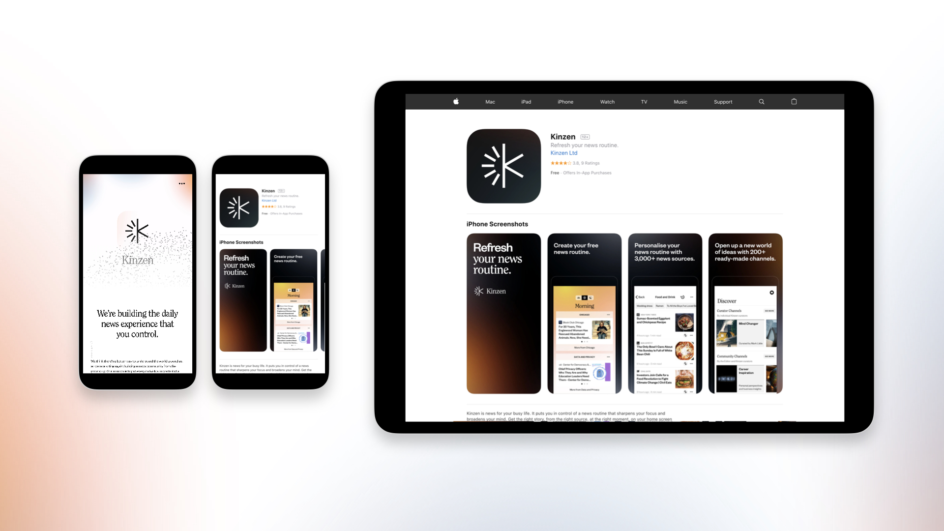
Kinzen is a news platform and app. It aims to reinvent our relationship with news: reimagining and reconfiguring our daily media consumption. The people behind Kinzen have a track record of pre-empting change in the media industry, so when they approached us with the task articulating this in a visual identity, we were excited. If anyone can effect a shift this big, this is the team. Kinzen launched with an iOS news app, where users are invited to create a news routine from community-verified sources, responding to the way they want to understand the world.
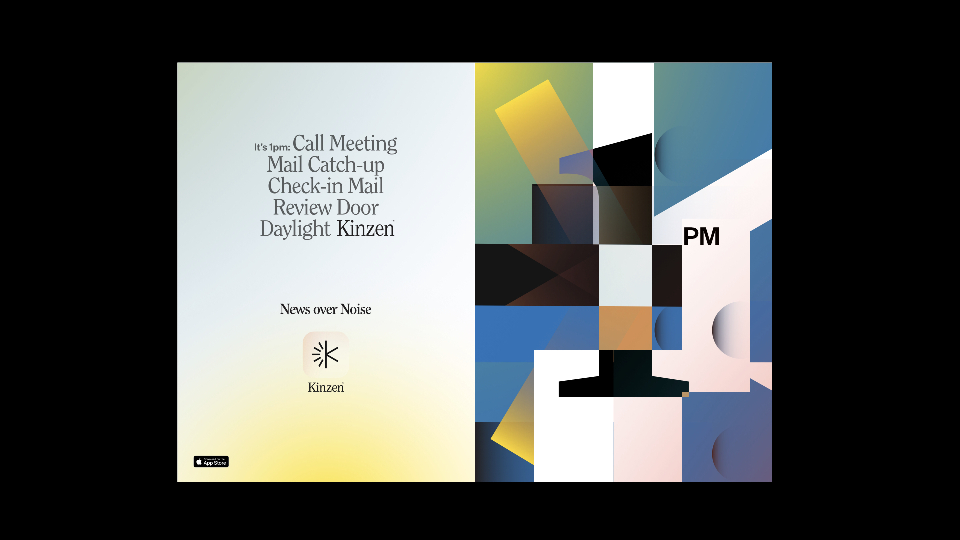
We worked with Kinzen to create a brand that could articulate this set of messages consistently and well. Our work began with naming, which gave us a sense of the expanse of the ambition and challenge at hand. By necessity, the visual representation pulls from a wide variety of sources: traditional print media, fine art, science fiction and nature. There is a bit of all of these things in Kinzen.
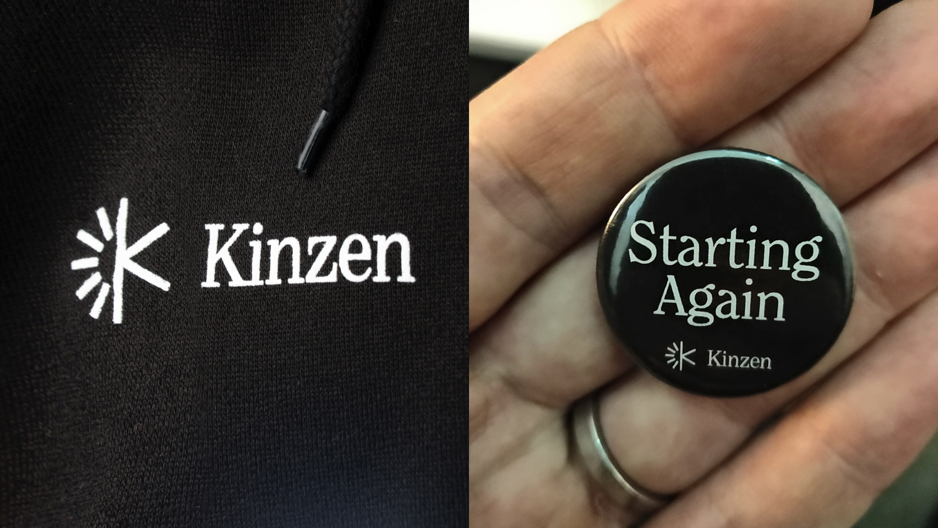
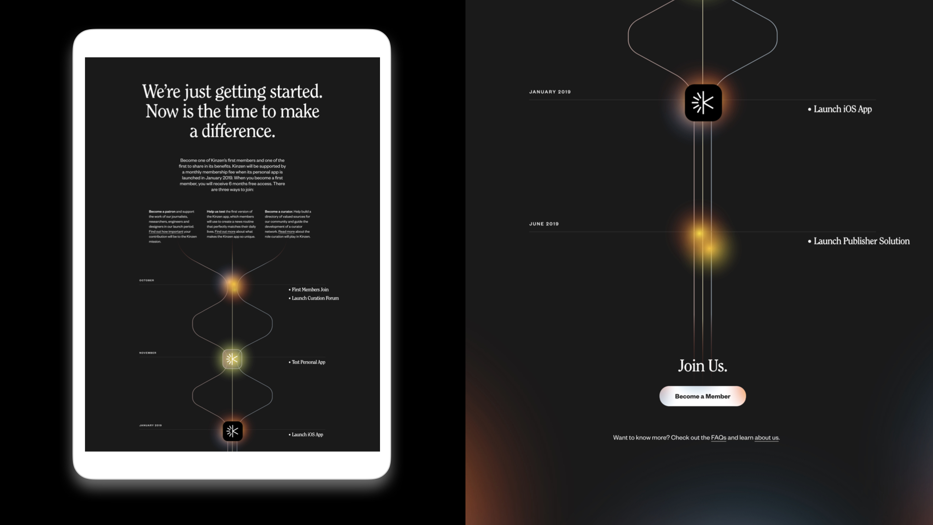
The brand exists in a number of applications. Online, a series of websites have heralded the new undertaking, first giving a platform for early adopters to engage and then announcing the launch of the iOS app. On social and programmatic advertising, images, copy and moving image were created in the studio to introduce Kinzen to a wide audience. The brand also lives in swag, and numerous in-house templates and decks.
Alongside this work articulating and promoting Kinzen, we have consulted with their product team to bring this brand to life in-app. We continue to partner with them as they to develop the platform and new products.
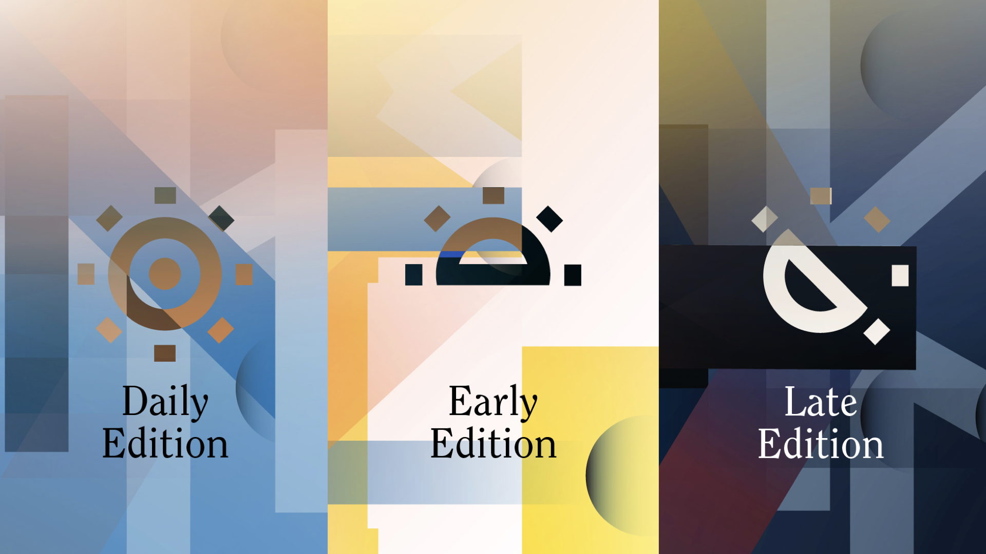
Typographic cues come from the world of print media, which also influences a monochrome treatment. This is infused with light leaks and a series of colour washes which represent the sky at different times of the day — a nod to the personal routine that the use dictates. The Kinzen logo is simple and runic, configured to be able to represent time when needed.