The National Quit Smoking Service is a unique and seamless service from the HSE to help smokers make a quit attempt, and provide help and support during their journey across multiple channels including phone, online and social media.
Ireland has had a QUITline service since 2002. In 2014, objectives were outlined that focused on the HSE QUIT Team offering engagement across multiple online platforms: website, social channels and digital advertising. The new omnichannel approach also needed to integrate with the new HSE QUIT media campaign: ‘You can Quit, We can help’.
The project scope for ebow was defined as providing a new website design, that repositioned the existing Quit brand as a more supportive, positive service with a focus on the service users and the service’s benefits and unique selling points.
ebow began the design process by conducting a user experience audit and a review of the existing website’s analytics and performance. The results of these found that users weren’t really engaging with the website. For example: the number of page views per session was low, and although traffic numbers to the website were reasonable, the conversion rate of people completing the plan registration process was low.
As improving this conversion rate was one of the key goals for the new website, ebow highlighted the key features that the new design approach needed to adhere to in order to achieve success and applied them to the new design concept proposed. These features included:
• A device responsive design, to cater for the growing mobile traffic and to future-proof the site;
• Clear signposting on key landing pages of the services unique selling points and the ‘reasons for the user to believe’;
• Clear call-to-actions to enter the registration process throughout;
• A simplified, user-friendly registration process that considered the mobile experience and potential ‘drop off’ points, and;
• A design approach that was welcoming and gave a feeling of support to the user to encourage further engagement and interest in the service offering.
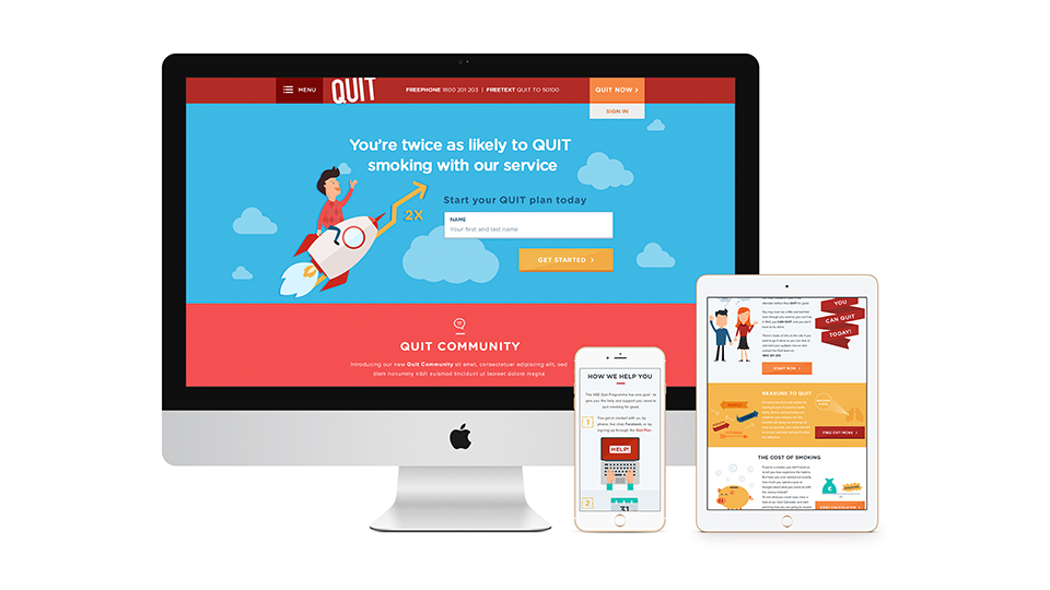
The result of all these considerations was a bright, bold and illustrative design, with clean lines that provided a modern, fresh feel to the website compared to the previous design which was very dark and text heavy. To support the new use of bright colours against clean, white space, ebow created a cast of QUIT characters – which has now been further developed to include actual representations of the QUIT Support team. The ebow Design team felt that using illustrated characters, as opposed to imagery of real people, provided a human element to the website while keeping the tone light, positive and supportive. This was done as an alternative to the Gerry Collins campaign, which – although saw and continues to see great success – carried a very serious and emotive message of the detrimental effect smoking has on people’s lives.
The design also primarily focused on the user’s goals while on the website, while still integrating the wider business goals of improving sign-ups and improving numbers of successful quitters through the service. This resulted in the creation of banners for the homepage that visually highlighted dealbreaker questions, such as what is involved in registering, what is included in the plan. This information was supported by call-to-actions that immediately directed users to further relevant information based on the following categories:
• I want to quit
• I’m quitting
• How does the service work
Although the registration was defined as a clear goal for improvement at the project outset, consideration was also given to the user’s experience once they have joined the plan. As successful quit attempts was also a measure of success that the QUIT team had defined, the on-going engagement with the website and wider QUIT service was paramount in achieving this goal.
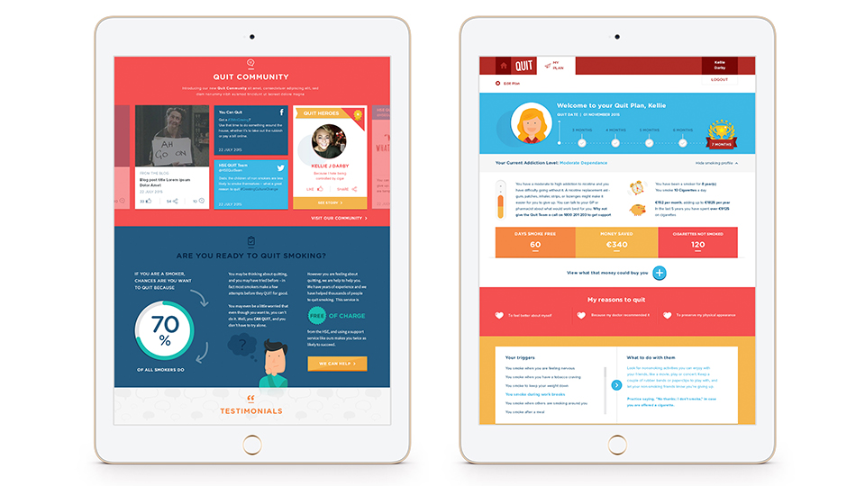
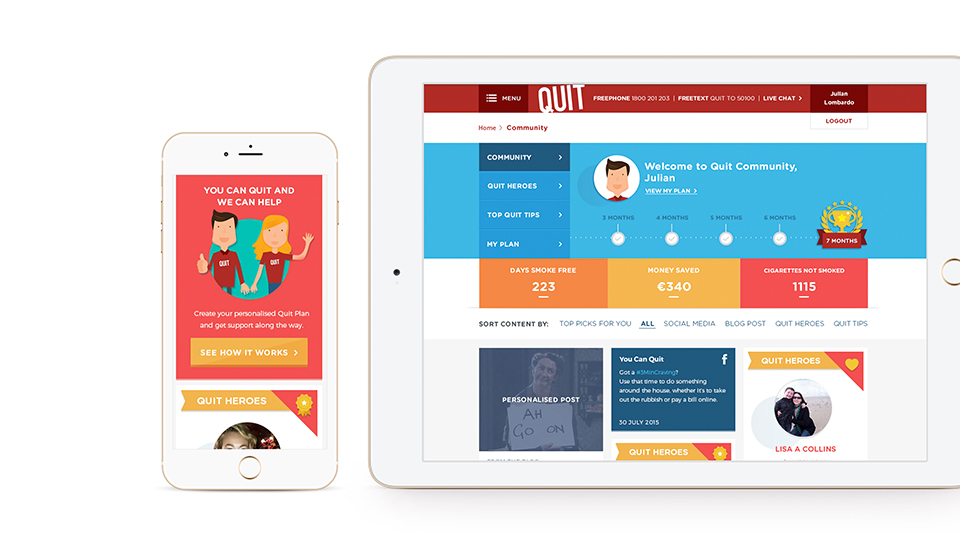
As a result, ebow created a user profile that provided a more personalised design and display of information to the registrant. This included features such as:
• A personalised welcome message, to keep the feeling personable and friendly;
• Positive affirmation and reinforcement on the quitter’s journey to date through personalised timelines and achievement ‘badges’ to highlight key milestones achieved;
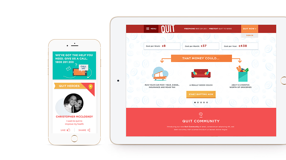
• An overview of items that could be purchased with money saved to date (based on calculations from information provided in the registration process), and;
• An overview of the quitter’s profile information, such as their personal triggers and the reasons for quitting.
This page allows the user to review their progress at a glance, as well as feel empowered and positive about their achievements to date and remember why they are part of this process. The user profile now includes the option for a printable page design that can be displayed in the quitter’s home/work etc as an on-going reminder.
Cost Calculator
In terms of further innovation, opportunities were seen in the early concept stages to include an interactive feature that would show users not only how much they could save by quitting, but also give examples of what could be bought with that money. This allowed for an element of humour to be incorporated, while also acting as a user incentive for successfully quitting. The Cost Calculator widget that was developed is not only present as a tool on the website, but is now an integral part of the registration process and the user profile section.
Community
As part of the latter phase of the project, ebow worked with Quit and pTools to create a new Community section on the website. This new feature continues to sustain and develop the design direction initially implemented by creating a supportive, engaging space within the website for users to regularly engage with.
The Community section also integrates the user’s profile information when logged in to provide a personalised curated experience, with overviews of the user’s journey to date through visual timelines, as well as showing content curated specifically to that user’s registration information e.g. articles related to pregnancy, if the user has ticked the pregnant option in the registration process.