The Good, the Bad and the Brave Dublin Fringe Festival is a name synonymous with bold ideas, brave performing arts and adventurous audiences. Drawing more than 30,000 spectators over the course of 16 days and nights each September, the festival is a spectacle of firsts where the city becomes the stage and all who participate can escape the ordinary and expect the unexpected.
Despite the increased saturation of our lives in digital media and culture, the Dublin Fringe Festival is ultimately about attending public events in physical spaces, and the brochure is primary physical artefact and souvenir of the festival which audience members and the general public can access before, during and after the festival.
Cover Stars
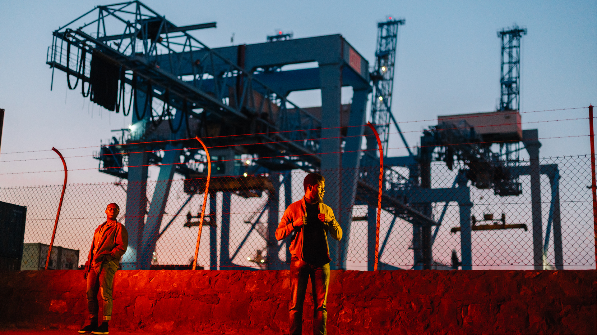
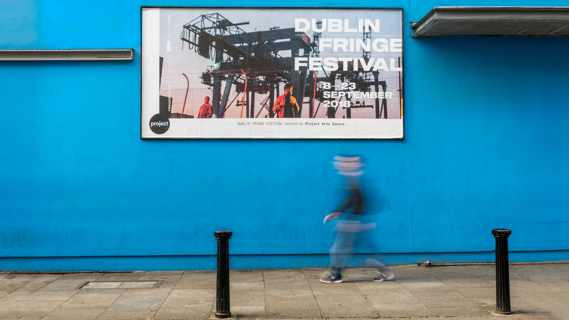
When it comes to all things Fringe, subversion is the name of the game. After all, the performers might be having a laugh but they certainly aren’t messing around. And neither were we. Using the physics term ‘Interference Fringe’ (“any of the light, dark or coloured bands produced by diffraction or the interference of light”) as a theme we explored how light, colour and refraction could be used as a means of interfering the everyday and highlighting disruptive and new ideas. Literally, we invited the viewer to look at things in a different light.
The covers needed a sense of independence and mischief, a change of perspective and an urban, even slightly seedy feel. Then, because we enjoy a challenge, we set ourselves the mighty task of creating not one but three different covers, shot panoramically in a folded triptych.
Of course, the art needed to come first so we pushed the people who made it to the forefront. The absolutely amazing and talented Thommas Kane Byrne, Dagogo Hart + Felicia Olusanya and Liv O’Donoghue were chosen as upcoming artists whose work represented the scope the diversity of the programme. Using the talented eye of photographer Myles Shelly and the inventiveness and skill of our own production team, we created covers that produced a visual representation of bringing disruptive and challenging ideas out of the shadows.
The unadorned cover and the distinct colouring highlighted the artists, while the rigid, oversized type set the pages alight.
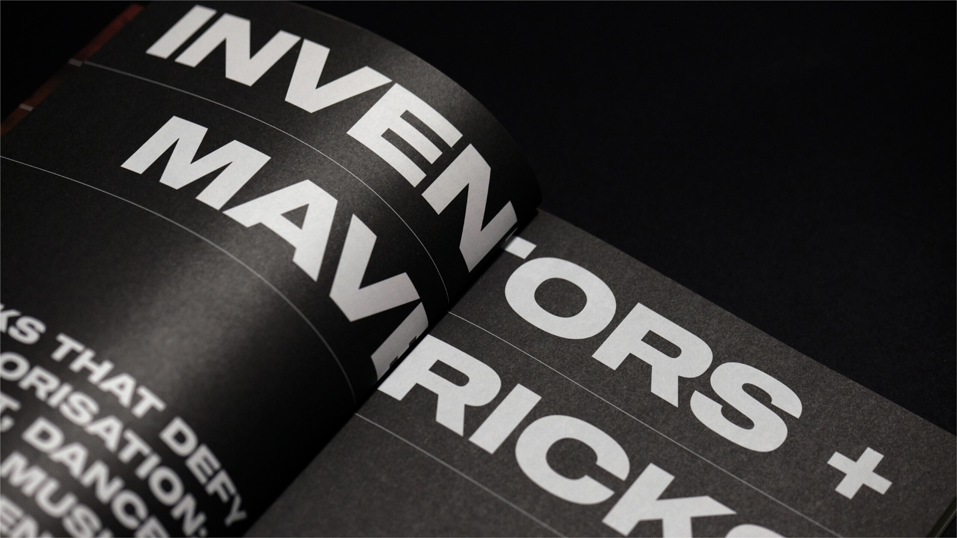
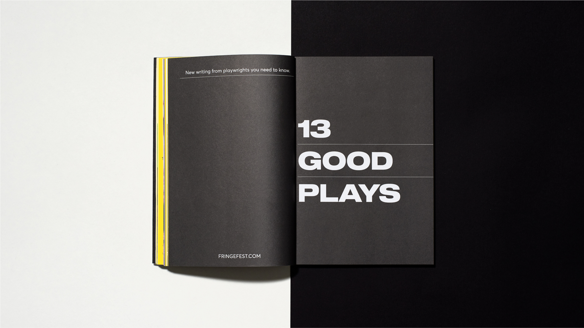
Making Words Work
In our redesign of the brochure, we made it much more user-friendly by re-evaluating the hierarchy of information on each page, prioritising the name of the work, and making a distinct typographic distinction from the artists name. We customised the show-page content the dependent on particularities of the photography provided by each artist while maintaining design elements to retain the branding identity.
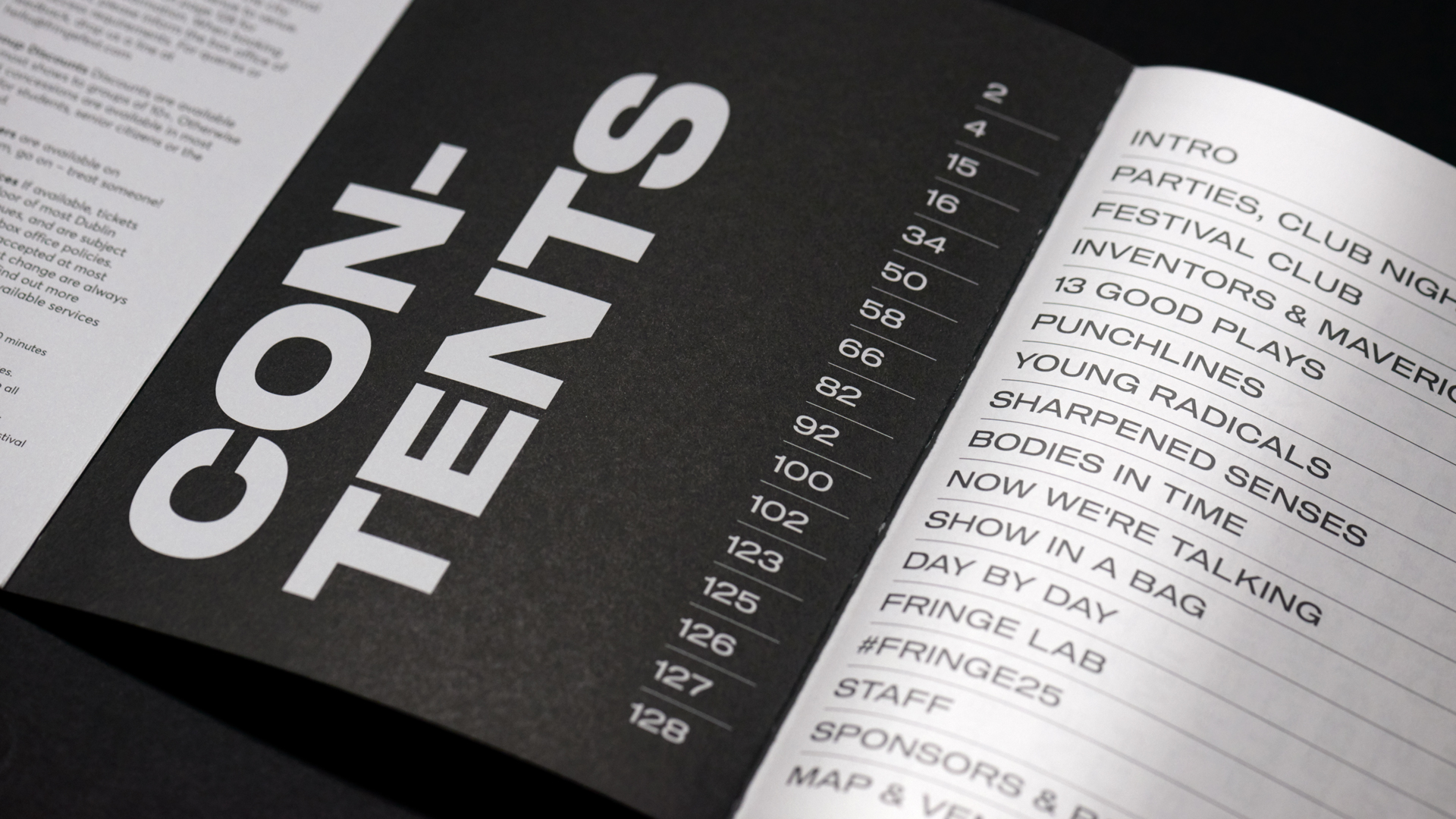
Given the sheer volume of shows in the programme of Dublin Fringe Festival, we used separate editorial pages to break the rhythm of the show-page content. Stark, bold type and disruptive page orientations mirrored the festival’s fresh approach and also highlight themes woven into Fringe’s curatorial decisions while helping the reader to easily navigate its event listings.