Cocu is a brand new food venture that we were asked to create branding and design for last year. The concept was born from a love of quality food and a desire to eat healthy, while maintaining a busy lifestyle. The name ‘Cocu’ is a play on ‘counter culture’ referring to the fact that they serve up fast, over the counter food using local, seasonal and healthy ingredients.
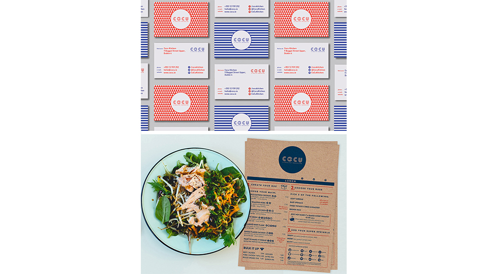
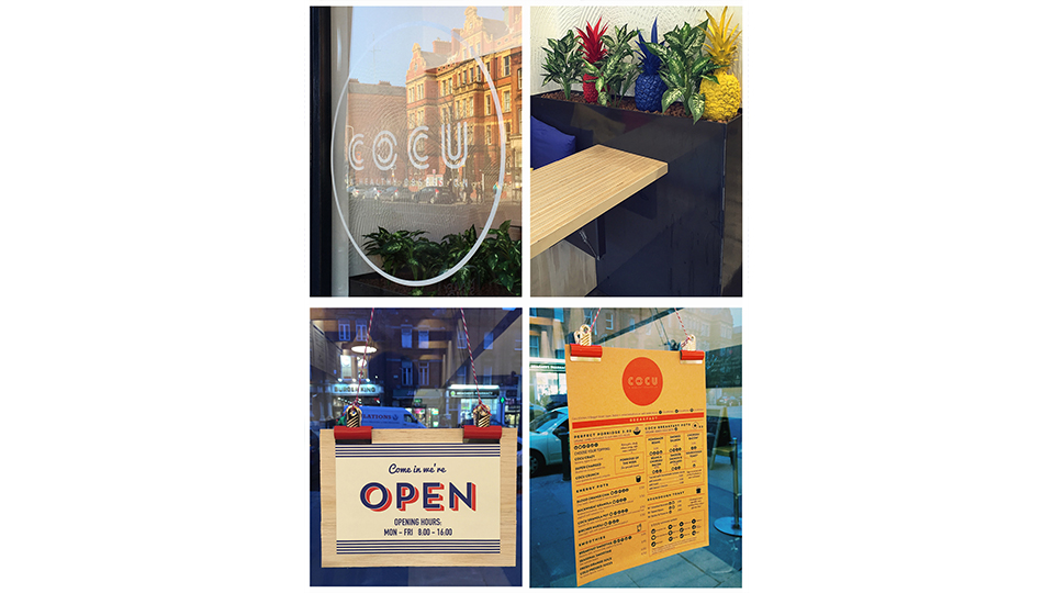
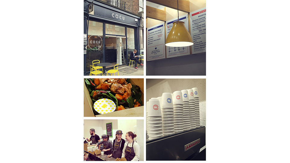
Part of the brief from the client was to create a new vibrant brand that targets the new up and coming health food generation. The brief for this was quite open and at the beginning we had to play around with a number of different names for the brand before we proposed the name ‘Cocu’. For the branding we wanted to use 4 primary colours that would be the entire colour palette for the brand. From this we also created a number of patterns that we wanted to use across the printed material such as loyalty cards, posters, food labels etc. Each of the patterns would also represent the main ingredients of the food box such as red for beef, yellow for chicken, green for vegetarian etc. We also applied these colours to pineapples that we spray painted and used in the interiors for the opening of the premises which was became really popular as people began to take pictures of them and shared them on a variety of social networking sites.
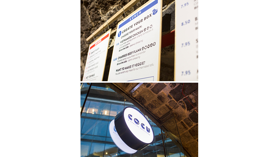
We used a font called ‘Lovelo’ for the logo. The letter ‘O’ was then used as a brand mark for details such stamps on the cups as well as a metal sign on the exterior of the building to the logo on the baseball hats.
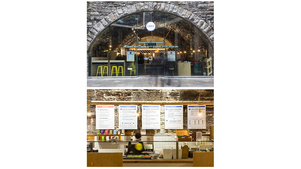
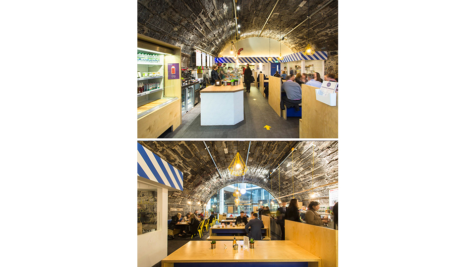
We worked alongside Dua Architects for the design of the interiors and signage for the Baggot st premises. For the Hatch street premises we designed all the interiors from furniture and fittings right through to the counter tops, signage, light fittings etc. Signs of Power we hired to work on all the instore hand painted signage.