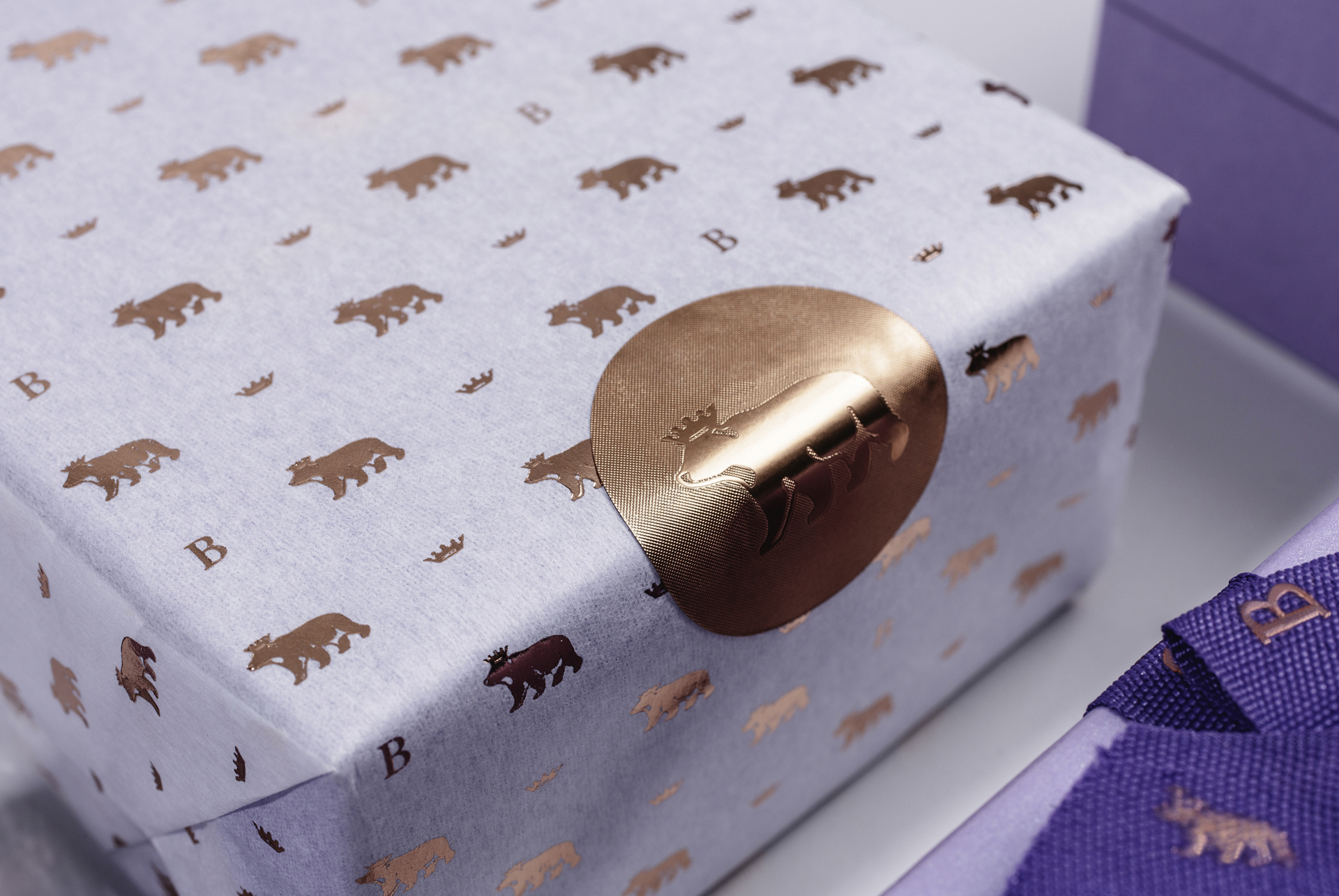
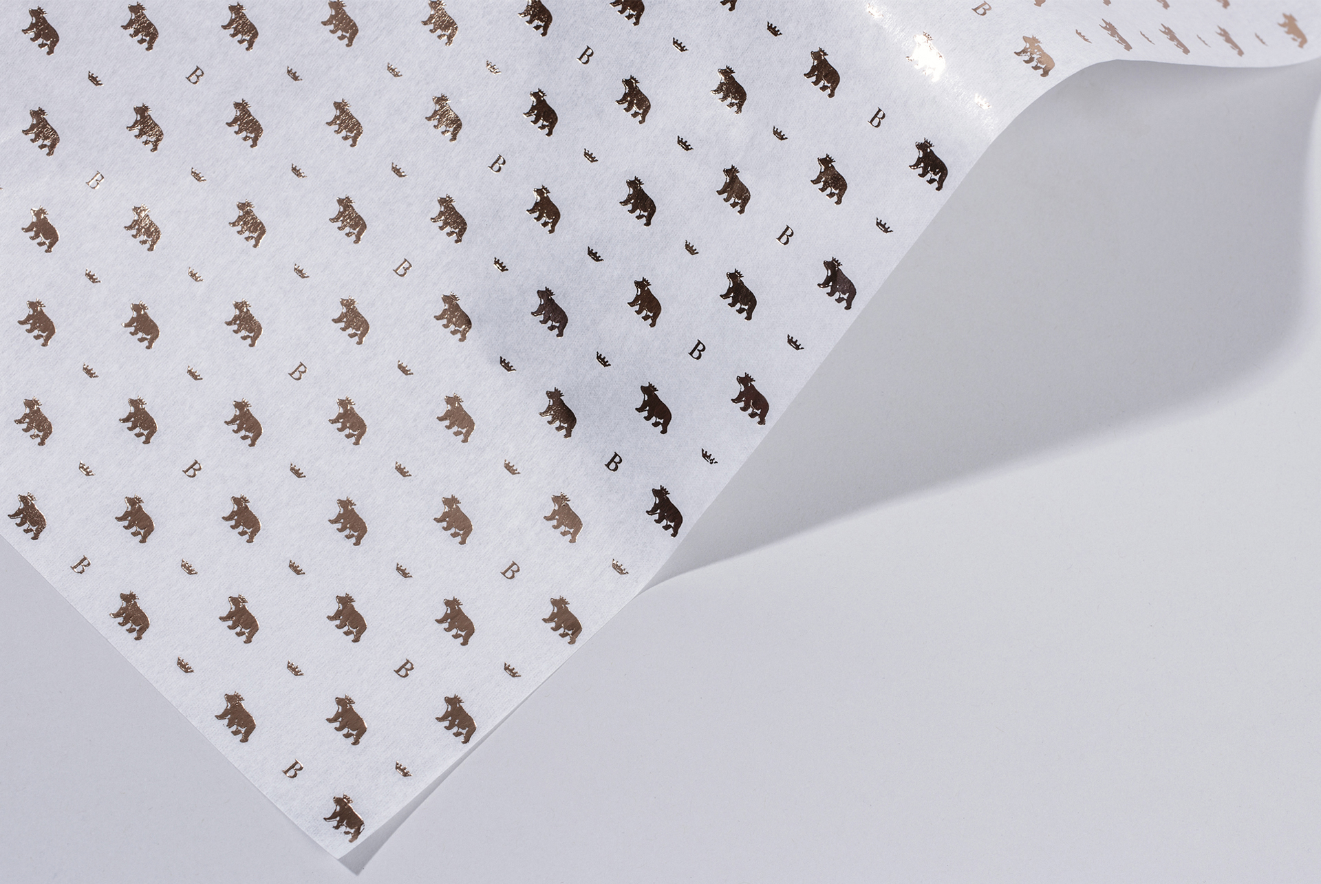
Family jewellers since 1916, the name Brereton stands for quality and craftsmanship. Specialists in selecting and supplying exclusive diamond jewellery sourced from around the globe and chosen for their design and endurance. With designing a new identity and packaging, the challenge was to establish a sense of heritage which differentiates them from other jewellers in Dublin and beyond.
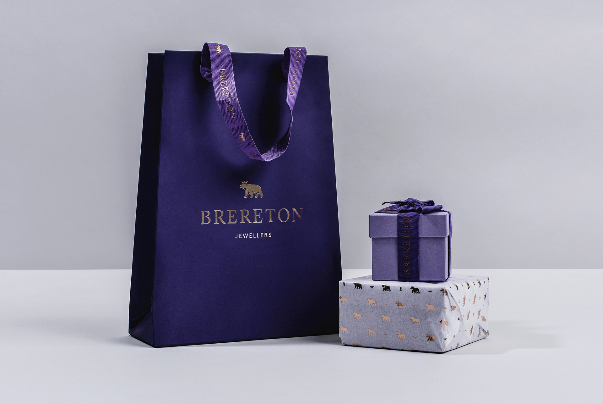
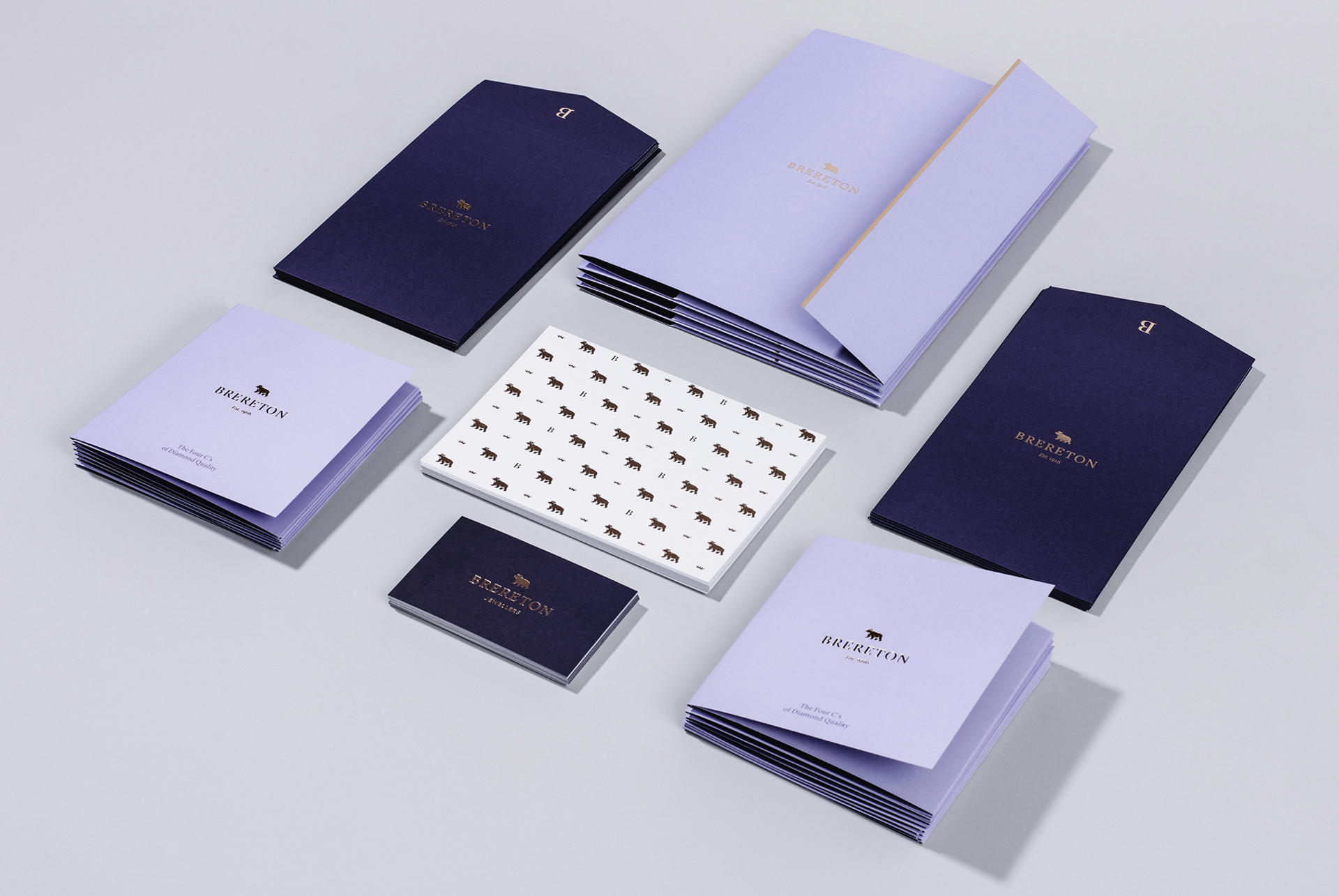
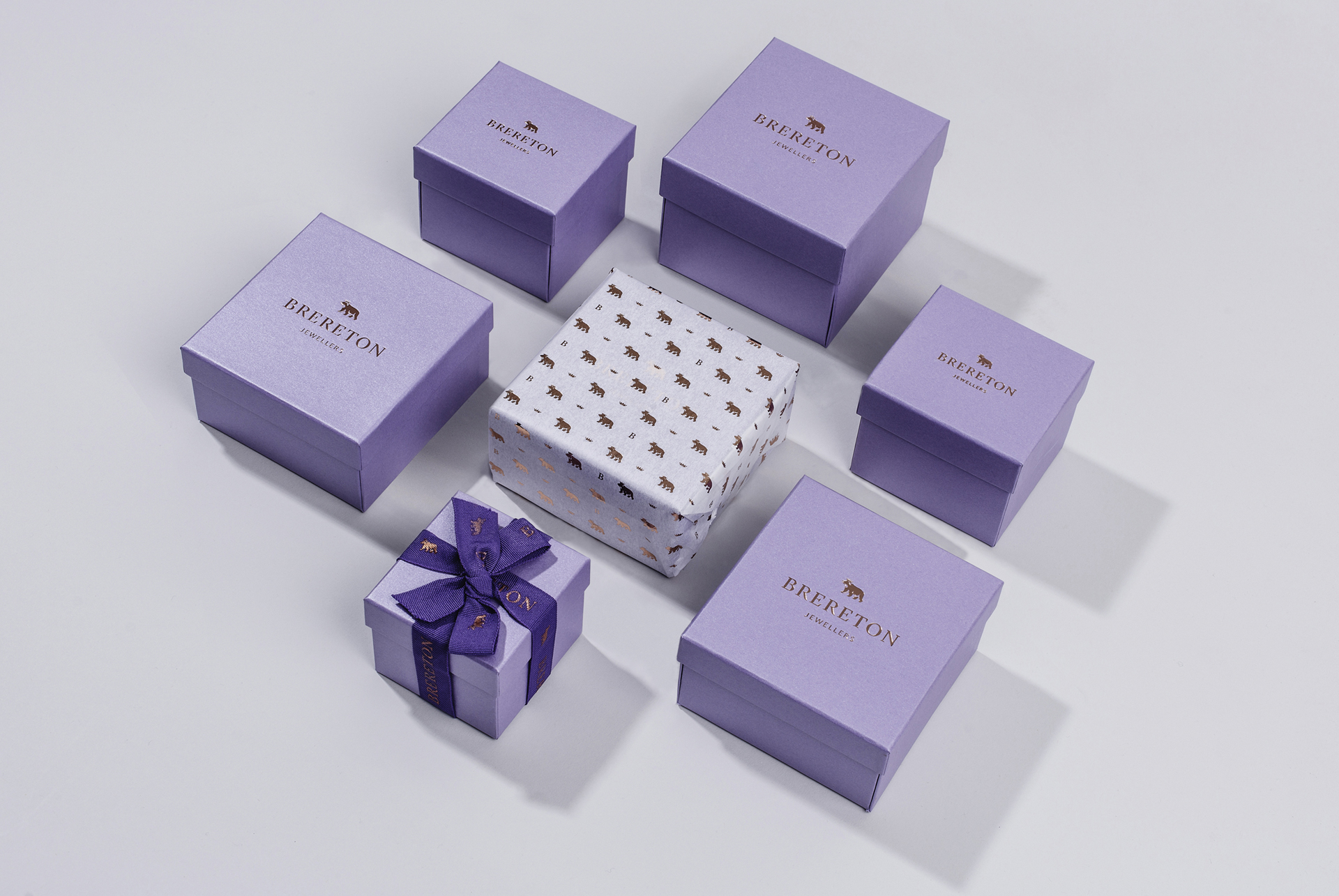
We looked at the family name Brereton and specifically at the Brereton family crest which contains a bear’s head in a ducal coronet. This forms the basis for the new Brereton symbol which we designed to allow for special finishing techniques such as foiling along with a new logotype in a classic serif. A contemporary purple palette was chosen which popped in print yet remained quite classic and high-end, replacing their existing burgundy and gold. We shortened the name John Brereton Jewellers to Brereton as other members of the family were now at the helm.
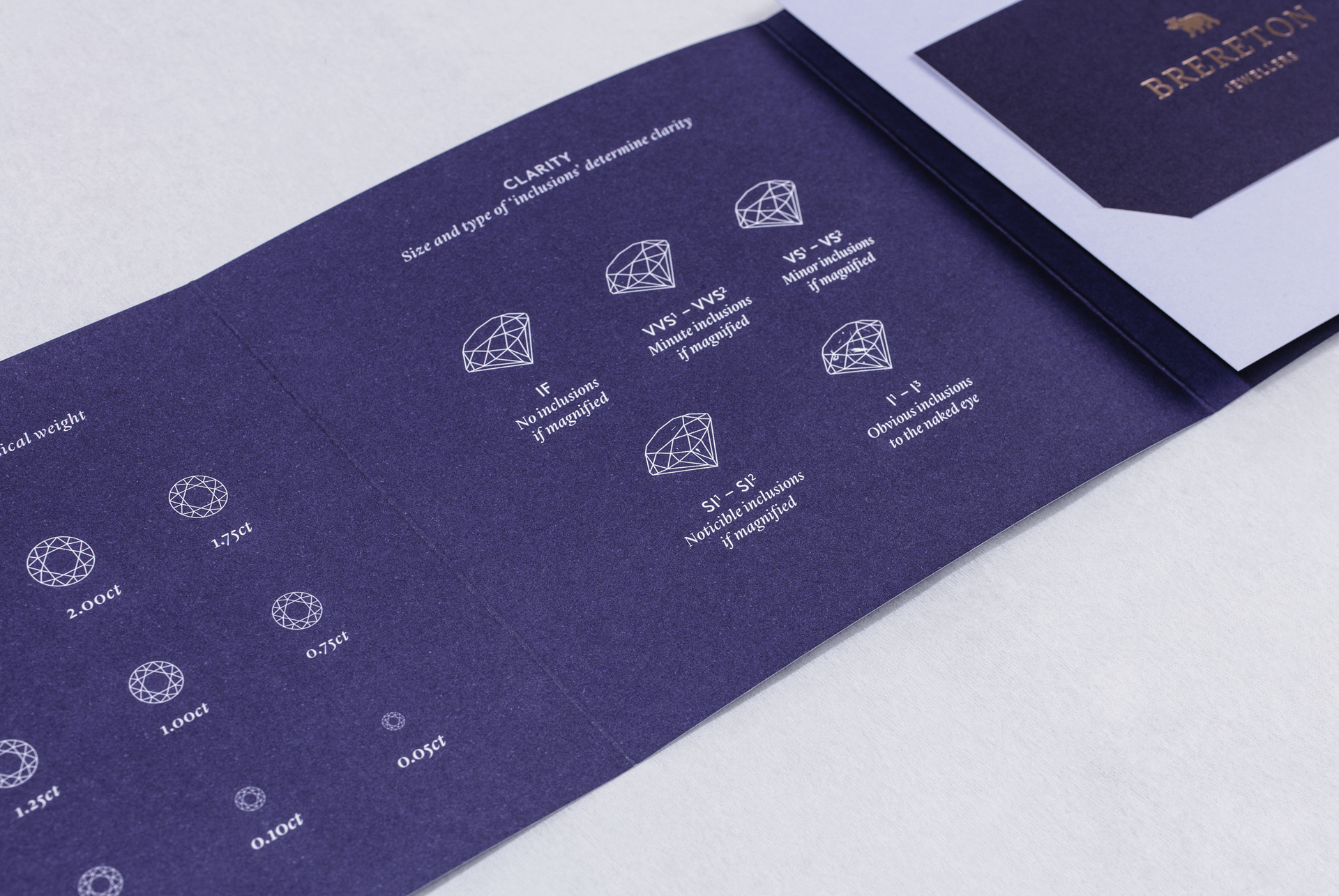
All of their packaging and key communication touchpoints were redesigned with an attention to detail to convey the quality and craftsmanship of the product offering.